What does your nonprofit’s online donation page look like? If it’s poorly designed, hard to navigate, or just not optimized in general, you could be missing out on hundreds of thousands of dollars. Accepting online donations is now essential for nonprofits, but there’s good news — it’s easy to create a donation page in just a few clicks.
What is a donation page?
Simply put, a donation page is a web page where people can submit donations. It’s usually part of an organization’s website and allows donors to submit payments online. Donation pages make it possible for nonprofits to accept donations with ease at any time, rather than only at fundraising events or through the mail.
Why you need an awesome donation page
The great thing about donation pages is they collect donations throughout the year, even outside of specific campaign periods, says Jess Woloszyn, a senior content strategist at giving platform Classy.org. Citing the organization’s “The State of Modern Philanthropy 2022” report, she points out that donation pages are also the most effective method of donation collection. They “bring in the most recurring revenue on average compared to all other campaign types.”
The report also reveals that donation pages are an important source of repeat donations. They make it easy for patrons to set up recurring donations — something that’s difficult to do with other donation methods.
Your charity’s donation page also allows you to reach a global audience. People don’t have to be at your local fundraising event to donate through your website.
Finally, it makes donor data collection a breeze. As long as you have the donor’s permission, you can collect their name, email address, and other information through your donation page.
What a great donation page looks like
Before you learn how to create a donation page, you need to know what a great donation page looks like.
First of all, visitors to your website should be able to find your donation page easily. “Digital friction will crush any online campaign,” says Sarah Evans, cofounder and CEO of the nonprofit Well Beyond. “Spending extra time reducing the clicks needed to find conversion pages and donation options will increase giving, as well as supporter trust and satisfaction.”
It also needs to be easy to use, writes Robin Ganzert, Ph.D., president and CEO at American Humane. “Giving should be as simple and direct as one-click ordering.” As proof, Ganzert points to a survey by an online fundraising company in which almost “half of respondents said they would give to their favorite nonprofit more often if it were easier or more convenient to donate.”
Here are a few elements that great donation pages have in common:
- As few fields for donors to fill out as possible
When it comes to donation forms, give donors as few obstacles as possible. If there are too many fields to fill out, a potential donor may find donating too much of a hassle and exit your page.
- A compelling “Why donate” section
This section is your chance to tell potential donors why they should donate. What exactly will they be helping out with? Add as much detail as possible about where their money will go.
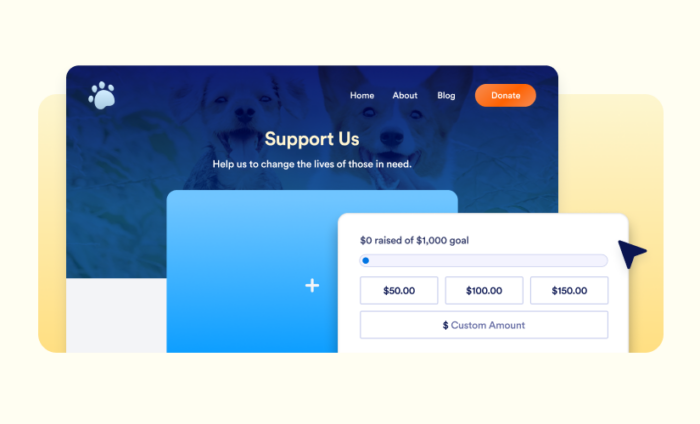
- Suggested donation amounts
Donors may not know what a proper amount for a donation is. Adding suggested amounts helps give them a guideline and makes the payment process more convenient, making people more likely to donate.
- Multiple payment options
If a donor’s preferred payment method isn’t listed, they’ll be less likely to donate. It’s important to give them different ways to pay, such as through a credit card or payment gateways like PayPal or Venmo. Offering well-known third-party payment service options can increase a potential donor’s trust in your organization.
- An option for recurring donations
It’s always a good idea to encourage recurring donations. People who want to provide ongoing support can opt in to make automatic donations each month. That way, the process is even more convenient for donors, and your organization will get more secure funding.
- A story that moves people to donate
Adding a specific example of a time your nonprofit achieved its mission can give people a concrete idea of what you have accomplished and encourage them to help you achieve similar outcomes through their donations.
- A fundraising goal
Showing potential donors your nonprofit’s fundraising goal can help them determine how much they should donate.
- A summary of fundraising progress
Some donors genuinely want to know how your fundraising is progressing. Letting them see your progress shows them how much support you’ve gotten, or, if giving has stagnated, encourages them to share your page to encourage more contributions. You can also visualize your progress with charts.
- Easy sharing options
Of course, your donation page has to be shareable so you and your donors can share it. Adding share buttons for social media platforms or simply a copy link button to your donation page can simplify the process.
- Mobile-friendly design
In the digital age, many people use their phones to browse the internet and make payments. Making sure your donation page is mobile-friendly makes it convenient for people to donate on the go.
- A donation button with a call to action, such as “Support our mission”
Language matters. A simple but powerful call to action can compel people to lend a helping hand.
How to create a donation app
Mobile apps can increase visibility for your nonprofit and your cause. Donors can submit information and payments anytime, anywhere through an app, making them likelier to follow through with a donation — so you need to get it right.
Creating a perfect donation app with Jotform is easy. No matter the mission of your nonprofit or charity, you can use one of our 30-plus donation app templates to get started. Our drag-and-drop App Builder makes it easy to customize an app to suit your needs. You can even include a Donation Box element to collect donations.
Integrate your app with one of our 30-plus payment processors to collect donations immediately. There’s no additional fee for using this service. Unlike other donation form providers, Jotform doesn’t take a cut of your donations — you only pay fees associated with the payment gateway you choose.
Every part of an app is customizable in Jotform, so you can include links, connect forms, add images, and even change the design to match your brand. You’ll even be able to generate a QR code that links to your app. Just remember the tips from above:
- Make it easy to use.
- Keep the app as short as possible.
- Provide multiple payment options.
- Encourage recurring giving.
Nonprofit organizations can also apply for Jotform’s nonprofit discount to get 50 percent off Jotform plans.
How to embed Jotform to create a donation page
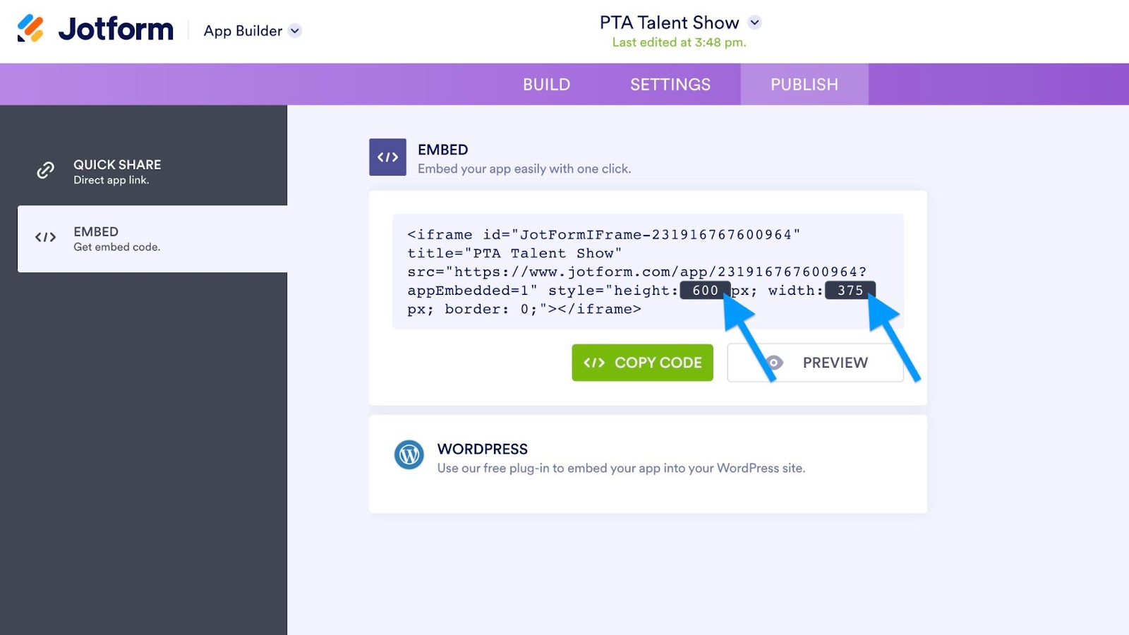
Creating a donation page is as easy as embedding the donation app into a page on your website. You’ll simply need to do the following:
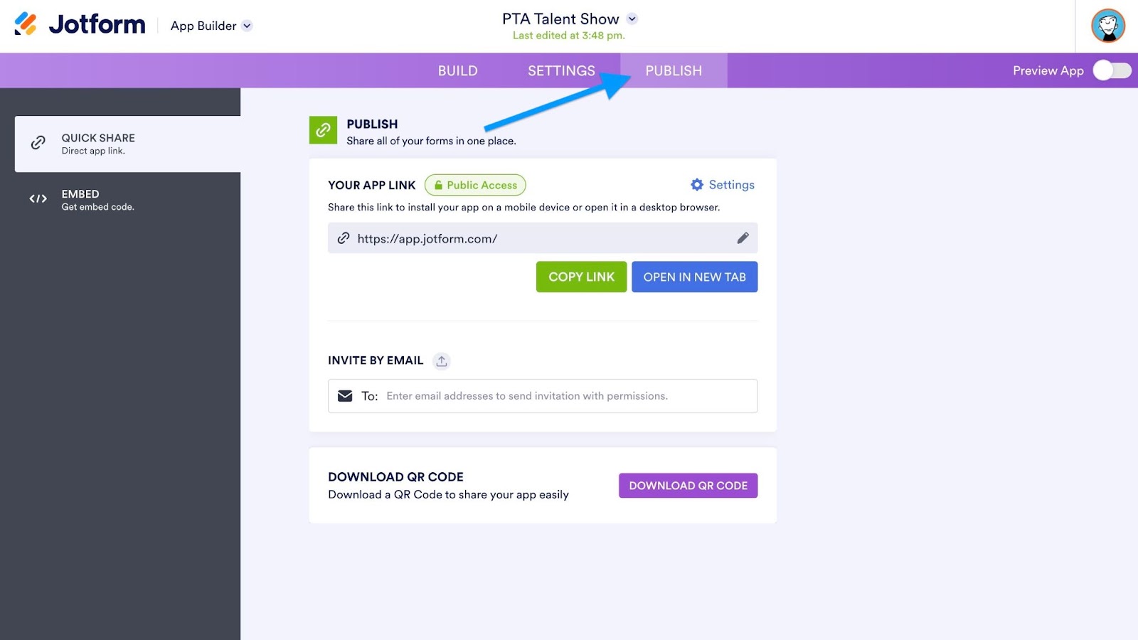
- In the App Builder, click the Publish tab.
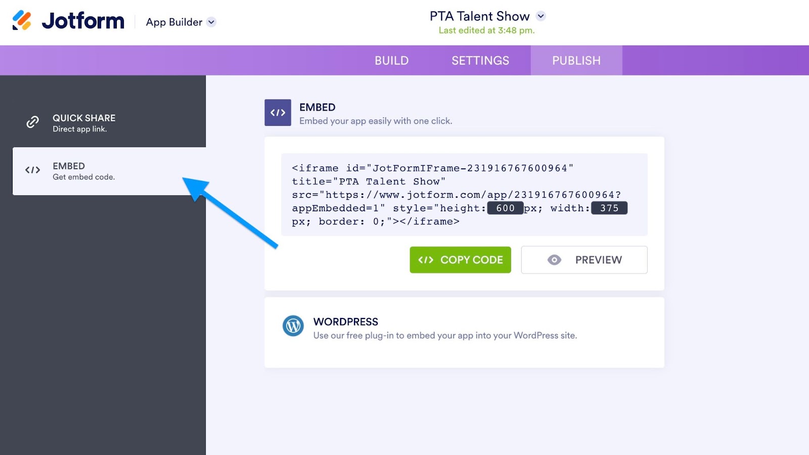
- Open the Embed tab.
- Customize the iFrame to your preferred height and width by changing the dimensions in the code.
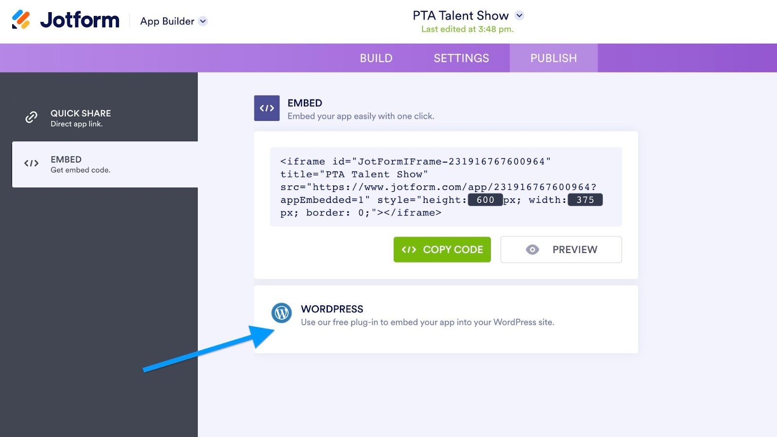
- Click Preview to see how the embedded app will look on your website. If you’re happy with it, click on the green Copy Code button to paste into your website.
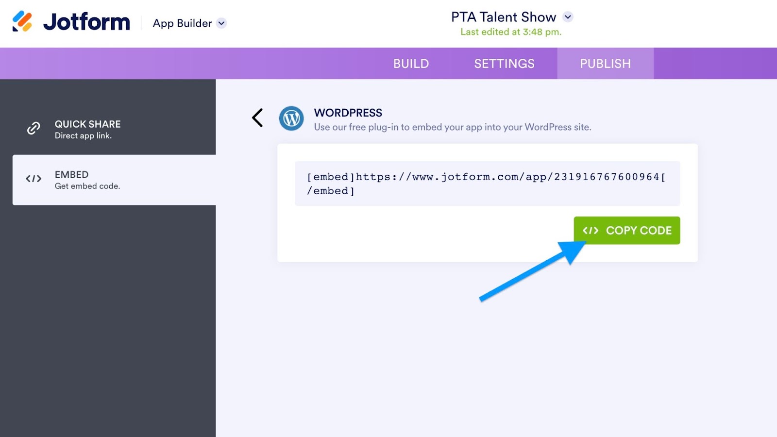
- If your website is hosted on WordPress, use the Jotform WordPress plug-in to copy your WordPress embed code.
- Click on the Copy Code button, then paste it into your website.
Creating a donation page with Jotform is as easy as that.


Send Comment: