As a nonprofit organization, donations often contribute a large part to the resources that are needed to keep you up and running. Therefore, you should put in some meaningful time and thought into how you make a “Donate” button for your website. The goal of a great Donate button should be to capture someone’s attention right away and be easy to locate, but without detracting from the main point of your website — showcasing your cause and why it deserves attention.
Here are some great examples of nonprofit organizations who made sure their Donate buttons work for them.
Acumen
Started over 15 years ago, Acumen has aimed to combat poverty by investing in companies and strategies that are taking on the fight in the roughest parts of the world. On their website, they greet visitors with bold photography showing some of the people most affected by poverty. It gives their cause a face. Their Donate button overlaps the opening image, but not intrusively.
It stands apart from the main navigation so that visitors can quickly and easily locate it. As you scroll down the page, the Donate button actually relocates to the far end of the navigation menu. While now part of the menu, it still maintains a differently colored background to distinguish itself. Acumen does a great job of highlighting their Donate button as soon as a donor visits the site, and making sure it’s visible, but doesn’t cover up any of the information.
Invisible Children
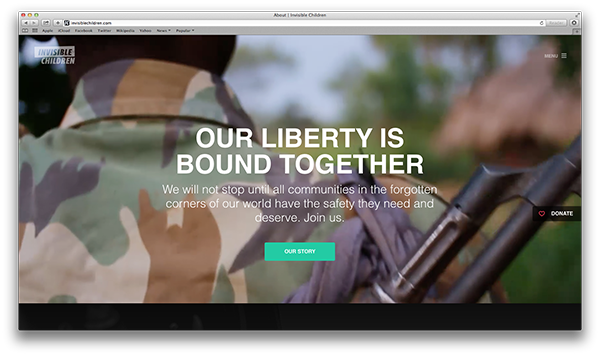
Invisible Children takes a similar approach as Acumen. Their Donate button is not designed as part of the main navigation menu. Instead, it stays attached to the right side of the window, hovering in the middle even as you scroll up and down. Invisible Children aims to end child trafficking in areas of the world where they are kidnapped to become child soldiers. And because their cause can best be explained through pictures and video, a lot of the content on the homepage contains moving imagery. The Donate button takes this into account well and never gets in the way, while staying visible constantly.
Sesame Workshop
Sesame Workshop is a nonprofit organization that produces the famous children’s show, Sesame Street. For their Donate button, they take the more traditional approach of incorporating into the top navigation menu. The key to Sesame Workshop’s Donate button is its design. Color and design choices are intentional and stay consistent with the nonprofit organization’s overall look and feel. Often, it’s easy to choose colors that are vibrant to capture a visitor’s attention, but it’s also important to match overall design of the website.
Amnesty International
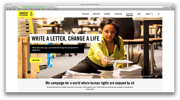
A global organization that fights on behalf of people whose human rights have been violated, Amnesty International is an enormous organization that requires tons of funding to remain operational. With so many cases to represent worldwide, it’s no wonder that donations are a vital part of Amnesty’s efforts. On their website, their Donate button instantly conveys urgency by asking contributors to “DONATE NOW.” The button is highlighted by a bold underline that draws your eye to it, but keeps the font the same as the other menu items.
Greenpeace
Greenpeace is an organization battling critical environmental problems to create a better world for all of us. While it may seem that they have enough on their plate, their website shows there was no lack of time put into the design of their Donate button. While also featuring a prominent button in the top, right corner of the page, Greenpeace takes it one step further and has an actual donation form right on their homepage. The form is limited to a few fields: just the dollar amount and an option to specify whether that’s a single or monthly donation, but the simplified design allows donors to make a choice even sooner about how much they’d like to donate, and then fill out the logistics on a separation donation form page. Good job, Greenpeace! If you’re looking to add a donation form to your nonprofit’s website, Jotform provides templates for donation forms that you can use immediately.
Have you tried different types of Donate buttons for your website? Let us know in the comments what you found to work well!


Send Comment:
1 Comments:
More than a year ago
Can you do m A look Back for me on my page and can you also do my year in review 2016 for me ok