Create Free Column Charts
Jotformレポートビルダーの、無料コラムチャートメーカーで、ローデータをプロフェッショナルなチャートに変換しましょう。直感的なオンラインフォームを使ってデータを収集し、カスタマイズ可能なチャートから強力な洞察を得ましょう。今すぐチャートを作成しましょう!
テンプレート
Explore Column Chart Templates
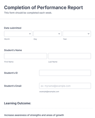
Student Perfomance Evaluation Form
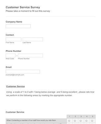
顧客満足度調査フォームテンプレート
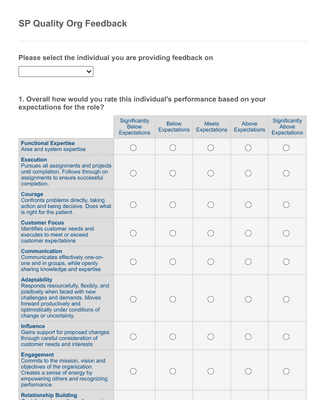
Quality Org Employee Feedback Form
メリット
Instantly Create Column Charts
Effortless data visualization
Jotformのレポートビルダーを使えば、オンラインフォームの回答を魅力的なコラムチャートに簡単に変換することができます。複雑なコーディングや、デザインのスキルは必要ありません。見たい送信データを選択するだけで、コラムチャートツールが自動的にプロフェッショナルなチャートを作成し、新しい送信ごとに更新されます。
Build informative visuals
Translate complex data in a clear and concise manner by converting your form responses into column charts. Impress your audience with professional visuals that tell the full story of your form submissions and bring your data to life.
Spot trends and insights
With column charts, you can identify trends and gain valuable insights from your form responses in seconds. The visual representation lets you quickly spot patterns, compare values, and make data-driven decisions with ease to build a better business.
Easily customizable
Jotform’s column chart maker allows you to customize your charts to fit your specific needs and branding in just minutes. Adjust colors, labels, and columns to create charts that align perfectly with your presentation or report style. The best part? No coding required!
Seamless integration with forms
コラムチャートのデータ収集にJotformを使えば、データ収集プロセスの効率化とチャート作成の自動化の両方を実現できます。チャートはフォーム投稿ごとに自動的に更新されるため、常に最新の状態に保たれます。
お客様の声
Jotformに関するユーザーの声
よくあるご質問
Jotformに関するご質問にお答えします。よくあるご質問はFAQをご覧ください。またはサポートチームまでお問い合わせください。
How do I create a custom column chart?
With Jotform, creating a custom column chart has never been easier! Simply open Report Builder and click + New Report. You can select an existing form to pull data from, import data, or opt to use a sample report. Your data will then be converted into a report. Simply click on the gear icon next to any set of responses and select Column under Chart type. Your data will then populate as a handy column chart, and you can customize it to your liking from there! When you’re done, your report is ready to download, print, or share in seconds.
Is Jotform’s column chart maker free?
Yes, Jotform’s column chart maker is completely free to use and always will be.
However, Jotform’s free Starter plan only allows for 100 monthly form submissions. You can access higher submission limits with a paid Bronze, Silver, or Gold plan.
Can I spot trends and patterns in my data using the column charts?
Yes. In fact, this is one of the main perks of using a column chart to visualize your data! Column charts allow you to create side-by-side visual comparisons of form responses to quickly contrast their values. This makes it easy to identify high-level patterns and trends within your data.
Column charts are also a great option for presenting your data to an audience because they let you demonstrate these trends with ease.
What are column charts used for?
Column charts are used to display and compare the values of multiple categories or groups of data. They are particularly handy for illustrating trends, patterns, and relationships between multiple categories of data, and they’re perfect for data presentation and interpretation, categorical analysis, and much more!