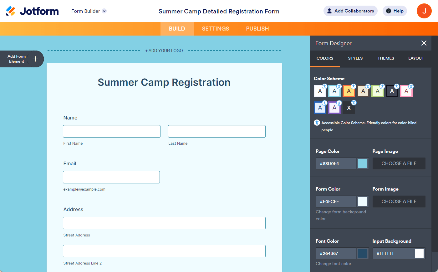
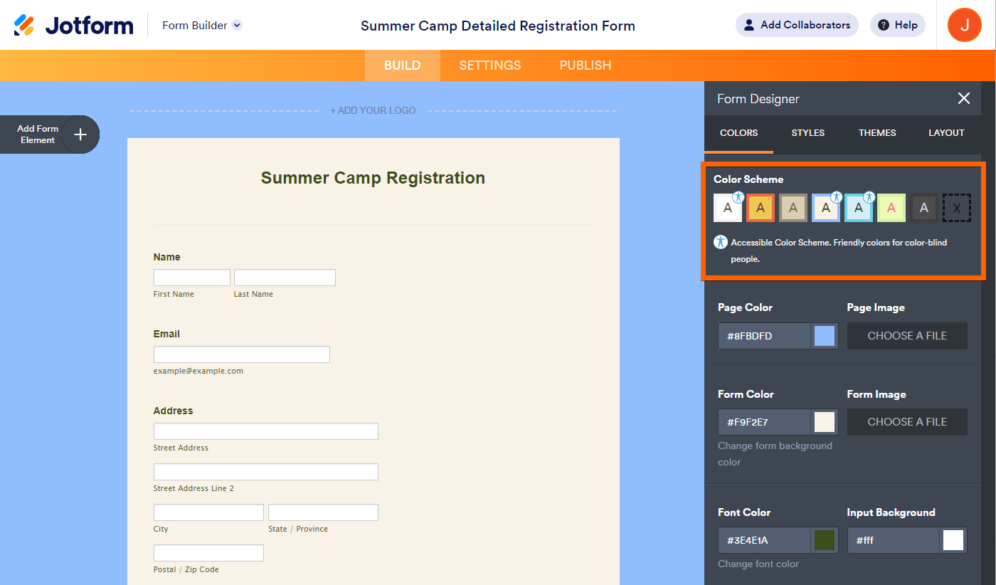
With Jotform Builder, we make it easy to create accessible forms. One important aspect of accessible forms is contrast and color use. Fortunately, we offer ready-to-use, accessible color schemes and themes.
When the Form Accessibility option is enabled in your form settings, the accessible color schemes are marked with a small human body icon in the form designer, making it easy to apply them. The Form Builder provides pre-made accessible color schemes for Classic Forms and accessible themes for Card Forms.
Classic Forms
For Classic Forms, we have the new default theme, where all color schemes are made to be accessible. Here’s an example of one of the color schemes:
Here are demo forms you can check:
- https://www.jotform.com/223270904812451
- https://www.jotform.com/223270636812453
- https://www.jotform.com/223271125129448
- https://www.jotform.com/223270640683454
- https://www.jotform.com/223270884805460
- https://www.jotform.com/223270390291451
- https://www.jotform.com/223270579322455
- https://www.jotform.com/223270936173456
For the old default theme, you can only choose from three accessible color schemes. Below is an example:
Card Forms
For Card Forms, you can only select from four accessible themes. Here’s an example:
Here is the complete list of accessible card form themes:
- https://www.jotform.com/223268241261450
- https://www.jotform.com/223271023863450
- https://www.jotform.com/223271043278452
- https://www.jotform.com/223270644745457
Please remember that you can change the colors according to your preference. However, if contrast and color use issues arise, you will see an accessibility warning in the editor.


Send Comment:
1 Comments:
More than a year ago
I'd just like to know what the parameters are so that I can create a custom color palette that works.
I wish I knew what was wrong with mine.
Some kind of general guide on how to make accessible color schemes would be good, because I'm not see the pattern from these examples.