All forms created in Jotform have two built-in features that most of you may be familiar with; the highlight effect and the error state.
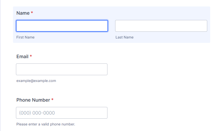
You can disable these two or customize both to enhance their look in the form.
Notes
- If you’re using the old default theme, kind reach us through our support center.
- A visual warning/error state is a staple of form validation and something that shouldn’t be disabled. Users need all the help they can get to be informed if they missed a field or incorrectly filled out one. Without a proper error or a warning to visually notify them what’s wrong, confusion will likely happen, leading to a low form completion rate.

How to Disable the Highlight Effect?
To disable the Highligh effect
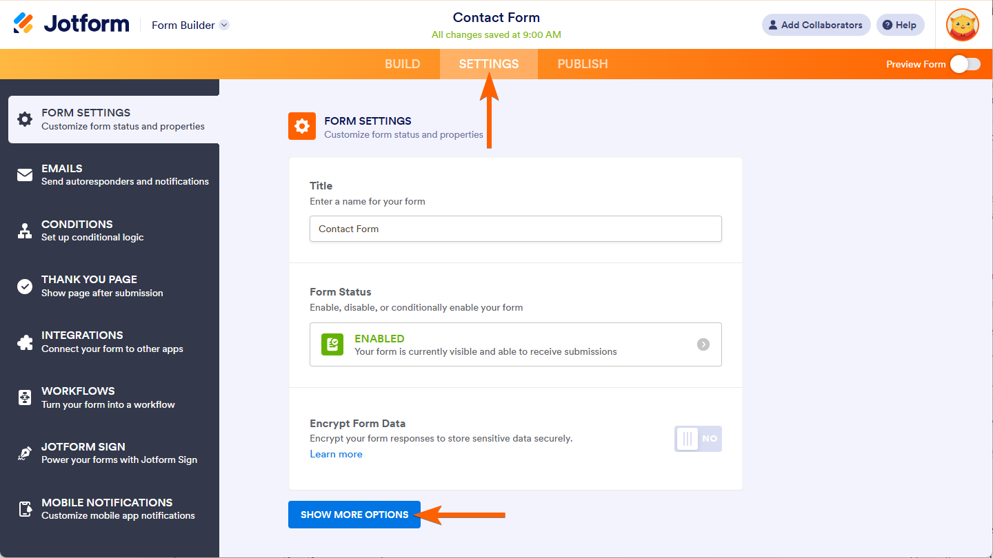
- In the Form Builder, go to the Settings tab.
- Click the Show More Options button.
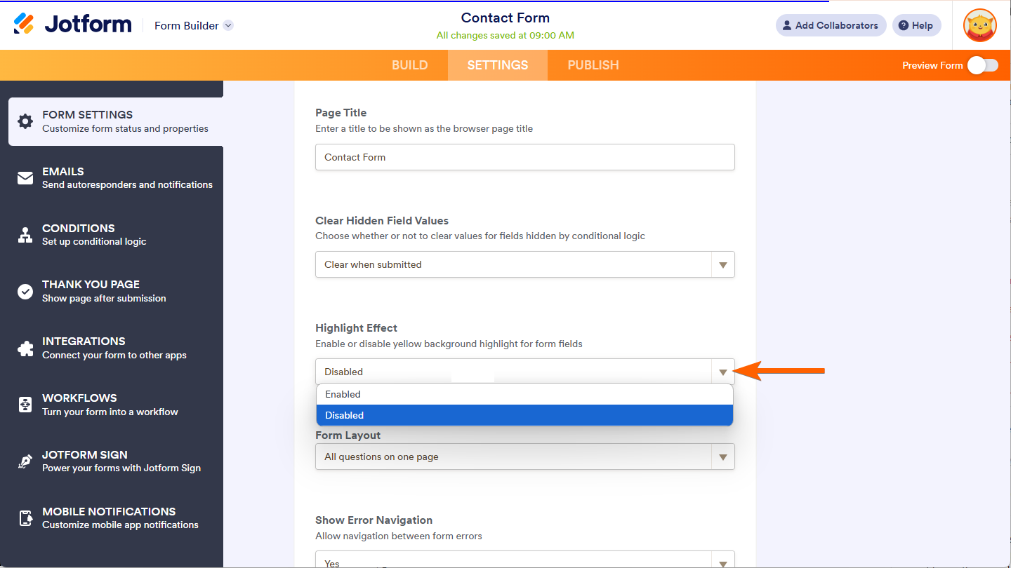
- Scroll down and find the Highlight Effect option.
- Click on Dropdown selection and set it as Disabled.
How to Remove the Error State Messages?
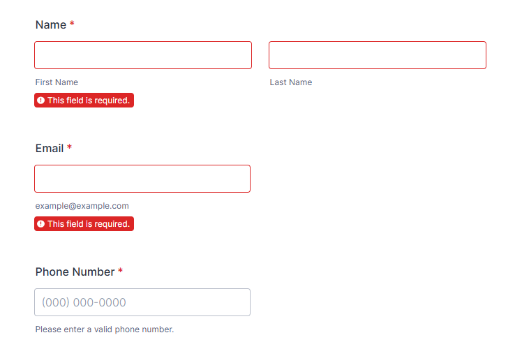
If you prefer to disable them, you should at least leave a simple or subtle hint that a field needs the user’s attention if it throws an error. And for this, we would need to inject some custom CSS code to disable the form’s error states.
.form-error-message {
display: none;
}
.form-validation-error {
box-shadow: none !important;
}
.form-line-error {
background: none;
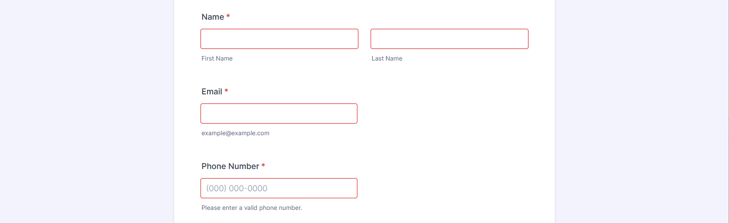
}The code above will remove the error state message and leave a simple red border on the field with the error. See the below image as an example:
How to Customize the Highlight Effect?
You can customize the highlight effect through the Advanced Designer. You can also customize it with custom CSS codes, and if you prefer this method, contact us through our support center for help.
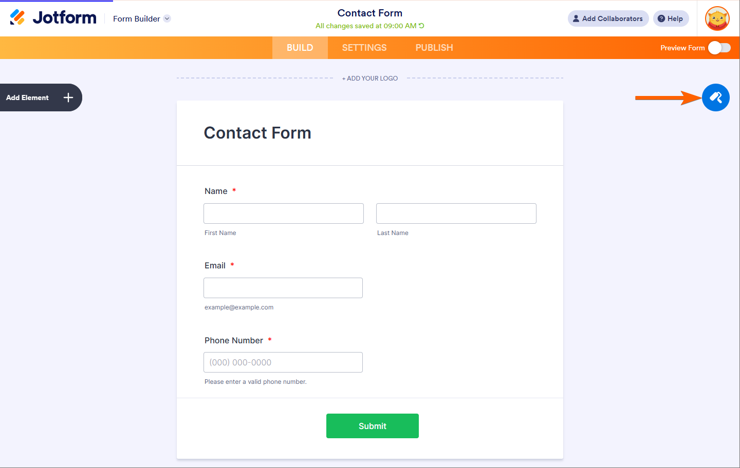
- In the Form Builder, click the Form Designer (paint roller icon) on the right side of the page.
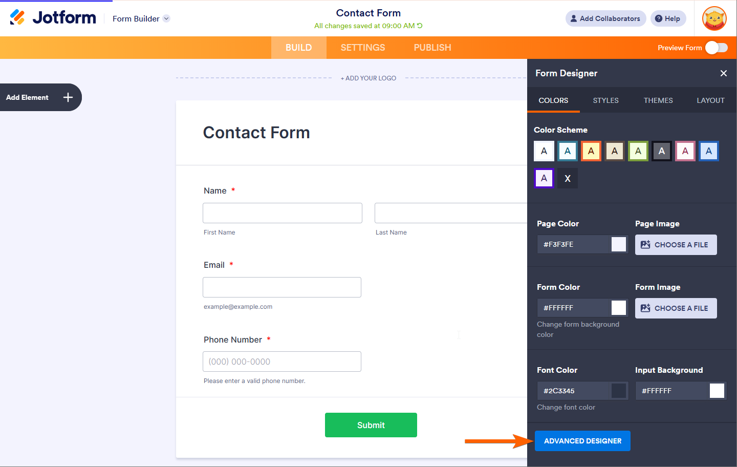
- Click the Advanced Designer button at the bottom part to load your form into the Advanced Designer page.
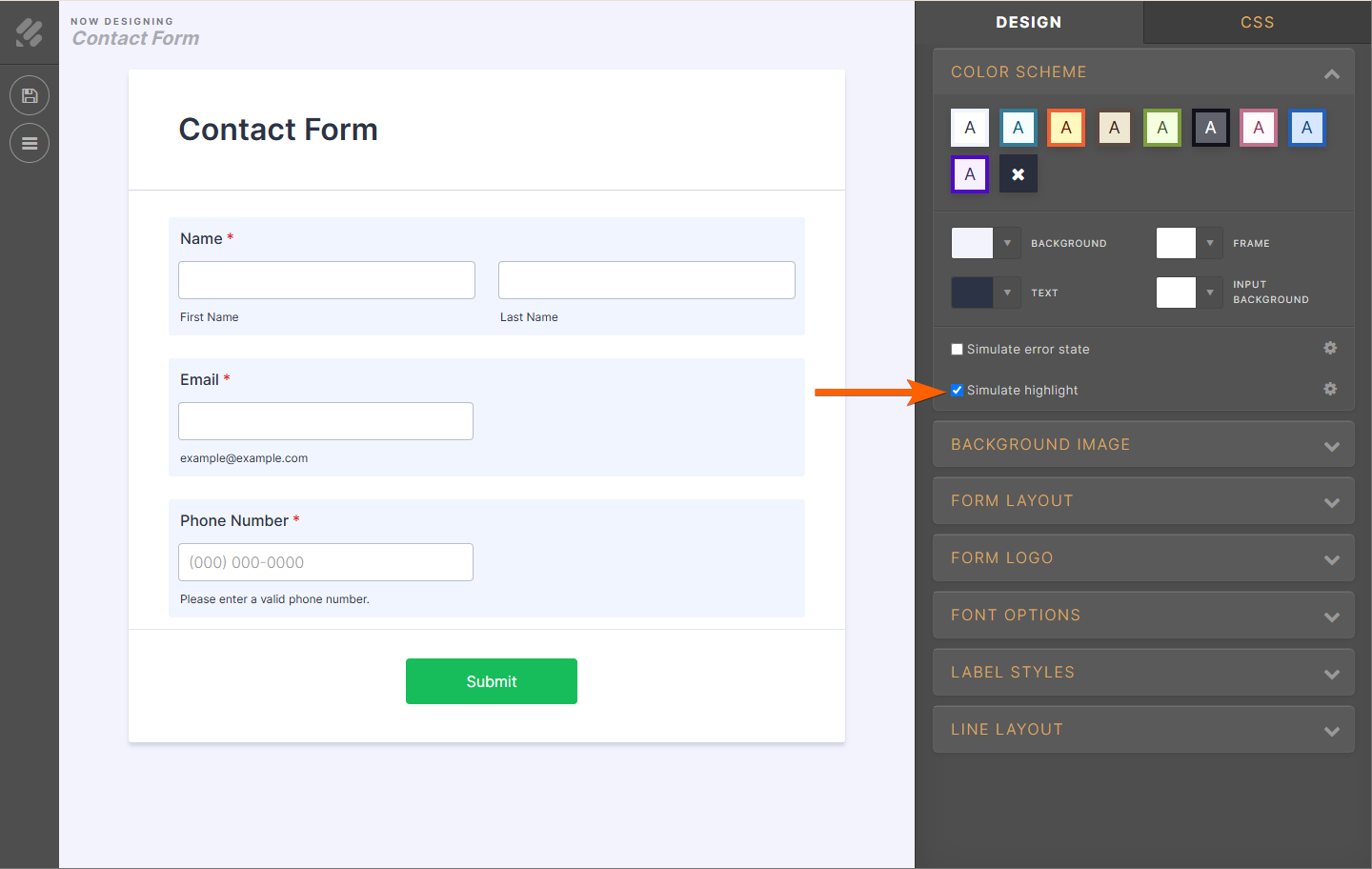
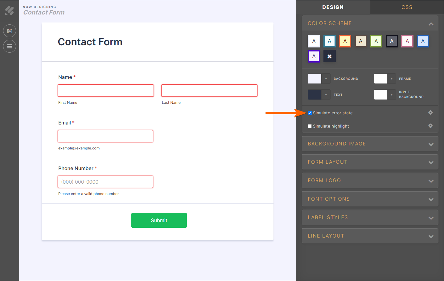
- Under the Color Scheme section of the Advanced Designer, tick the Simulate Highlight option.
- Click the corresponding gear icon to its right to see your customization options.
- Lastly, don’t forget to click the Save button on the top-left side of the advanced designer to save your changes.
How to Customize the Error States?
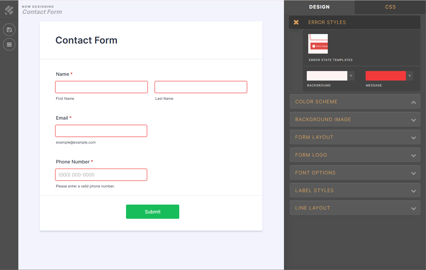
You have to follow the same steps above, but this time, tick the Simulate Error State checkbox.
When you click the gear icon right beside the Simulate Error Checkbox, you’ll be redirected to choose from four of our error state templates. After selecting your preferred style, please don’t forget to click the Save button to save your changes.
You can view our demo form here.

Send Comment:
1 Comments:
More than a year ago
Error message consistently shows up on form.
Would really like confirmation on gettin rid of it