Top 5 welcome email examples
The customer welcome email is your first touchpoint with a customer after they’ve purchased your product or service. A welcome email is also a powerful communication strategy, yielding four times more opens and five times more clicks than a standard marketing email, so it’s vital to get the details right.
The welcome email has two key goals: to thank the customer for their purchase and to tell them what to do next. With a clear call to action, you can guide your customers to the next step, which is likely to begin the onboarding process by completing their profile, logging into the product, or reading a training guide.
While it contains a lot of useful information, a welcome email is typically short, clear, and full of personality and excitement. After all, the customer has purchased your product — and that’s something to celebrate.
A word of advice: Send a welcome email as soon as possible after the customer buys your product. “You risk your customer’s enthusiasm for your service with every passing day you leave things quiet. Communicate while the customer is open, interested, and keen to get started,” says Devin Schumacher, founder at SERP Co, a digital marketing agency.
Here are five successful welcome email examples from leading organizations that you can use to write your own welcome email.
5 successful welcome email examples
1. Asana
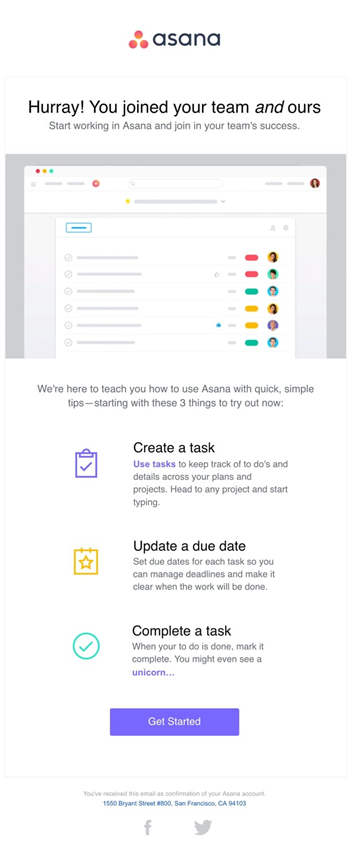
Asana begins its welcome email by celebrating the action the customer has just taken: signing up for Asana. The email contains very little text — but it’s incredibly helpful and designed to support the customer in optimizing their time to value, a key customer onboarding metric.
The welcome email focuses on tasks, which is Asana’s key value proposition. It provides the customer with three tips they can implement right away. These tips are also likely the most common tasks that customers need to know to use Asana, so the email sets them up for success from the beginning.
2. Squarespace
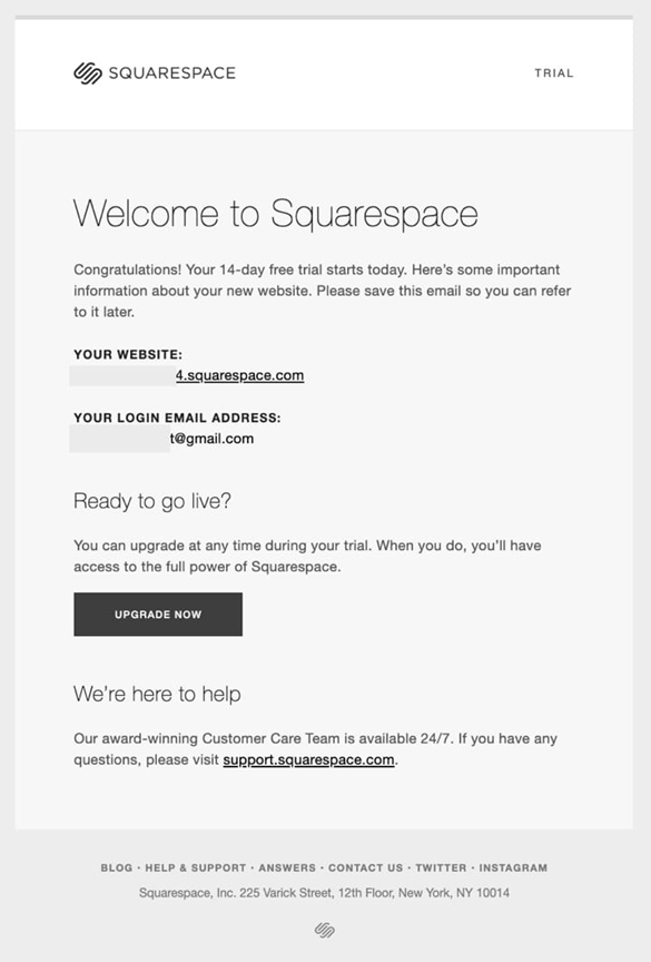
The Squarespace welcome email provides the customer with critical information: their login details. Because customers can start with Squarespace as a free trial, the welcome email also lets them immediately upgrade to a paid account. The CTA button to upgrade is prominent and clear so the customer doesn’t miss that opportunity.
Finally, this welcome email also gives customers a direct link to a support page. Clicking this link takes them to help documentation, such as videos, walkthroughs, guides, community forums — everything a customer needs to learn how to use Squarespace.
3. Hootsuite
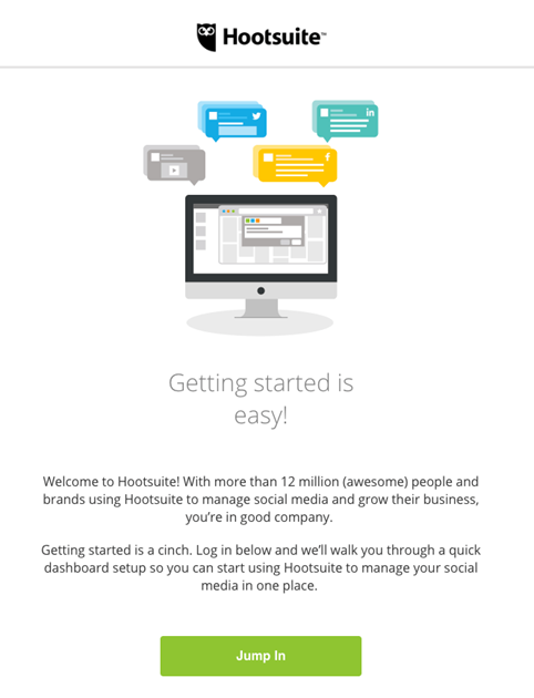
The Hootsuite welcome email begins by telling the customer they’re in good company with the more than 12 million other people who use Hootsuite. This is a great way to create a sense of belonging and reassure the customer about their decision to sign up for the service.
To encourage the customer to immediately start using Hootsuite, the welcome email then explains the next step: By clicking on the prominent CTA, they’ll go through a quick dashboard setup. This way, Hootsuite helps the customer reach time to value more quickly instead of letting them figure out the setup on their own.
4. Dakota Design Company
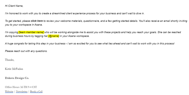
The Dakota Design Company welcome email delivers a helpful guide that includes everything a customer needs to get started. Katie McFarlan, CEO of Dakota Design Company, notes that the guide serves as a reference customers can go back to anytime during their engagement.
By including the new point of contact in the welcome email, Dakota Design Company makes sure customers know who to talk to if they have questions or feel overwhelmed at any point in the process.
5. Campaign Monitor
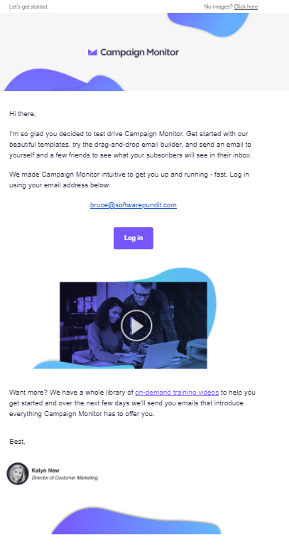
Bruce Hogan, CEO of SoftwarePundit, notes that the Campaign Monitor welcome email is effective because it sets expectations for future communications with the customer. This email is short, but it’s packed with important information. The first paragraph tells the customer about different activities they can try on the platform, and the second explains exactly how to log in.
The welcome email also links the customer to an entire library of training videos, so they can browse the different topics and find the information they need right away. Campaign Monitor then tells them to expect more information over the next few days. This is a good way to keep from overwhelming the customer at the beginning of the process.
Streamline customer communication with Jotform Gmail Agent
The welcome email is a crucial first step in your customer’s journey, setting the tone for their experience with your brand. With Jotform’s Gmail Agent, you can automate your welcome emails to be sent instantly, ensuring timely and consistent communication with every new customer. By drafting personalized replies based on past interactions, FAQs, and your brand’s tone, the Gmail Agent helps you maintain a high level of professionalism and efficiency from the very start. This automation frees your team from manually crafting each email, allowing them to focus on other important tasks while ensuring your customers receive a welcoming and informative message right after their purchase.
The welcome email is one of the most important parts of the customer onboarding process. Along with using these welcome email examples as a guide, don’t forget to follow best practices by sending the email right away and including valuable information to successfully get the customer started with your product.



Send Comment: