As COVID-19 descended on the United States in 2020, health authorities and businesses developed a number of tools and techniques to help minimize its spread. From social distancing to temperature checks, they tried to develop simple processes that prevented coronavirus from spreading from person to person.
One widely adopted tool for fighting the spread of COVID-19 was symptom screening forms. These forms allow event participants and school staff and students to certify that they don’t have symptoms of coronavirus like a fever, cough, or difficulty breathing.
At Jotform, we help people create online forms that can be used for anything, including COVID-19 screening forms. In fact, over 6 million people submitted one of our COVID-19 screening forms during the pandemic. In this article, we’re analyzing how prevalent these screening forms were by location and whether or not they correlated with cases of coronavirus.
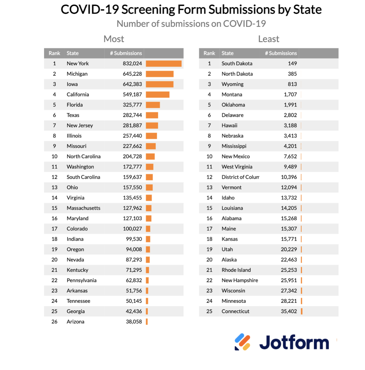
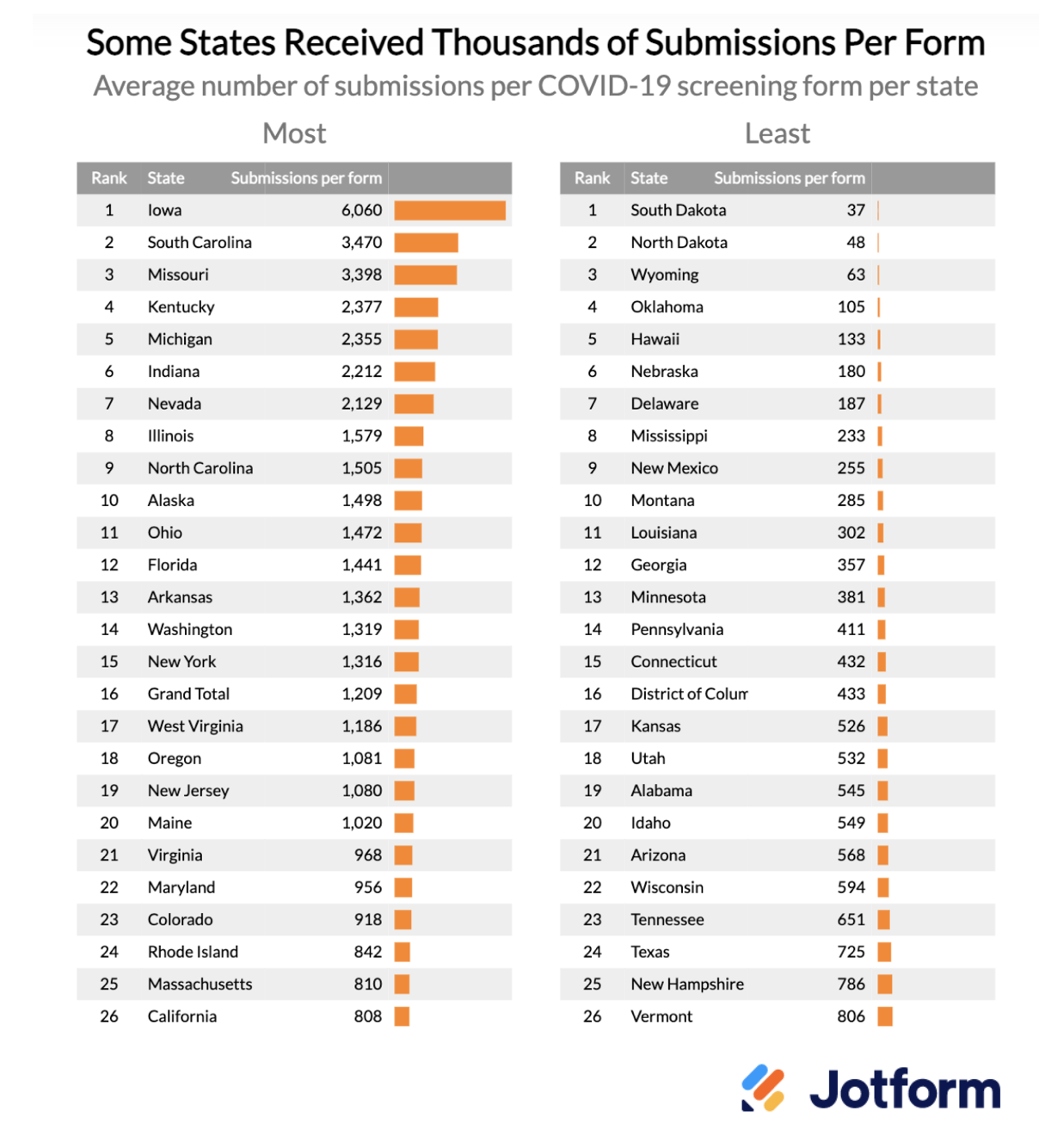
The state with the most COVID-19 screening submissions was New York. More than 800,000 people in New York submitted a COVID-19 screening form, followed by Michigan and Iowa. Iowa had the highest number of submissions per form created, with an average of over 6,000 responses per form.
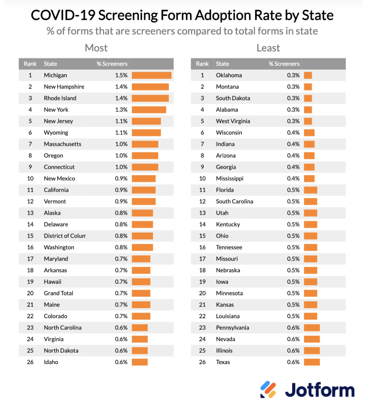
To measure the adoption of COVID-19 screening forms while adjusting for the size of the state, we looked at the percentage of active COVID-19 screening forms in each state. Michigan, New Hampshire, and Rhode Island had the highest adoption rates of screening forms, while Oklahoma, Montana, and South Dakota had the lowest.
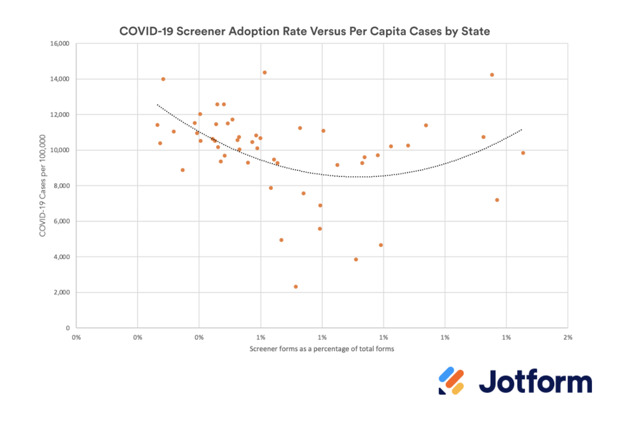
There wasn’t a straightforward correlation between screening form adoption rates and COVID rates — at the extremes, states with very high and very low rates of COVID used forms most often and states with medium levels of COVID rates were least likely to use forms.
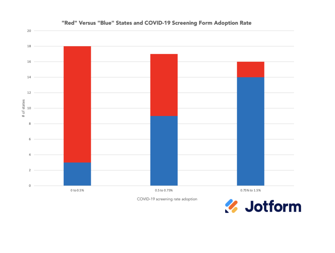
However, one notable pattern was that almost all states that adopted COVID-19 screening forms were “blue” states, which means they voted Democratic in the 2020 presidential election, and almost all of the states that had very low levels of COVID-19 screening form adoption were “red” states, which voted Republican.
Pro Tip
Conduct COVID-19 screenings and collect healthcare data securely with HIPAA-friendly online forms.
Data and methodology
Before diving into the results, let’s spend a moment reviewing the data and methodology of the study. From May 2020 (the formal declaration of the start of the COVID-19 pandemic) to May 2021, we analyzed active U.S.-based forms and submissions to calculate what percentage of them were COVID-19 screening forms. We then cross-referenced that data with the COVID-19 per capita infection rate data and the partisan voting data from the last presidential election.
There were more than 6.1 million submissions to COVID-19 screening forms during the pandemic, which made up 7.2 percent of all submissions in the United States during the period. The chart below shows the number of COVID-19 screening form submissions by state:
New York state leads the pack with over 800,000 COVID-19 screening forms submitted, followed by Michigan, Iowa, and California, each of which had over 500,000 submissions. In general, you would expect larger states like New York and California to have lots of submissions, but smaller states like Iowa also make the list, indicating that other factors were at play.
Next, let’s look at the average number of coronavirus screening responses per active form (forms with at least one response). The following chart shows the average number of responses per form by state:
By a considerable margin, Iowa has the most submissions per COVID-19 screening form, with 6,000-plus on average. Due to the anonymized nature of the data set, we don’t know the driving factor behind the high usage of forms in the state, but we can surmise that it was for a large-scale event (like a vaccination drive) or a frequent event where the same form was used on a daily basis (like a health screening form for attending school each day).
In most states, the typical form got a tremendous amount of responses with, on average, hundreds or thousands of responses.
As mentioned before, you would expect larger states to have more responses by virtue of having more inhabitants. But after controlling for the size of a state, which places in the United States adopted COVID-19 screening forms and which ones did not?
The rest of the analysis looks at the percentage of submissions per state that were for COVID-19 screening forms versus all submissions in that state during the same period. Put another way, what was the adoption rate of coronavirus screenings after adjusting for overall usage of Jotform in each state?
The chart below shows the COVID-19 screening form adoption rate by state, ranked from highest to lowest:
The state with the highest adoption of COVID-19 screening is Michigan, where 1.5 percent of Jotform submissions during the pandemic were for coronavirus screenings. Michigan, a state with significant COVID-19 outbreaks, had five times the adoption rate of Oklahoma, a state that ranked last for COVID-19 screening adoption but also had one of the highest rates per capita of COVID-19 infections. In fact, many of the states with the highest rates of infection also had the lowest adoption of COVID-19 screening forms.
Is there any relationship between the rate of COVID-19 screening adoption and the per capita case rate in a given state? For example, is there a high adoption of screeners in states with a lot of COVID-19 spreading or very little, or is there no relationship at all? The following chart plots each state based on screening adoption and COVID-19 per capita rates.
There is no clear correlation between a state’s level of COVID-19 screening form adoption and coronavirus prevalence. In fact, there appear to be clusters of very high coronavirus prevalence and low usage of screening forms as well as areas with high rates of coronavirus and high usage of screening forms to combat the pandemic.
What else could be going on related to the adoption of COVID-19 screening forms? One potential answer is politics. The chart below segments the states into three buckets, those with low, medium, and high levels of COVID-19 screening form adoption. For each bucket, states are split into “blue” (voted Democratic in the 2020 presidential election) versus “red” (voted Republican).
The vast majority of states that adopted COVID-19 screening forms at high levels were blue, while the vast majority that did not were red states. Those with middling levels of screenings were split between blue and red.
As the coronavirus unfolded over the last year and a half, ordinary citizens had to improvise in order to help control the spread. From social distancing to cloth masks, to using online forms to screen for coronavirus symptoms, we’ve used the tools at our disposal to help society function in the midst of a pandemic. While health screening forms were a rare use case for online forms before the pandemic, we’re proud that millions of people used Jotform for this reason.




Send Comment: