The year was 2019. And a popular presidential candidate had just fired a shot across the bow to all of us who work in the online form industry.
See the video below. Trigger warning.
Now, of course, Senator Sanders wasn’t referring to lead forms when he said that. He was merely condemning overly bureaucratic government forms that citizens are forced to complete. But still, isn’t there a nugget of truth that applies to the forms we use to grow our business?
That’s why we’re bringing you 5 tips to improve your lead capture forms so that people will not only fill them out, but won’t hate doing it.
1. Treat your form like a conversation
We treat a lead form like a conversation because it is a conversation. Oftentimes this is the first conversation we have with prospective customers.
So what does that mean?
It means making sure there’s a headline on the form that makes sense, using the introduction space to set expectations for the rest of the form, and adding sublabels when necessary for clarity.
It also means customizing your CTA so that it isn’t the standard “Submit.”
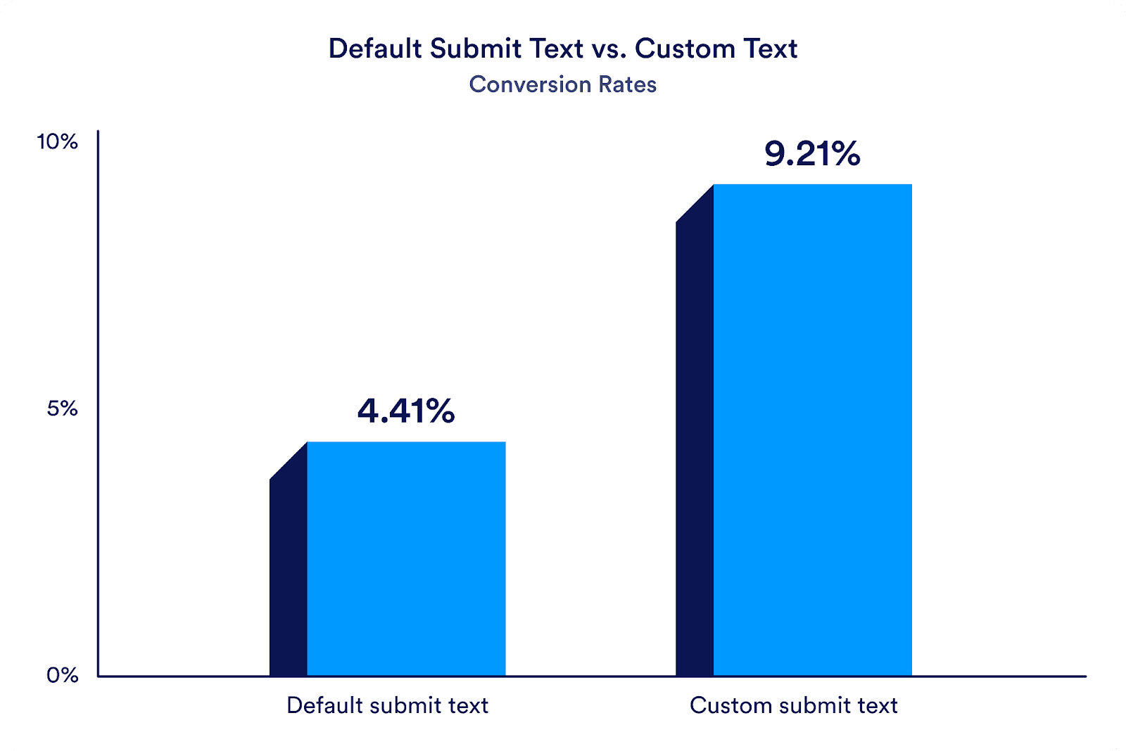
Among Jotform forms that are used to collect leads, those with default “Submit” text convert at a rate of 4.41 percent on average, while the conversion rate more than doubles on lead forms using custom CTA text.
I’m not suggesting that simply modifying the text will double your conversion rate. A Jotform user who takes the time to modify a CTA is probably making other form improvements along the way. But this is still a strong indication that you can be more specific with your CTAs. Consider action text like “Request more information,” “Connect with our team,” and “Grow your business.”
2. Find your zen in form simplicity
Each additional form field (or question) that you include on your form decreases the chance that it gets filled out. True story.
By how much?
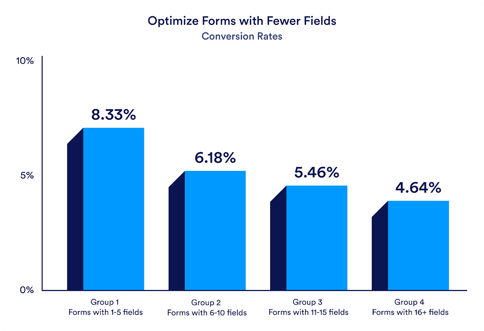
When we look at Jotform lead forms grouped by those with 1–5 fields, 6–10 fields, 11–15 fields, and more than 15 fields, the data paints a clear picture.
Lead forms with 1–5 fields converted at 8.33 percent on average. The conversion rate is nearly half that for lead forms with more than 15 fields.
This means before you even start creating a form, you need to ask yourself a fundamental question: What is the information that your business absolutely needs from a lead, and what’s the information that it would simply like to have?
Of course we all want as much information as possible from prospective customers, but at what cost?
3. Pay attention to design
No proper lead form should go unbranded. Good design builds trust, and isn’t that what we’re looking to do with our leads?
There are three simple improvements you can make to properly brand any form: adding a logo, modifying the color scheme to match your brand, and using a font family that matches what you use on your website. That’s all it takes.
This is especially important if you’re embedding your form into your website. You want people who interact with your form to see it as an extension of your site. A form that doesn’t match your site’s brand will create a disjointed and unprofessional experience for visitors.
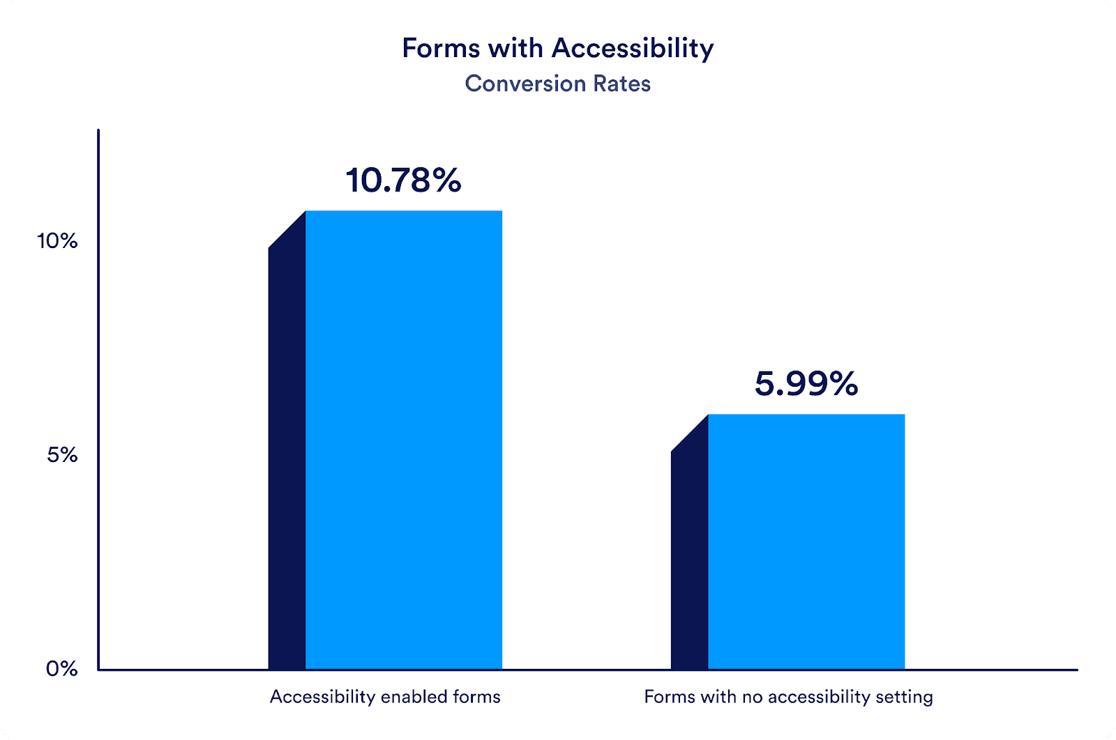
Properly designing a form also means designing for all audiences. Make sure your form is designed for
- Accessibility
- Mobile devices
- Multiple languages
Being mindful of each of these audience possibilities has been shown to increase conversions as well.
4. Automate
Forms are the perfect automation tool. A single form entry can automatically trigger dozens of actions behind the scenes.
For lead capture forms, this also means integrations. As soon as a lead sends their information through your form, it can instantly populate your preferred CRM, your email marketing service for continued lead nurturing, your project management board to kick of a series of tasks, a spreadsheet that can be shared with your entire company, or even Slack, where a discussion can take place about who’s best suited to help this particular lead.
But don’t forget about emails. Your forms can set in motion a number of automated emails, including notifications to multiple recipients, conditional emails that go to a certain party depending on what’s selected in a form, and approvals.
5. Express gratitude
Last, but not least, is the thank you page. Most people leave it as the default “Thank you. Your submission has been received.” Instead, try something more personal or helpful. You can use this space to direct people to your website, have them sign up for webinars, watch videos, or link out to your social channels.
Conclusion
By implementing these tips, you can transform your lead capture forms into valuable assets that not only yield better results but also enhance the overall experience for your potential customers. None of these tips requires much additional effort, only your attention.
Did we miss any tips? Is there anything you’re doing that’s working really well for your lead forms? Let us know in the comments.
This blog post is based on a talk we gave at Dreamforce by the same name. Check out the presentation slides here.


Send Comment:
1 Comments:
More than a year ago
Nice sun up, thanks Chad. Can you clarify what you mean by Accessibility Enabled Forms?