Over the years, Adobe Illustrator has become one of the top applications for creating vector illustrations. There is almost nothing you can’t make in Illustrator. It is a powerful tool for creating vectors for all kind of logos, websites, icons, business cards, print materials, etc. One of the best features of the vector format is its ability to scale up or down to any size without any loss in quality (unlike raster illustrations).
But let’s not forget that Adobe Illustrator is complex software. Despite all of its advantages, Illustrator demands a lot of skill, work, time and patience. The software will not generate effects automatically; excellent effects are the result of trying and testing different settings. Trial and error is an effective method in achieving the desired result. Creating realistic vector illustrations in Adobe Illustrator can be fun, but it can also give you a headache if you can tell something’s missing from an illustration but don’t know how to get it.
Here is a list of things to consider when creating stunning vector illustrations:
- Perspective,
- Smooth lines,
- Colors,
- Edge highlights,
- Reflections,
- Shadows.
Stick To Perspective
When it comes to drawing realistic vector illustrations, perspective is paramount in importance. If you ignore perspective, the illustration will look flat and distorted and lack depth.
The most important aspects of perspective are size and distance. The farther away an object is, the smaller it will appear, and vice versa. By increasing and decreasing size in this way, you can achieve good depth in your illustrations.
There are a several methods of drawing perspective.
Perspective Grid
One very useful way is to use a perspective grid, which is a new feature in Illustrator CS5. Establishing a horizon and the vanishing point is part of this. The perspective grid in Illustrator is an editable tool, so it can be adapted to suit one’s purpose. You can change the perspective simply by dragging the corner nodes of the grid. You can make the vanishing point longer or shorter and change the number of boxes in the grid. Being able to adapt the working environment to your needs will make it easy for you to do advanced drawings.
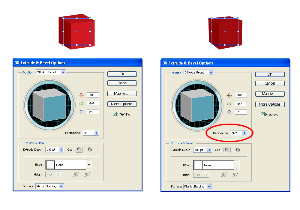
Extrude and Bevel
Some people have trouble seeing and presenting perspective in the first place. In this case, I would recommend “Extrude and Bevel,” which is a convenient tool for creating 3-D objects. You can set a value for “Perspective” in the “Extrude and Bevel” options box (either type in a value or drag the slider over). Expanding an object will make it editable. Because the Extrude and Bevel effect gives you an object with many parts and anchor points, it is highly recommended that you use that object as the reference for tracing with the Pen tool (P). This way, you’ll create clean and simple vector illustrations without any unwanted parts or any anchor points that are an obstacle in the printing process.
If you have imagination and some skill, you will be able to draw an illustration based on an estimation of perspective. Of course, this method is not quite precise.
But adding perspective alone is obviously not enough to create stunning artwork.
Using The Pen Tool For Smoother Lines
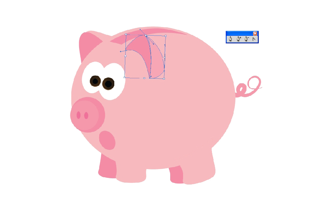
Creating shapes in Illustrator shouldn’t be complicated. To draw paths and curves, either use the Pen tool (P) or simply combine objects with Pathfinder features such as “Unite,” “Minus Front,” “Subtract,” “Intersect,” etc. Because the paths contain numerous anchor points, you will have to adjust them to create smooth lines. Anchor points are highly editable and can be adjusted with a few excellent tools. You can change the position of the path just by editing one anchor point. This takes a lot of practice; you’ll need a steady hand and patience.
Live tracing is one effective way to create vector illustrations. Try to complete a drawing with as few anchor points as possible; avoid adding anchor points at shorter intervals just to maintain the smoothness. To get smooth lines, make sure that the handle of the anchor point forms a tangent on the curve (i.e. inner or outer tangent). You can always add or remove anchor points by going to the “Add Anchor Point” (+) and “Delete Anchor Point” tools (-).
“Convert Anchor Point” (Shift + C) allows you to make changes on the anchor points themselves. With this amazing tool, you will be able to change the angle of the handle, thus enabling you to change the path of the lines. Whereas adjusting just one side of the handle will result in an angular shape.
Coloring
This part of the creative process is quite fun, but still demanding. Choosing the right colors can be a challenge. First, you have to determine what style you want. Gentle and pastel colors might work for retro illustrations, which would be rather simple and two-dimensional.
If you want to get photo-realistic, you might want more vivid colors. Good contrast can make the artwork stunning. If you don’t know how to mix and match colors, Adobe has a great website with color swatches and beautiful combinations.
There is also a swatch library in Adobe Illustrator, where you can find a lot of useful swatches and even create your own and save for future projects.
Gradients
When it comes to coloring, applying linear and radial gradients is the best way to show light sources and to give depth to your artwork. Establishing the position and angle of the light source is the first step in the coloring process. Shadows and highlights should be added according to the source of the light. Dark colors will simulate shadows and shade, while light colors will create highlights.
Besides creating shadows and highlights, gradients are the great way to simulate shape. Using color, you can give volume to an object or character. Use as many colors as you’d like to build a gradient, but just blend them well; otherwise, you’ll end up with harsh color transitions. If you tend to blend colors effectively, then try out the different “Blending Modes,” such as “Multiply,” “Overlay,” “Screen” and “Light.”
Linear gradients are mostly used to present a plane. Radial gradients are suited to ovals and round shapes.
Transitions between colors in gradients can be smooth or sharp. Smooth transitions are convenient for representing shade, shapes and forms. Sharp transitions are good for simulating gold, steel, chrome and other metals (i.e. for representing the reflection of light on these metals).
Gradient Mesh Tool
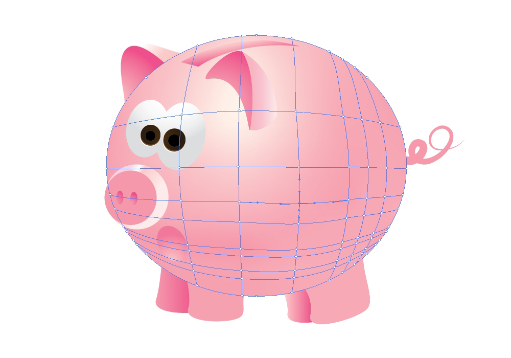
Because gradients are limited to linear and radial shapes, we sometimes have to find ways to use gradients in unconventional ways. Creating a gradient for an irregular shape is complex, because it involves blending colors between uneven forms with the use of linear and radial gradients. This can be a lot of work, but the Gradient Mesh tool is handy for this purpose.
The Gradient Mesh tool is a powerful tool that enables you to split up any part of an object by adding editable points and applying solid colors to those points. This way, you are able to create a gradient that follows the actual shape of the illustration.
While gradients make illustrations more realistic, there is always room for improvement. A great illustration is made up of many well-integrated details. Mixing and matching colors and shapes is not easy, but it does lead to a beautiful result.
Highlighting The Edges
When you are done with the gradients, your illustration should be ready for some nice edges. There are a few ways to create them. If your illustration has straight edges, the best way to highlight them is with the Pen tool (P). This enables you to create simple shapes that can be blended (via gradients) with the rest of the illustration. Or you can create a sharp white edge and turn it into the reflection using a low-opacity setting. Either way, you will be emphasizing the shape of the object.
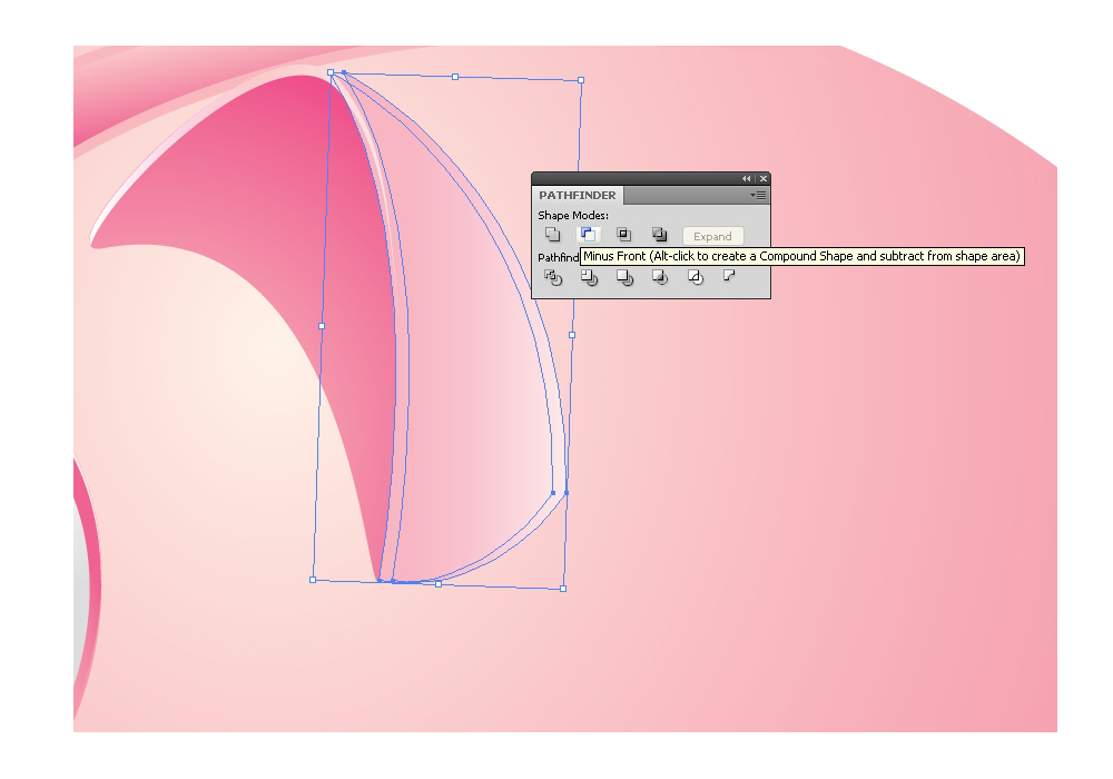
Creating a highlight for curves is not much different. The most important thing is to make the shape of the highlight follow the shape of the object. The Pathfinder panel has a lot of features for creating curved highlights; doing it with the Pen tool alone would be tricky.
Reflections
Besides edge highlights and shade, light sources can create many reflections and shadows. Take a good look around you and you’ll see all kinds of reflections: on glass, plastic, wood, metal, clay, even in liquid. Reflections come in various forms. The most important thing, again, is to follow the shape of the object. For those skilled with the Pen tool, curved highlights shouldn’t be a problem. If you are unsure how to draw highlights with the Pen tool, try combining different shapes in the Pathfinder panel.
Even though the most common color for reflections is white, with reduced opacity, try out different color combinations.
Highlights are useful for showing off the material of an object. With a careful color combination and reflections in the right places, you can simulate the look of a surface quite well. The result is a nice illustration with a glossy surface.
The Final Touch: Shadows
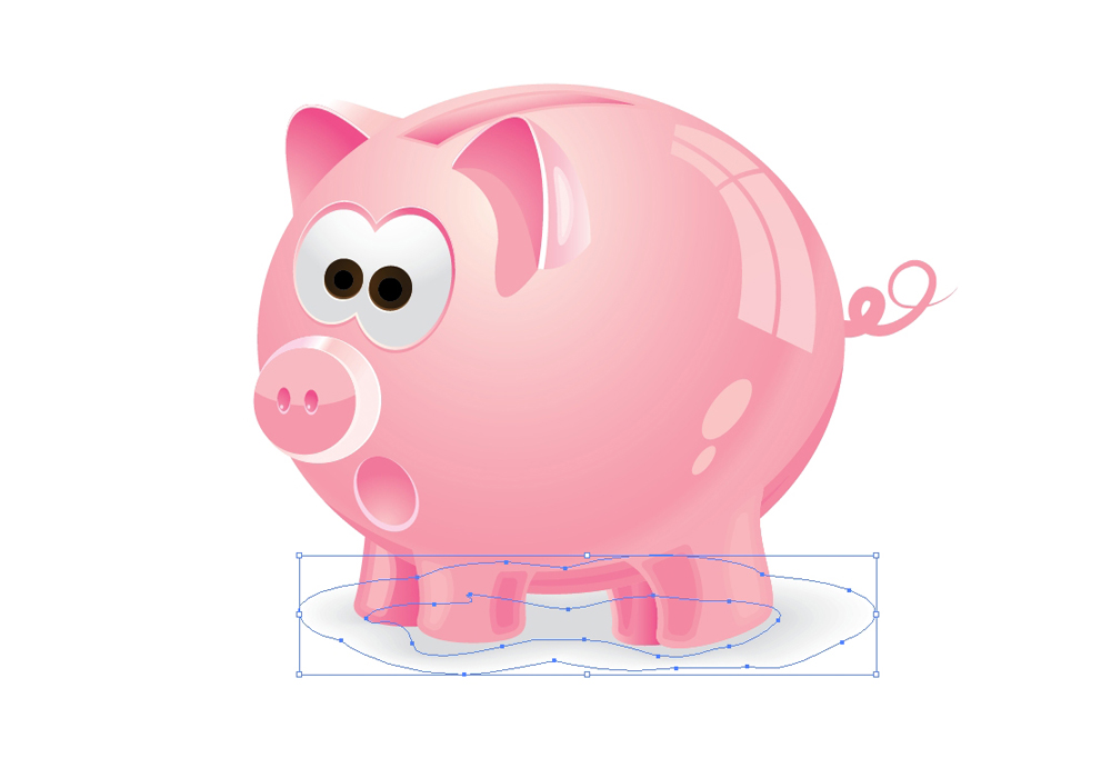
The main purpose of a shadow is to create an illusion of three-dimensionality. Without shadows, the illustration is not really complete. The shadow “defines” the illustration in a way. Like reflections, shadows are created by the influence of light sources. The intensity or softness of the shadow depends on the distance between the object and the light source. A light source above an object will cover almost the entire object. Uncovered parts of the object will cast shadows on surfaces below and on objects nearby.
You can create a shadow with a solid color (for a sharp shadow) or with a linear or radial gradient (for a soft shadow).
If your object is complex, the best way to create a shadow that follows the entire shape of the object is to use the Blending tool.
There is one rule about the Blending tool, and that is to create two objects or paths with the exact same number of anchor points. This way, you ensure that every anchor point on one object (or path) has a corresponding anchor point on the other object (or path). The result will be a shadow with nice color transition.
Summary
Although there are just six rules to follow, there is the danger of too much detail. Try not to exaggerate the details, or else the illustration could look messy and overcrowded.
Light is your greatest ally. It will lead you through the whole creation process, connecting the different parts of the illustration and making them come alive.
Just keep the illustration simple and clean to minimize mistakes.
(al)(rb)
Photo by RF._.studio on Pexels









Send Comment:
14 Comments:
More than a year ago
Thank you Jasmina!
I learned a lot.
Chas.
More than a year ago
BlueMaster looks just great. Thanks for this collection.
More than a year ago
Thank you very much guys!
More than a year ago
Awesome tutorial.Great explanation of beaytiful vector image Illustrator.
More than a year ago
Why do people feel they need to nitpick and correct/suggest changes to this article? If you feel so compelled to knock other peoples work please go out and write your own article/tutorial on achieving realism in your vector images. I think it was a nice little read and very helpful if your extent of illustrator experience is very limited. So on that note, thank you for the article and I appreciate your contribution to the community.
For the rest of the people... it is pretty simple, grow up.
More than a year ago
Thanks for this advices, are very usefull, Gradient Mesh is one of the Illustrator tools that I am not use too much, but I have to. Thanks
More than a year ago
Hi Ben,
If you take a look at my previous tutorials you can find the instruction hot yo create curved highlight. The best way to create a highlight is actually to draw it with Pen Tool. However, if you are not a skilled Pen Tool user it might be tricky. Basically, you have to duplicate twice the shape where you want to create the highlight. Nudge one of the copies and under the Pathfinder Panel hit the Minus Front button.
Check out the Magnifying Glass Tutorial for Adobe Illustrator or How to Create a Cute Piggy Bank in Perspective with Adobe Illustrator. You'll find complete explanation.
More than a year ago
I guess I'm not following your instructions, maybe you can elaborate on how Pathfinder panel can be used to create curved highlights.
More than a year ago
Actually Tim the title is absolutely fitting (otherwise one of our team would have adjusted it, but thanks for trying to look out for us). The post is all about bringing realism to illustrations that would otherwise be flat and lacking. Rather than leaving your animated characters or character illustrations lacking the proper shading or even surface reflections that bring a real-life element to your world of whimsical illos, taking these extra steps to fill in those gaps. That was the point, and that is exactly what Jasmina has done.
I would also say that your attempts to further correct the article are unnecessary, but once more we thank you for your dedicated effort on our behalf. Illustrator may have always ranked high with many users, but I would always steer away from such absolute statements as you have made. I believe it took time for Adobe to win the entirety of the user base over (which I would not be convinced it fully has, though after many iterations they have certainly won their fair share of the market over), and it is also this constant costly upgrading that continues to lose AI favor. So I think the post reads just fine.
Thanks again for your two cents.
Noupe Editorial Team
More than a year ago
I think the point BBQbrains is making is that the title of this post is Increase the Realism of your Vector Images, and the illustration that has been created is not very realistic. It's a cute pig and a fun illustration, but it is not representative of what the article is talking about.
I've also seen this on iStockphoto and I'm assuming it's you ;)
I would also say that the statement of "Over the years, Adobe Illustrator has become one of the top applications for creating vector illustrations." should say, "Adobe Illustrator has always been the top application for creating vector illustrations."
While I am not a huge fan of Adobe (I liked Macromedia FreeHand better), Illustrator has ALWAYS been the top vector illustration program. I have been using their software since 1989. Others have come close (like FreeHand and Corel Draw), but Illustrator has never been toppled from that seat.
More than a year ago
Thank you for your comment. I agree, there is always enough room for some adjusting and improvements which will make your illustration perfect.
More than a year ago
Thank you Chris! When you have a good idea and you know exactly how your illustration should look like, an hour - hour and the half should be enough to complete a piglet like this.
More than a year ago
Your example needs some polishing:
Mouth, nose, eyes awkwardly misalign along the main axis.
Closest ear deviates from the cross section.
Legs are different lengths and appear to attach at incorrect locations.
Shading and reflections are very odd (especially along the underbelly).
Actual ceramic pigs very much like this one do exist. You don't want to be too literal in a cartoon, but I'd refer to a real one to get the basic stuff right. Some things are truly hard to imagine correctly.
More than a year ago
Quite impressive, so how long did it take in the end to create that piglet?