When it comes to web design, schools need to take a strategic approach to accurately communicate their vision online. Your school website serves as the primary resource for current students and parents to find information on courses, extracurricular activities, upcoming events, and more. A site that’s well-designed and engaging can play a major part in enrollment.
As with any web design project, creating a beautiful and engaging website starts with selecting the right content management system (CMS). One that caters specifically to the school sector will have the right functionality and tools. Especially for schools with limited budgets, it’s important to find a CMS that’s easily navigable without the help of a professional web designer.
Once you’ve chosen a CMS that suits your needs, you can get started building an exceptional website. To aid you in the process, we’ve compiled some tips that you can easily incorporate into your school’s website:
- Feature a clean and easily navigable design.
- Include strong imagery.
- Follow web accessibility guidelines.
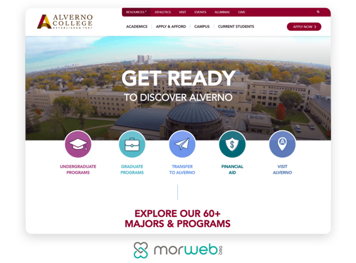
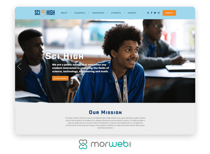
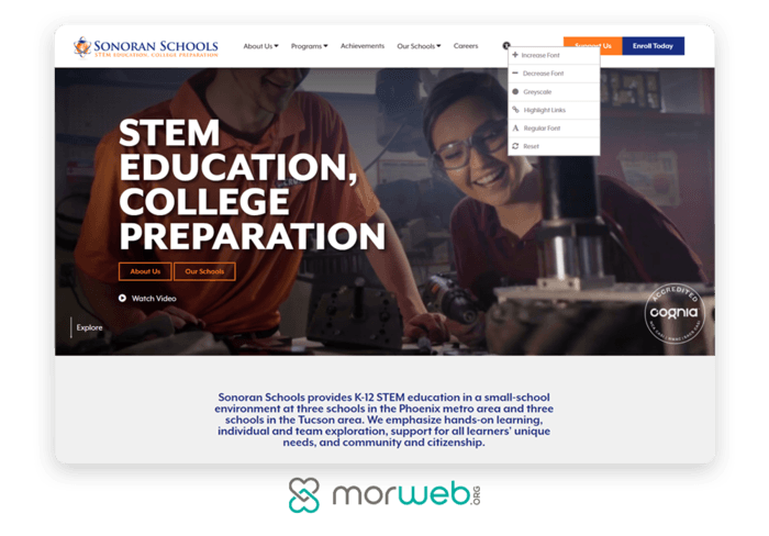
Before diving into the above tips, take a moment to browse this list of best school websites. You’ll get an idea of what these tips look like in action and may find some design inspiration for your own website.
Ready to create a school website that provides an immersive user experience for students, parents, and staff? Let’s get started.
1. Feature a clean and easily navigable design
A clean, minimalist design works well in almost any digital space. Online education websites are no exception. Cluttering up your website with excessive content can be very distracting to visitors. It’s unlikely that people will stick around to read content that’s irrelevant to them or click through multiple sections to find the content they’re looking for.
To create a clean and straightforward website, include the following elements:
- White space. White space refers to the space between different design elements. It can break up content, draw attention to important information, and guide visitors through your website. While it has benefits, you’ll need to strike a balance between white space and your content. White space does still take up space after all.
- Consistent fonts and colors. Visual consistency is an important part of branding. It lets your users know that they’re still on your school website while they’re looking around. It’s important to stick to two to three fonts and colors outlined in your school’s brand guidelines. Be consistent with the ones you use on everything from your homepage to your staff directory.
- Smooth navigation. A well-designed, engaging website will give your users exactly what they need in an intuitive way. Start with a navigation menu that features high-value pages, like your course catalog, enrollment form, and school fundraising page. Some schools separate their navigation menu into different sections for students, parents, and faculty, so each can find content relevant to their needs.
If your school website is cluttered and difficult to navigate, users likely will leave before exploring other pages, which will increase your bounce rate. The above tips will help you avoid this scenario and create a website that’s visually appealing and easy for students, prospects, parents, and teachers alike to navigate.
2. Include strong imagery
Research has found that we process images 60,000 times faster than text and tend to remember visuals more often than text. Furthermore, pages with images or videos draw, on average, three times more views than their text-only counterparts. In other words, visuals are a vital part of digital marketing.
You need to take a more strategic approach than simply placing a few images and videos, though. When designing each of your web pages, keep these tips in mind to intentionally incorporate images in a way that fully engages your education website’s visitors:
- Feature original photos. Generic stock photos present very little value to readers. Instead, show what your school has to offer with your own high-quality photographs that show off your campus, classrooms, and students. Current students will be excited to see themselves on your school website, while prospects can decide if they envision themselves at your school.
- Be strategic in placement. First, be sure each image you use is relevant to the content itself. From here, you can use images as a way to break up text and keep visitors engaged. A CMS with front-end editing capabilities will make it easy to adjust your design and place these elements in a visually effective way.
- Use image carousels. When you have multiple images per page, consider including an image carousel that rotates through them. This will contribute to a clean, minimalist design by making sure you’re not overcrowding your pages.
- Incorporate images in your forms. If your school features a donation page or hosts events, this is an ideal opportunity to incorporate imagery. Feature an eye-catching photo or your school logo to remind visitors why they’re either donating, signing up for your event, applying to your school, or completing some other action.
When used correctly, images can be a real game-changer for your school’s website. Take the time to be strategic in your approach. It will pay off in the long run.
3. Follow web accessibility guidelines
To get in front of more prospective students, make sure your website is accessible to all visitors. This means complying with web accessibility guidelines so that people with disabilities or impairments can still view and interact with your education website.
There are two common standards for school website accessibility: Section 508 and WCAG 2.1. Both have similar criteria, much of which overlaps. It’s up to your school to determine which criteria it adheres to, but many have chosen to follow the WCAG 2.1 guidelines. Upon establishing which criteria to use, share it with anyone who is responsible for updating and adding content to your school website.
While many web content accessibility guidelines require help from a professional developer, a nontechnical CMS will enable you to take many steps toward better accessibility on your own. Here are a few tips to improve your school website’s accessibility:
- Add alternative text to images. Alternative text (or alt-text) is a phrase or sentence added to an image’s HTML coding that describes the appearance and function of an image on a page. Clear, straightforward alt-text helps visually impaired users using screen technology to better understand what an image is and determine its purpose. This text will also be displayed in place of an image if the file cannot be loaded.
- Provide alternatives to videos. Unlike images, videos don’t enable alt-text. Because of this, you’ll need to provide other options for those who have visual or hearing impairments. For instance, you can create a transcript and make it available either as a supplemental document or by linking to a separate web page. You may also provide an audio track that describes the video. Additionally, you can provide appropriate text-based labels for all controls, so screen readers and audio browsers can read them.
- Use high-contrast colors. WCAG 2.1 requires a contrast ratio of at least 4.5:1 for text and graphics. For reference, the highest contrast ratio is black text on a white background. Keep in mind that the reverse, white text on a black background, is difficult to read. Choosing high-contrast color combinations helps those who are visually impaired read your content.
Accessibility is an important component for every form and page on your website. Implementing the above tips will not only make your website accessible to a larger audience but also enhance your overall design, making it easier for all visitors to view and interact with your content. Explore more tips for building an accessible school website with this web compliance guide.
The gist
Building a website that engages your students and parents shouldn’t seem out of reach. By starting with a CMS tailored to schools’ needs, you’ll have the functionality and tools you need to create an effective design that captivates your community.
School websites are crucial for creating a lasting first impression on prospective students and parents while also keeping current ones informed and connected. By incorporating these tips, you can easily accomplish each of these priorities in an aesthetically pleasing way.
Now that you have a solid foundation of web design knowledge, start experimenting on your school’s website. With best practices at the forefront of your strategy, you’ll develop a strong, compelling education website that’s sure to garner attention from your audience.













Send Comment:
1 Comments:
More than a year ago
Hey there, I must say this one is the most notable for me. And I am glad to read your article about education web design low cost websites. I really enjoyed this post. Thank you for sharing.