According to the U.S. Centers for Disease Control (CDC), 61 million adults, or 26 percent of the population, have some kind of disability. Of those, 5.9 percent are deaf or hard of hearing, and 4.6 percent are blind or visually impaired, even with corrective lenses. Many of these people are turning to online courses because it’s difficult for them to learn in a traditional classroom setting.
Fortunately, high-speed internet access and computers have made it possible for people to learn from anywhere, at any time. People with disabilities can take classes from their homes, but they need accessible online courses that take their needs into account.
Legal requirements for online course accessibility
Online course accessibility is required by law for universities and colleges. The Americans With Disabilities Act (ADA) mandates that colleges and universities using technology to educate students provide students with disabilities the same access to learning as their counterparts.
While there are no specific mandates under ADA for websites or online courses offered by non-college entities, businesses with 15 or more employees that operate for more than 20 weeks per year can be sued if their content isn’t accessible to users with disabilities.
To be on the safe side, design your course to be accessible.
Basic guidelines for developing accessible courses
There are some basic things to know when you’re designing accessible online courses. You need to use image descriptions and alt-text for all your images and videos, add captions and/or transcripts to videos, and make sure all PDFs have been run through optical character recognition (OCR).
Using alt-text and alt-tags makes it possible for screen readers to read the description of the image or video to a user who can’t see it. The alt-tags should describe the object itself and its purpose, like a diagram of an engine and which parts it focuses on.
Text transcripts make it possible for hearing-impaired users to read spoken course content. You can either hire a transcriptionist to create transcripts for you, or use a tool like oTranscribe to do it yourself.
All PDFs you upload as part of your online course should be run through OCR. This will make it possible for a screen reader to read these out loud to a visually impaired user. However, it’s better to include the information as part of the web page so that the user can better access it.
The importance of layouts and structure
The structure of your course content is very important when you’re designing for online course accessibility. Use style elements such as headings and bullet points to break up the information into manageable chunks.
Additionally, as you create content, consider how you present it. For example, large, bold fonts with uncluttered backgrounds are easier for someone to read without using a screen reader. Use high-contrast color combinations to make it easier for those who are color-blind to read the information on the screen.
Consider how your students will navigate the course content. One best practice is to make it possible to reach all the content just using keyboard shortcuts. This accommodates physically impaired users who have trouble manipulating a mouse.
Creating options for content
In addition to transcribing video and audio content, make sure that your students have multiple options for learning. Use a combination of text, video, audio, and images so that important information can be understood in a variety of ways.
When you’re writing content, address the different language skills your students may have. For example, spelling out acronyms, defining specific terms, and avoiding (or at least explaining) jargon makes content accessible to a variety of learners.
Small elements make a big difference
Small things can make your online course more accessible. One of these is hyperlinks. The ADA specifies that hyperlinks should be text within a sentence to make them more readable, so you could either write something like:
- To read the ADA regulations, visit https://www.ada.gov. (This option should only be used for short links.)
- ADA Regulations. This option is ideal for longer links.
Another small but important thing you can do is choose a sans serif font like Arial or Helvetica. These fonts don’t have extra strokes and are easier to read on a screen than a serif font like Times New Roman.
Use accessible forms
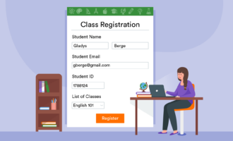
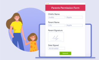
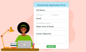
Online courses will require students to submit assignments, give feedback, and take tests. You can use accessible forms, like the ones provided by Jotform, for these tasks. Accessible forms have alt-text descriptions baked into form fields and come with high-contrast color schemes. Jotform’s Form Builder includes an accessibility checker.
Designing for online course accessibility helps those who learn differently understand the material. Leverage simple design elements and tools that make it possible to deliver your courses, and you’ll be able to meet the needs of all students.





























Send Comment: