Do you know Mondrian? You’ll probably say no. But that’s unlikely. At least his art style will seem familiar. Take a look.
The Name Giver: Piet Mondrian
Piet Mondrian was a Dutch painter, and inventor of the neoplasticism, an art form that he assigned a near-religious status to. Mondrian was one of the founders of abstract painting and inspired people like Walter Gropius to the invention of the world famous Bauhaus architecture style.
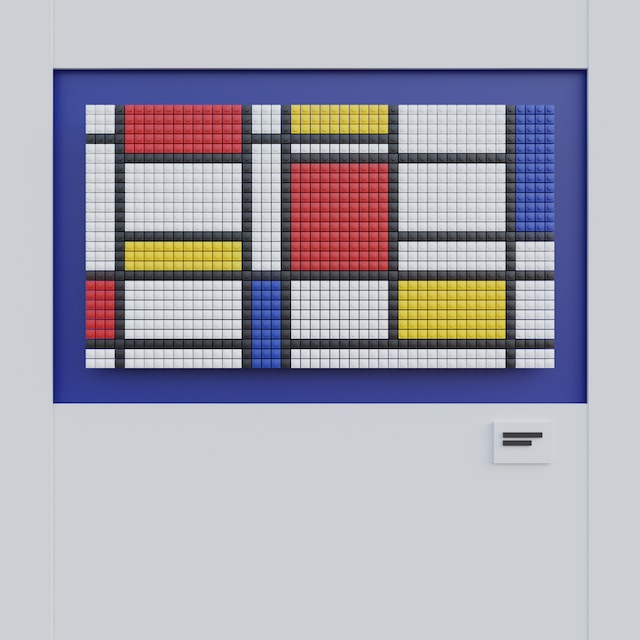
I’m sure you’ve seen Mondrian’s mosaic-like paintings before. This creation is called “Composition with Red, Yellow, Blue, and Black” and was made in 1921.
From the early twenties to his death in 1944, Mondrian has been dedicated to the focus on primary colors and clear lines. His design vocabulary inspires artists and architects to this day.
Mosaic as a Design Grid
Mosaic-like design grids are not only suitable for architecture, as a mosaic also allows for the best possible usage of the given space of rectangular media, like screens. Thus, it’s no surprise that screen designers take inspiration from the Dutch neoplasticist.
The concept of different tessellation of the screen was first adopted by Microsoft for its mobile operating system and was then used for the desktop version as well. Metro-Design, later renamed to Modern Design, represented a user interface set up as a mosaic. The larger the tile of the respective interaction, the higher its importance for the user, or the functionality in general.
Heavy color contrasts between the individual tiles were not an uncommon occurrence. However, in contrast to Mondrian, this was not a necessary component of the concept.
Mondrianism as a Design Style
There’s no need to elaborate further on why Mondrian’s structure concept is a good choice for website design. Especially in times of responsive websites, and the CSS box model, as well as features like Flexbox, and CSS Grid, the mosaic is almost the logical design model.
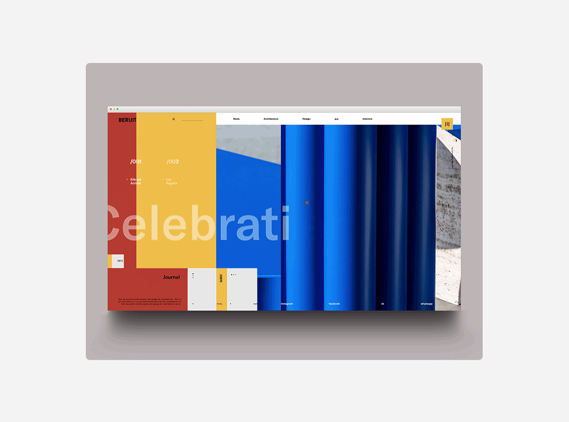
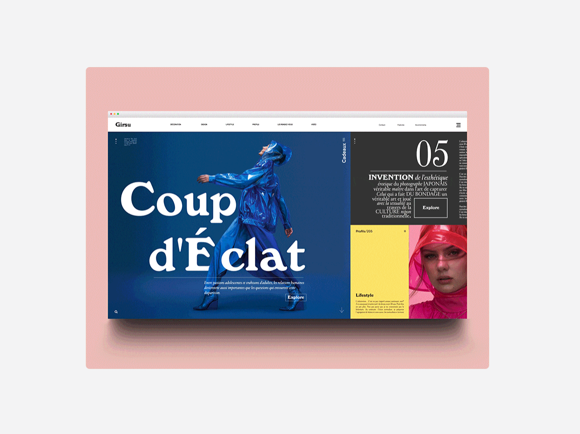
Now, if we connect tile designs with animations, which can be easily isolated in zoned screen areas, we can create some impressive layouts.
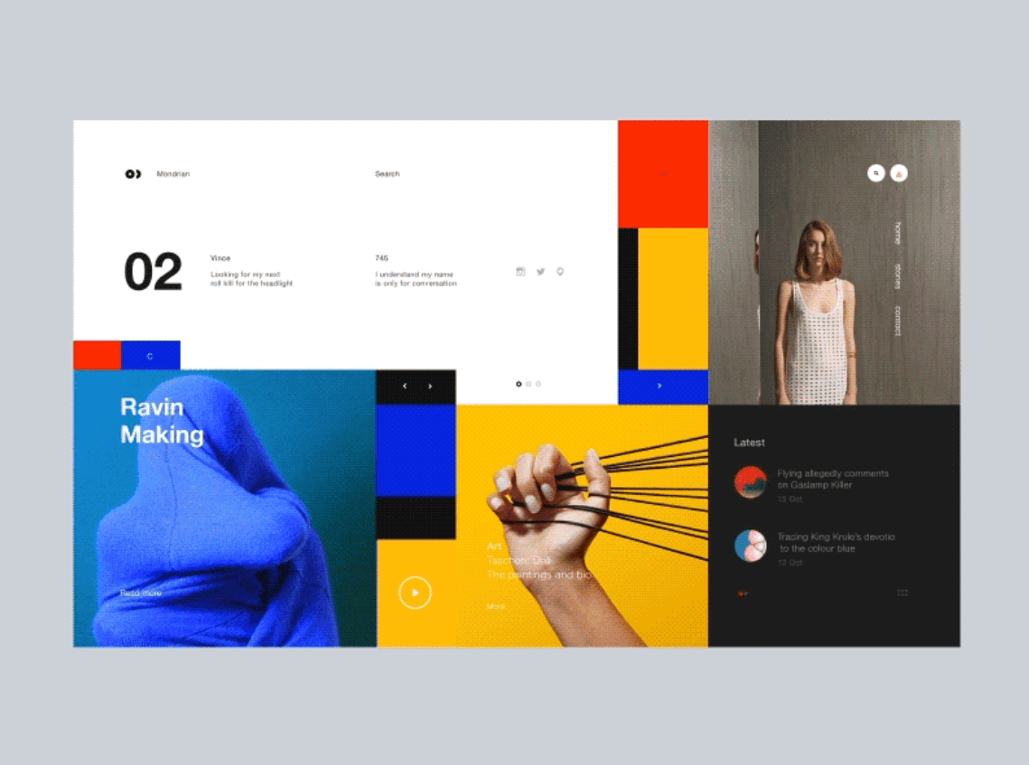
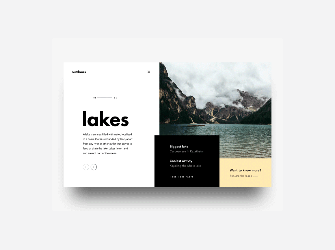
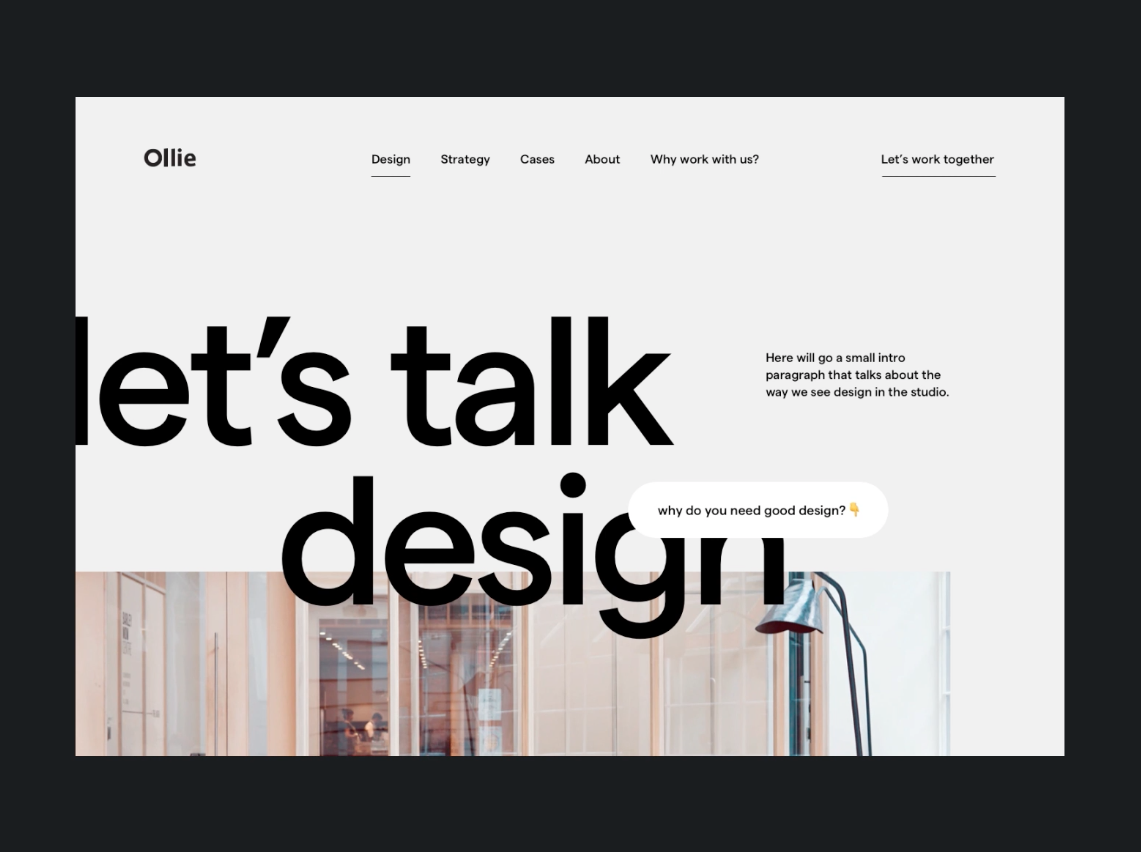
On Dribbble, tons of designers show what that can look like. All shown examples were posted in December 2017.
Over at Muzli Design Inspiration, you can find even more examples for mondrianisms, including some very remote ones.
What do you think about this design style? Which projects would it be the most suitable for?
Photo by Tirza van Dijk on Unsplash




Send Comment:
1 Comments:
More than a year ago
Mondrianism in Web Design is new for me i will try in web designing