Dedicated landing pages are a favorite tactic of email marketers. And it’s no mystery why. An effective landing page attracts subscribers and can substantially increase your conversion rate.
What is a landing page?
A landing page is a standalone web page created as the first step in the lead funnel for a specific marketing campaign.
Landing page visitors come from many channels, including an email message, a link from another web page, a search engine ad on Google, or a social media platform. The primary purpose of a landing page is to present your initial call to action (CTA).
A well-designed landing page helps to ensure the best conversion rates for your digital marketing campaigns. A persuasive landing page can also drastically lower your lead generation costs.
Landing pages are the open end of the lead funnel that directs website traffic from other sources, such as your social media or email campaigns. This is where you greet leads who have taken the very first step to interact with your brand. A well-crafted landing page gives visitors compelling reasons to register for a webinar, download a report, or sign up for valuable information through an email newsletter or RSS feed.
Here are some tips on crafting landing pages that persuade leads to subscribe to your email campaigns.
Pro Tip
Create a custom lead generation form with Jotform and add it to your site in seconds. It’s free!
Keep it simple
Visitors won’t spend much time digesting a landing page crammed with complicated content. Keep your content marketing message succinct by listing targeted SEO keywords as bullet points. Present social proof that shows your visitors how many of their peers have responded to your CTA.
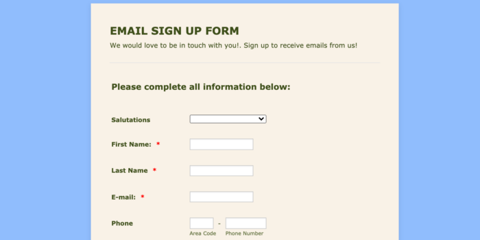
Effective landing pages typically have a prominent CTA button and a brief signup form with very few form fields. You can make the process even simpler by enabling the form to autofill the fields for the visitor. This makes it likelier users will complete the process of responding to your call to action.
Include a value proposition
Visitors are reluctant to give their phone number and email address when they visit a website. Therefore, the landing page content must deliver compelling reasons for visitors to hand over their personal information. Show them how they will benefit by joining a webinar, downloading a report, or subscribing to your email newsletter.
Focus on the top benefits that appeal to your target audience. Make sure those benefits appear where the visitor will see them as soon as the page loads.
Add visual stimulation
The visual components of your landing page design are effective tools for capturing email leads. Consider using a sidebar subscriber form, popups, a photograph, an embedded video, or a combination of these elements. Include bold headers that state your value proposition to convert visitors into subscribers. Color selection is important, so always adhere to an aesthetic that uses minimalist simplicity.
A countdown timer is a good feature for prompting email visitors to take the desired action. It fires up the psychological urgency to act by highlighting that this is a limited offer or an exclusive deal.
Personalize the experience
You’ll gain a deeper level of engagement and a higher conversion rate when the landing page speaks directly to the visitor. Personalization sends the message that you care enough to spend time customizing the visitor’s experience.
You can personalize landing pages for visitors in many ways, depending on the information you have. This includes the visitor’s name, the name of their company, their job title (for B2B audiences), the device and browser the visitor is using, and the messaging based on the ad or marketing campaign content they clicked on.
Landing page design tools
There are many landing page builders to choose from, depending on your marketing campaign, size, scope, and budget.
Examples include Unbounce, which offers a user-friendly visual landing page tool that doesn’t require developer assistance. It has an A/B testing feature to help you get the intended response from your users. The A/B testing covers everything from the visuals and content you use to the social proof, outbound links, subscriber form, and more. This landing page builder also integrates with many email marketing tools, like Mailchimp.
WordPress Landing Pages is an option if you already use WordPress. Yet another software to consider is Instapage, which is functional, user-friendly, and high performing while remaining affordable for most brands. Instapage can scale for companies of all sizes, from startups to large corporations.
Having the right landing page for your content will increase the number of email subscribers and, therefore, the number of people who are more likely to convert. Examine each marketing tactic to determine how you can develop a landing page to turn that audience member into a customer.


Send Comment: