Often, when we’re building our forms and surveys, we’re preoccupied with including the right fields and questions, crafting the best phrasing, getting the design of the form just right, and making tweaks to ensure we get the most submissions possible.
One often overlooked item is the thank you page, and it’s more important than you might think.
You may be collecting inbound registrations, soliciting outbound leads, or asking respondents to fill out another form. But when a potential client or customer takes the time to give you vital information about themselves, how you thank them for it can affect your future relationship.
With this in mind, Jotform is happy to debut an exciting new Thank You page.
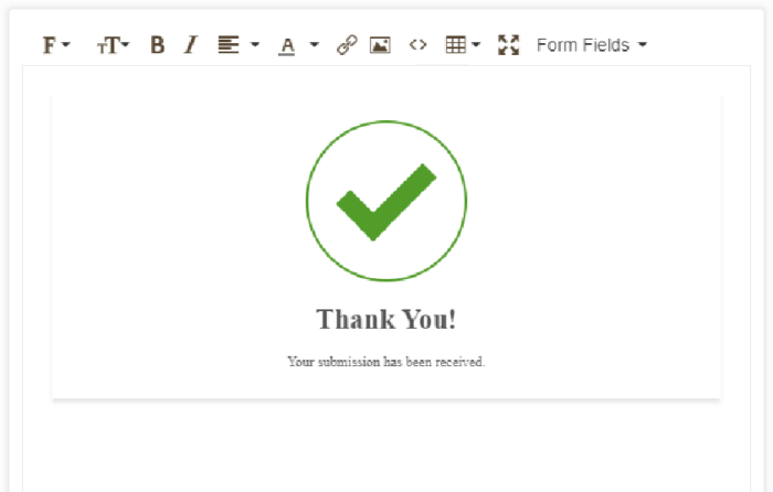
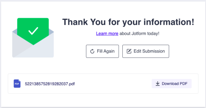
Our new Thank You page is more visually attractive than the old one, and it will make it easier for your respondents to learn more about your organization as well as help boost overall customer engagement with your brand.
OLD:
NEW:
What is the Thank You page, and how can it drive engagement?
Simply speaking, the Thank You page is the screen a form respondent sees immediately after successfully submitting their answers to a form or survey. It’s the first chance (after a user takes an initial action) that your organization has to start building a relationship with the user, and it’s important to take advantage of this unique opportunity while you have their attention.
Think of how many billions of forms are submitted around the world each day. Each and every one of them is a chance to create more engagement with users; from signing up to access a download of some sort to scheduling an appointment, each scenario represents the end of the first interaction and the beginning of the next.
In an effort to improve the effectiveness of your forms, the new Jotform Thank You page provides updated tools and new functionality to guide that next user interaction.
Your Thank You page can aid customer engagement in a number of ways. Of course, there are times when your request for information is straightforward, such as a one-off survey, and simply thanking the user for their time is appropriate. But in any situation where you’re creating an ongoing relationship with the user, additional engagement benefits your organization.
Here are some examples of how a thoughtful Thank You page can assist with customer engagement:
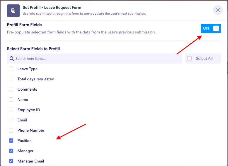
- Gain more insight and information. We’ve created a way for form owners to dynamically prefill subsequent form requests (either for the same form or another form) with information respondents have previously submitted. For respondents, prefill eliminates the frustration of filling out the same data over and over again, making it more likely for them to submit follow-up information.
- Build trust. A new or existing client is vital to your organization and well worth a thoughtful thank you. For example, once they’ve scheduled an appointment or submitted an assessment, build trust with the user by providing a link to your guidelines on customer care or to your About Us page, where they can find out “the why” behind your organization.
- Provide education. When a new contact or lead signs up to receive news or inquire about your services, that means they’re interested in hearing from your company. Your Thank You page can help them learn more about your offerings by including downloadable proprietary reports, webinar recordings, or articles about your company culture.
- Amplify their effect. A user who has just completed a transaction has demonstrated trust in your organization. Your Thank You page can capitalize on their commitment (and potentially increase your ROI) by providing links to scheduled giving or additional products, a referral link or offer, or an invitation to rate their experience.
Introducing Jotform’s new Thank You page features
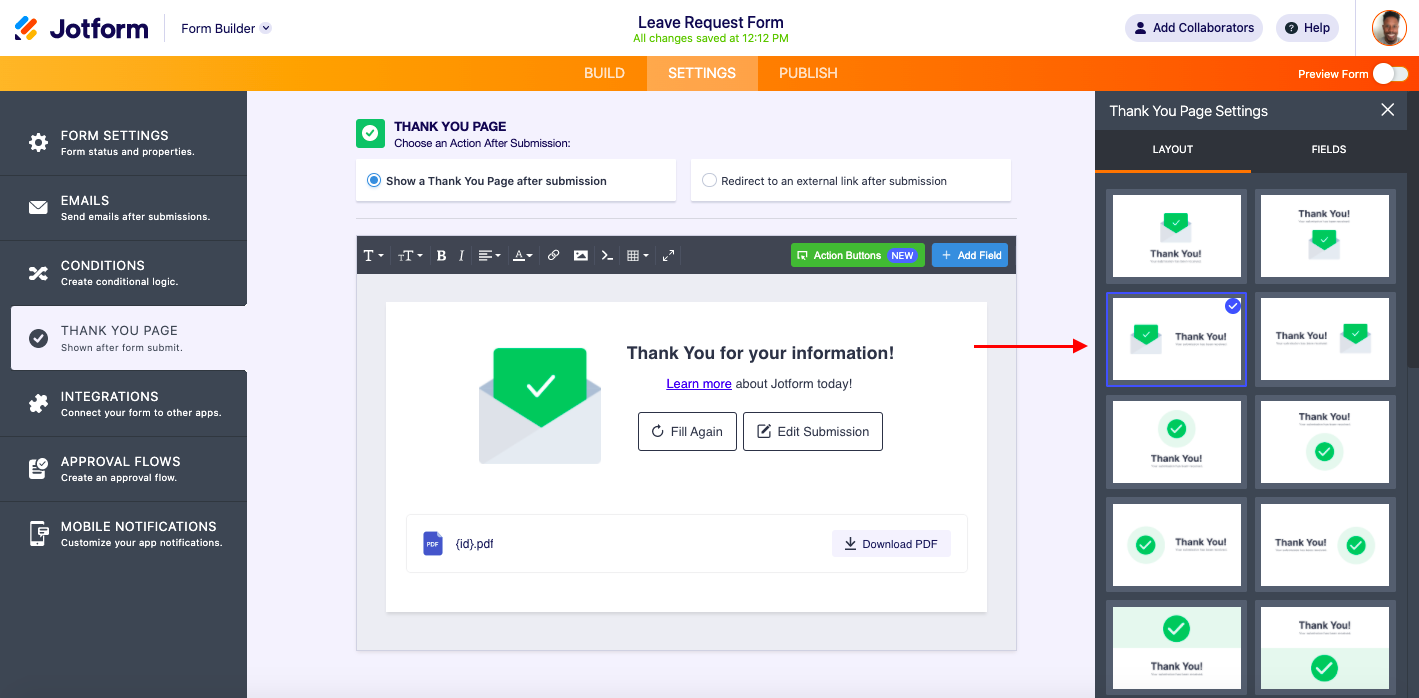
Overall, the new Thank You page offers a more modern design that will appeal to your users, encouraging them to engage with your brand. You can access the new Thank You page through the Settings tab in the Form Builder. Now let’s dive into the highlighted features and updates.
New layouts
Our first step in helping you engage more effectively with your users post-submission was to update the overall look and feel of the Thank You page. One major feature is our layout option.
Layouts can be fairly straightforward, or you can create unique designs with customized arrangements of images, text, links, and other page features.
By offering your users different Thank You page layouts, you’ll have new ways to visually engage your respondents. You’ll also inject creativity into your Thank You page while still maintaining the brand presence and the professionalism you need for your customers.
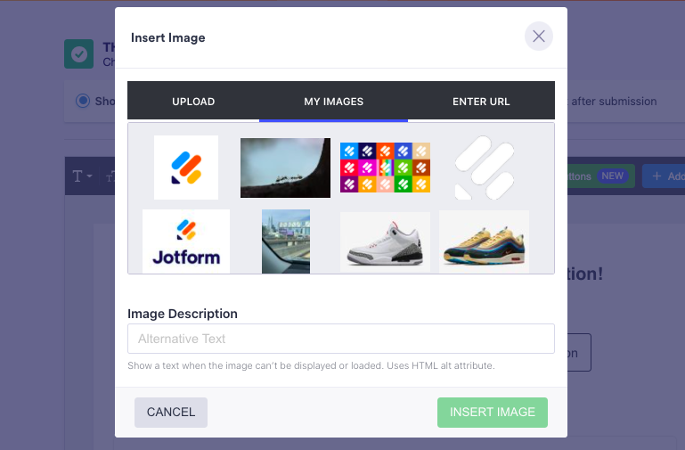
You can choose any available layout page template simply by clicking on it; the layout will be applied to your page automatically. For additional customization, you can update the background image by uploading a new image, using a saved one, or entering a URL.
You can choose from additional form completion icons and match them to your design. Inserting your organization’s logo or background is a good way to reinforce your brand.
New toolbar
Also in the back end, the Thank You page features a new toolbar with updated icons that show their active state when a cursor hovers over them.
OLD
NEW
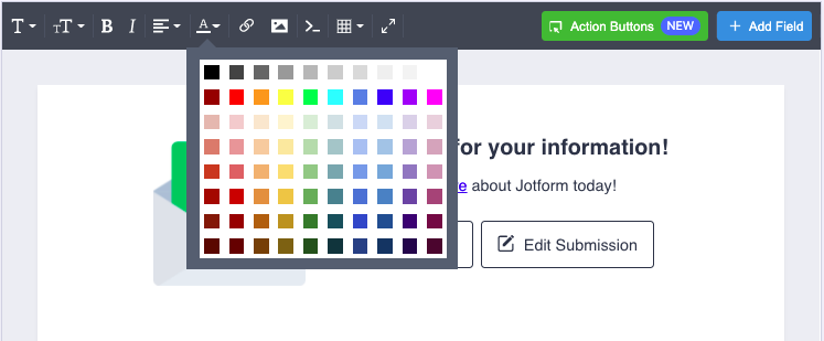
The toolbar allows you to customize the look and feel of your Thank You page. In addition to formatting the font and adjusting text alignment, you can add links to documents or pages on your site to engage with or educate respondents on relevant topics.
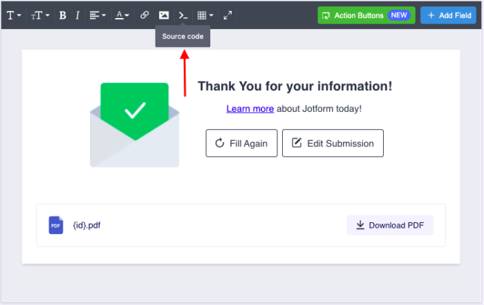
You can also add pictures or hyperlinked graphics to provide a more polished presentation. And there’s the ability to edit the HTML code of the page to fit your brand’s specific look and feel.
NEW
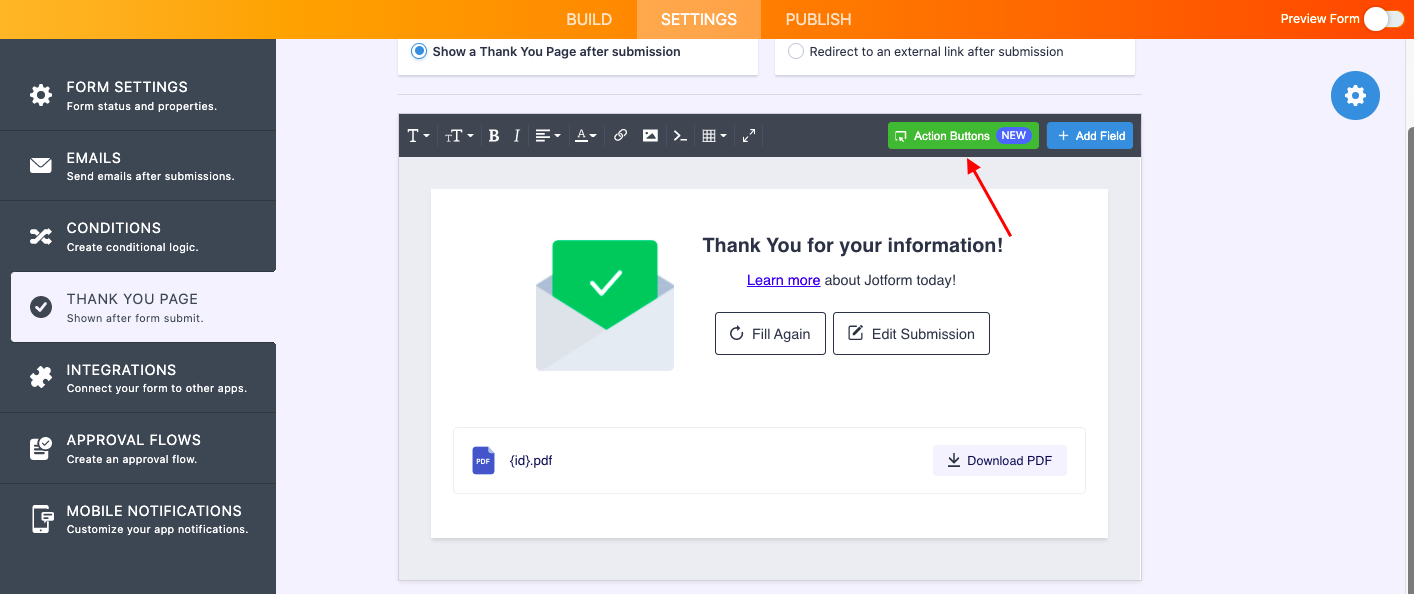
New Action Buttons and updated Add Field button
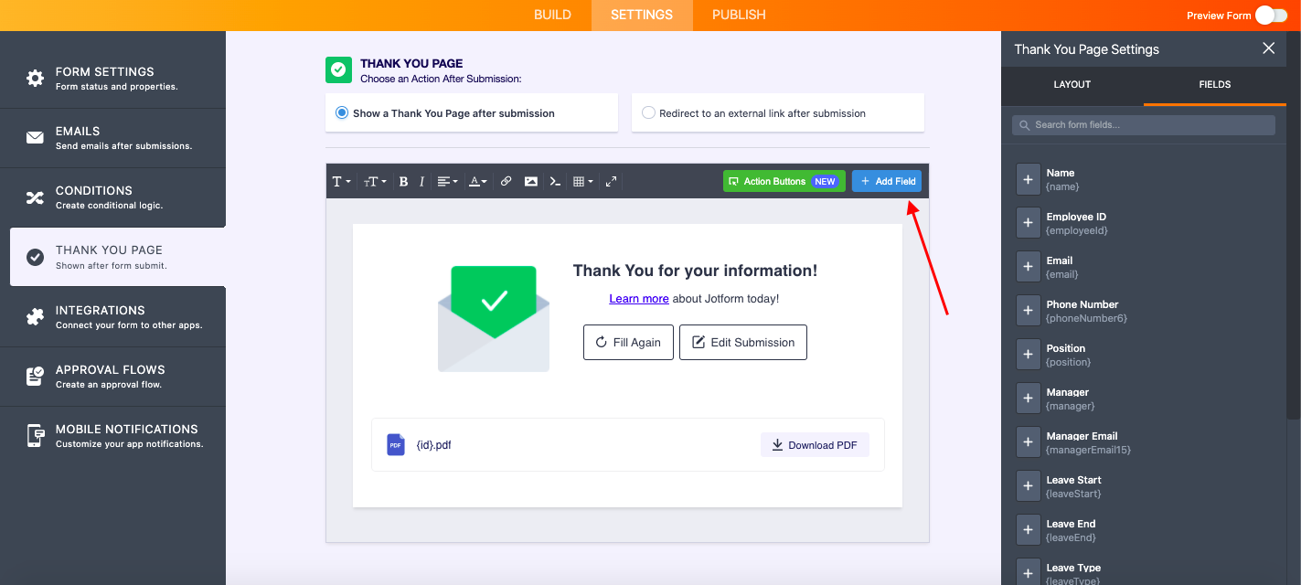
The updated right panel of the toolbar includes buttons to add a field and add action buttons.
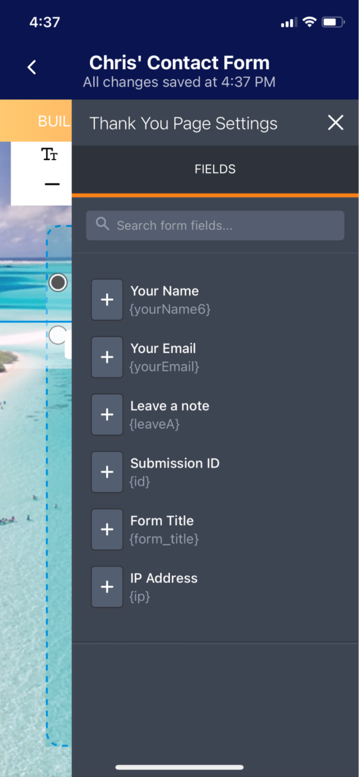
When you click the Add Field button, the Thank You page settings panel will open, enabling you to add any field that’s part of your form. This presents respondents with more personalized messaging post-submission, such as their name or the name of their organization. It’s a small touch that can ultimately help build trust.
Also, you now have the ability to search form fields. Just use the search bar in the upper right of your Thank You page settings. When your form contains many fields, this makes finding and including form fields on your Thank You page a snap.
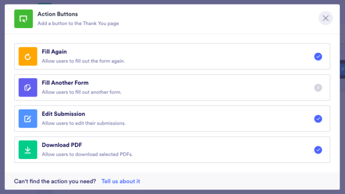
Our new Thank You page Action Buttons allow respondents to take a variety of actions after they submit the form.
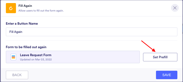
For instance, with Fill Again, the respondent can reload the form and submit it again. This is helpful when you need to accept multiple consecutive submissions, such as at an event where multiple contacts at the same company need to enter their information or when multiple kids need to fill out applications for school or extracurricular events.
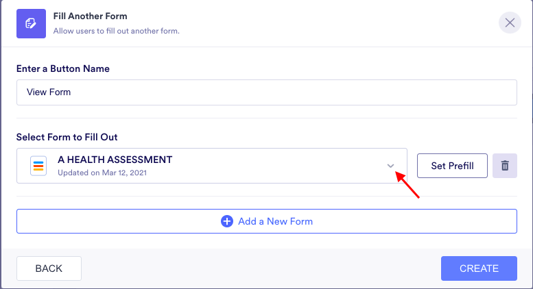
The Fill Another Form button allows you to add subsequent or other relevant forms to the Thank You page for the respondent to complete. This is valuable in scenarios like new hires filling out multiple forms during the onboarding process.
The Edit Submission button allows users who’ve made a mistake to go back into the form, revise it, and resend it, while Download PDF lets the form submitter easily download their submission as a PDF.
Once the form owner creates and customizes a PDF submissions document for their form, they can easily add it to the Thank You page for download.
Incidentally, form owners can also rename the action buttons based on their needs or what they believe their audience will most likely respond to.
Form prefill capability
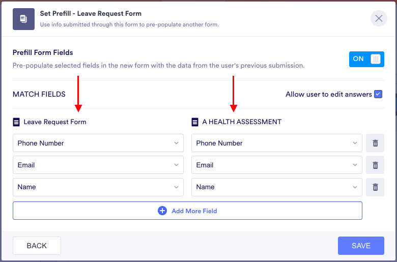
For the Fill Again and Fill Another Form action buttons, you have the ability to dynamically prefill the forms you’re requesting from your respondent.
With Fill Again, you can set the fields to be prefilled with specified existing data.
For Fill Another Form, you can set which fields are to be prefilled in the newly requested form by using data from the initial form.
Filling in the same data over and over for multiple forms in a queue is frustrating for your end users, especially when they’re being thanked for filling out the first form. Prefilling forms linked from your Thank You page makes this process easy.
We’re proud to lead the industry with the only known automated flow for prefilling another form, which enables the form owner to set a prefill menu that will roll over for different form filling experiences.
Thank You page for Jotform’s Mobile app
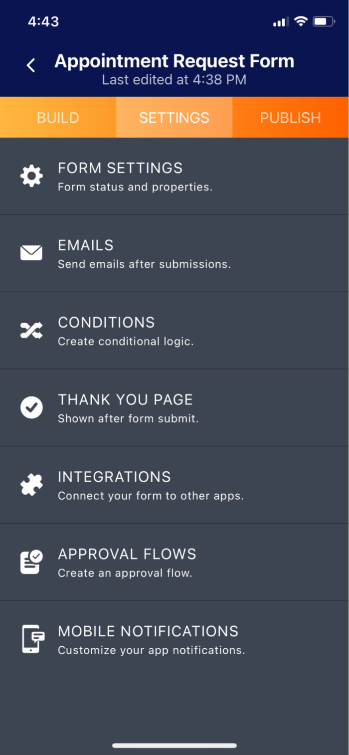
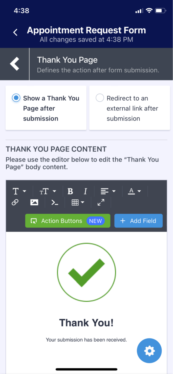
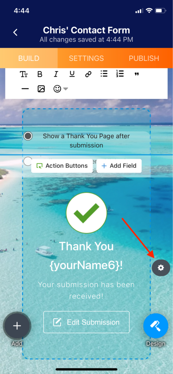
Jotform’s Thank You page settings are also available on our mobile app (you’ll need to make sure you have the latest version of either the iOS or Android app downloaded).
Whether you have a classic or a card layout for your form, from your smartphone you can edit the Thank You page either in the Settings tab or directly on the Thank You card (via the properties toggle) respectively.
Additional ways to create engagement with your Jotform Thank You page
The positive impact your Thank You page can have on relationship building is clear. With that in mind, here are a few more tips you can use to make a more effective and engaging post-submission Thank You page:
- A/B tests. An A/B test can give you insight that will help you optimize your page. By testing an original design (A) against an alternate version (B), you can see which performs better. By A/B testing each element of your Thank You page (i.e., layout, headline, message, etc.) and tagging your post-submission actions, you’ll optimize your page for the highest engagement possible.
- Provide an offer. Keep your respondents engaged in your organization or industry by providing free educational resources or, in the case of purchases, a future discount on products.
- Social shares. Your Thank You page is a great place to include your social share buttons. Chances are, if respondents have shown an interest in your organization by submitting a form, they’ll be more inclined to follow you. As a result, they could add incremental business down the line.
Try updating your Thank You page today and see what kind of impact it has on user engagement.




Send Comment:
15 Comments:
More than a year ago
Problem: Even when the option to show is turned OFF the buttons: "Fill Again", "Edit Submission" and "Download PDF" show an the Thank You page at the bottom in the form of links.
More than a year ago
Thank you
More than a year ago
Does this new thank you page fix the issue where refreshing the webpage sends a duplicate submission?
More than a year ago
Thanks
More than a year ago
Thank you !
So much in assisting
Me to learn this ,
Note :
I am still learning
More than a year ago
Thanks
More than a year ago
Excellent, I like more and more this tool and your newsletter.
More than a year ago
Yes I'm new to this I never really trade before I will like to know more about your company
More than a year ago
Thanks
More than a year ago
Thanks
More than a year ago
Dear sir/madam
I'm glad and thankful for the video you just put on Facebook.
I live in Germany but American us citizen,I could like to use this page for treading and e.t.c and I believe you can coach me on all that.
And secondly I could also like to know what it's more about because I get this information from service member in the US air force in overseas Germany, it's helpful for both side?
Looking forward feedback
More than a year ago
Thanks
More than a year ago
Is there a way to confirm a slected appointment on the thank-you page?
More than a year ago
Thank you for updating me to help to know what is going on with you
More than a year ago
Is the thank you page only available on desktop not mobile app?