It’s official! Our new, revolutionary online form layout, Jotform Cards, has finally launched.
We threw out everything we thought we knew about online form design when we built Jotform Cards. The new style asks form questions one at a time, with humanlike interactions and a gorgeous interface.
But we didn’t just create Jotform Cards because they look pretty. We created them to give your business better data.
Our UX Research team evaluated more than 12,000 forms and compared conversion rates between traditional form styles to Jotform Cards. What we found was that forms created with Jotform Cards had a 36% higher conversion rate. It didn’t make a difference if the form was embedded on a website, or used as a standalone link — Jotform Cards just performed better.
This means that you could be getting 36% more leads, event attendees, job applicants, or requests for service. That means you could be getting 36% more of the customer, employee, or student feedback that your organization depends on. It means you could be collecting 36% more revenue through your order or donation forms.
Here are some of the main Jotform Cards features we’re excited to show you:
Welcome Page
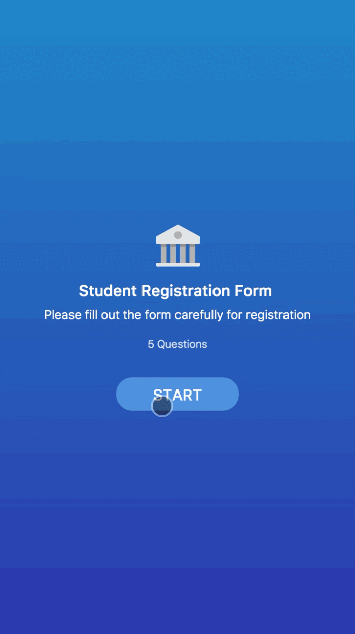
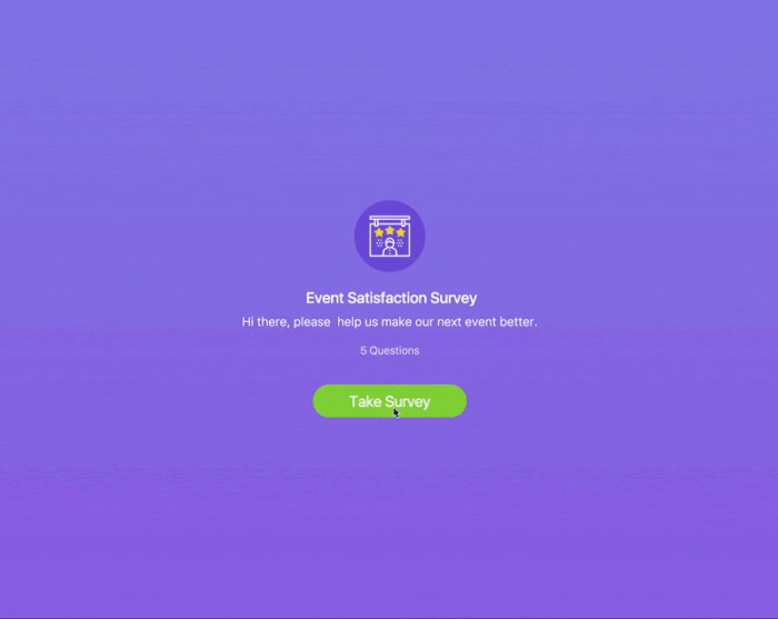
A Jotform Cards welcome page is a great way introduce your organization and to explain the background and purpose of the form. By connecting with your respondent early in the form, it increases the likelihood they’ll fill it out.
Visually Stunning
Jotform Cards raise the bar for online form design. It offers limitless options for how your form can look, including dozens of color sets and even the ability to play videos as your form background.
One-Question-Per-Page Format
Despite our best efforts, human eyes can only read one thing at a time. And even if you could read two things at once, you can’t type out answers to multiple form questions simultaneously. That’s why we made Jotform Cards show one question at a time. It significantly improves focus, and reduces page noise.
Mobile Ready
Your forms need to look great on any device. Jotform Cards are 100% mobile friendly and offer features to enhance the mobile experience. The one-question-per-page format beautifully translates to any device, enabling a natural swiping motion to see the next question on phones and tablets.
Progress Bar
Progress bars are invaluable for letting your respondent know how much of the form they’ve completed. Jotform Cards progress bars go one step further and indicate completed questions with a bright green dot. It’s a gamification feature that encourages form completion. People are more likely to complete a task when they’ve been provided an indicator of progress.
Icons
Use our new library of icons to liven up your form. Add them as question selection options so that your respondents can choose between professionally-designed images when filling your form.
Micro Animations
It’s jarring to receive an error message when trying to fill out a form. To make the experience more pleasant, we’ve included a micro animation that shakes no to let the user know they’ve filled something incorrectly. It’s a more approachable, human way to alert the respondent.
Emoji Slider
Your respondents will have the chance to express themselves with an emoji slider that changes faces as you move it across the bar. This is a more enjoyable way for someone to give you feedback.
Smart Embed
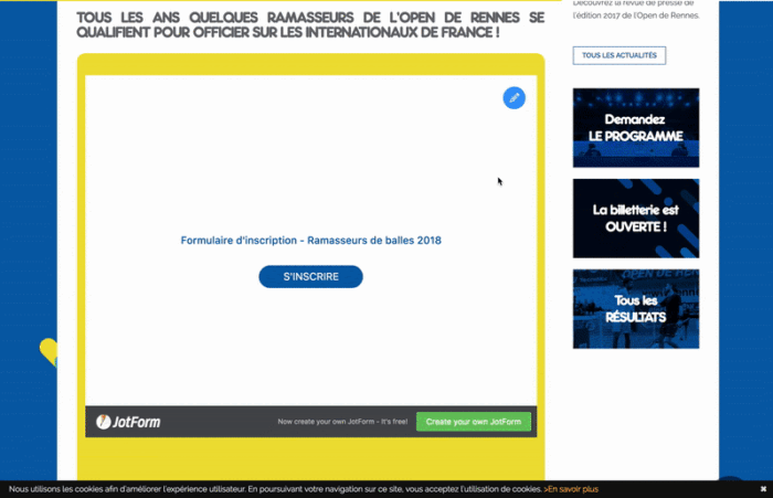
Jotform Cards will seamlessly match your website’s look and feel with our Smart Embed feature.
Since 2006, our focus at Jotform has been to make it easy to build forms and collect information. However, with Jotform Cards, we turned our focus to the people filling out your forms. We wanted them to be well served by Jotform, even if they weren’t the ones collecting the information.
Try Jotform Cards for yourself today!
Have you already started collecting data using Jotform Cards? Do you have a favorite feature? Let us know what you think in the comments!


Send Comment:
28 Comments:
More than a year ago
Hello ! Congrats for your awesome company and work .
I have a question. I use jot form cards and I have put a single choice box with some products. When I am on preview mode and I am making a choice, ( on button 1 for example ) the card goes away automatically to the next step. Is it a way just to make a choice and the card stay at its position without going to the next step ?
I think is more friendly for the customer to ''play'' with some choices, before he/she decide and go to the next step.
Thanks !
More than a year ago
Hello, I have created a Jotform using the new Card template and set up my payment wizard using Braintree. Everything is set up fine but when I try to do a test payment and click "next" after filling out the payment card, nothing happens? How do I fix this?
More than a year ago
Question, I have created a form using this template but some areas need more than just one question. Is there a way I can easily do this?
For example, I am building a consent form and I would like to make respondents check a box stating they have read the content be fore going to the next page.
Can I add a check box to a text box so that I am still able to have the formatting I like in the text box? Please assist.
More than a year ago
Can I put a hyperlink in one of thse forms and if customer touches it, it automatically goes to that link?
Also, if I embed jotcard on my website ...how am I notified of the cutomers data that they input?
More than a year ago
Hello, I work for a bank and think that I can embed a jot card to my website? If so, is this counted as one submission? Not sure what a "submission" is.
Thanks,
Linda
More than a year ago
How do I enable the progress bar?
More than a year ago
What is this jot form.
More than a year ago
The Jotform Cards look very neat and could be fun to use for the user. I see we can convert our JotForms, not tried this yet, so very easy to change.
More than a year ago
Specific to collecting feedback (using your event satisfaction card as an example), is there a way to share that information on social media sites such as facebook and google reviews?
More than a year ago
Looks great, I will check it out. Thanks!
Christal.fiverr.com/christalclearly.
More than a year ago
Fantastic. Loving these tremendously. well done.
When the next big update comes along would it be possible for us to be able to integrate more then one payment option on a form. It would be great to give clients the option of choosing how to pay and more importantly who with? Surprisingly a lot of people don't like using PayPal for example.More than a year ago
Is there a way to import forms created in the old Jotform format into this new Jotform Card format and keep the same form address?
More than a year ago
I offer four subscriptions from $30-120 which show up on one card but with page numbers. Is there a way to present all four without having to click through page numbers? If not, can I change the subscription numbers to a custom text, such as $30, $60, $90, $120
More than a year ago
Hi Aytekin, if your UX Research team tested Jotform Cards with people with disabilities and assistive technologies, such as screen readers, screen magnifiers or Dragon Naturally Speaking, please consider adding information about your level of compliance with the Web Content Accessibility Guidelines (WCAG 2.0) and ADA Section 508. Web accessibility is a legal requirement in many countries but for e-commerce sites excluding a sizable group of potential customers is bad for business. (E.g. "If I go on an e-commerce website and put stuff in my cart, but get to the payment screen and have trouble because the checkout button's not labeled -- that's a high degree of frustration"
The number of companies that are getting into legal trouble for discriminating against online customers with disabilities is growing ( So, if the form solution you are offering is fully accessible (I haven't checked if it is), it would be beneficial to your business if you let the world know if yours is 'the friendly and inclusive way to ask' :-)
More than a year ago
I'm excited to try this!
More than a year ago
Can I embed a Card Form in a website so the overlay happens with the snazzy new card layout for the modal window but the website is in the background and not the card from background?
More than a year ago
Not exactly sure what this is ?
More than a year ago
Do you feel that "cards" are as effective with longer registration forms? I completely LOVE it for shorter forms...wonder if the number of clicks will deter users from completing the form.
Here is the one that i use:
Thanks so much,
More than a year ago
Do all rules in an existing Jotform FORM
remain when the FORM is transferred into Cards?More than a year ago
I'm mainly interested in the back end of CARDS.
Once all the information is gathered how is is laid outfor me to read? Is the layout identical to the existing
Jotform PDF?
More than a year ago
Does this integrate with Salesforce.com?
More than a year ago
ossm
More than a year ago
finally , great addition to jotform. We have been waiting for this . now you just past typeform in ux :-) Yay
More than a year ago
does this affect existing jotforms or old way of making forms in any way?
More than a year ago
Excelente trabalho. Parabéns!