While our team is working on the remaining 104 Internet Explorer bugs, I will sneak out and write another Jotform 3.0 preview. 🙂 Today, I would like to cover the main features on Jotform 3.0 Form Builder.
We have many competitors. They are really good at marketing. I don’t really care or look up what they are doing. What I care about is making the best online form builder ever. If we can just keep doing that, I am sure our user base will grow and some of them will keep supporting us by buying the Premium edition.
You might say “best” is a relative term. It can mean many things. So, let me explain. When I say “best”, I mean three things:
- Ease of use
- Flexibility
- Features
These are opposite powers all pulling in a different direction. It is very very hard to accomplish a good balance. This is how Microsoft Word and Photoshop became so successful. And this is also why most software products fail.
On Jotform 3.0 our goal was to improve our product so that we advance on these three fronts while still not losing the balance to a single side. To accomplish that we had to rewrite the form builder from scratch. I don’t want to get into technical details, but for example, our previous form builder simply generated HTML code and added to the innerHTML while the new rewrite directly works on the DOM. This was required to provide more flexibility.
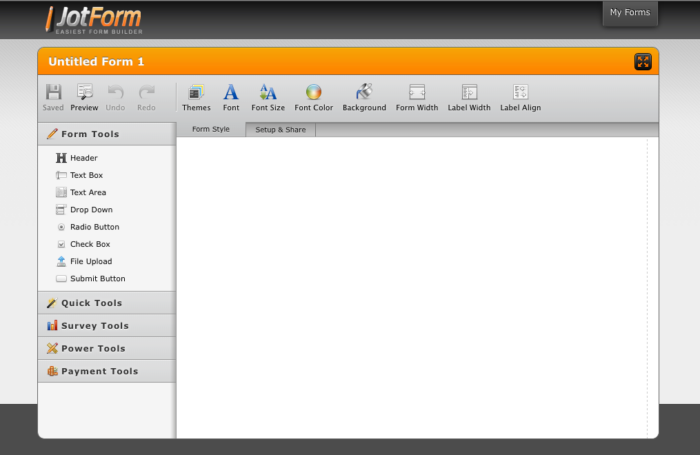
Before I bore you more with technical details, let’s take a look at some more screenshots of Jotform 3.0 form builder. Here is what the new form builder looks like when you first open:
During usability tests we found out that having a default form can cause confusion for new users when they open the form builder for the first time. So, Jotform now simply opens with a blank space on the form editor. Beautiful, isn’t it?
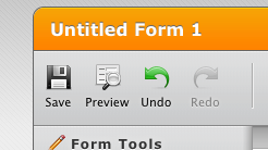
Toolbars Overview:
Right side of the toolbar contains commonly used elements such as Save, Preview and Undo/Redo.
Toolbars are context sensitive. So, they can change when you are doing different things.
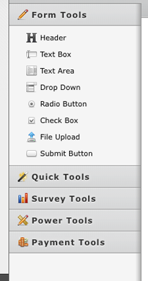
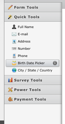
Toolboxes Overview:
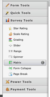
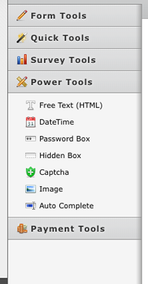
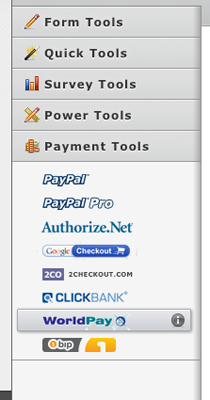
Jotform 3.0 has 40 form field types. We categorized these field types into 5 categories:
- Form Tools
- Quick Tools
- Survey Tools
- Power Tools
- Payment Tools
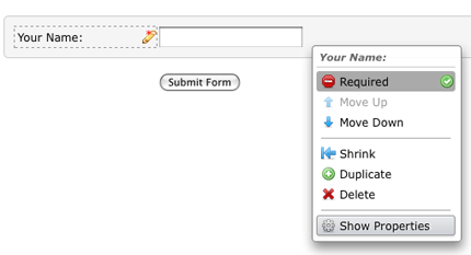
Menus Overview:
On Jotform 3.0, you can right click on any question to get a context sensitive menu.
Thank you for listening. I will try to keep posting more sneak peaks while we get ready for the release. Stay tuned to learn about our new Email Wizard, Themes, Integrated Payments, awesome new Reporting features and more.
By the way, those 104 Internet Explorer bugs: 90% of them are in the “does not look right on IE” category. Our team is unbelievably good when it comes to writing cross browser bug free code. They seldom find bugs on the main functionality. 🙂







Send Comment:
11 Comments:
More than a year ago
Hi Brett,
Yes, the folders feature is coming with the new version on Wednesday.
More than a year ago
I love Jotform, and I hope this is the right place to ask this. Is there a way to create folders to better manage My Forms? I have 100+ forms and I'd like to throw them into folders (before my scroll finger falls off). Any way to do that?
More than a year ago
Tony: Unfortunately changing a field type from from dropdown to checkbox and vice versa is not possible. But we will look into the problem of deleted fields getting lost on the reports. I am sure, we can find a solution for that.
More than a year ago
I've very pleased and excited about new Jotform. I just signed up a few days ago and started to use it as internal for the employees. My boss said this is one of my best discoveries, so it does make me look smart. :-) 1 quick question: Can I change format of an existing question to another format. Ex: I'd like to change a dropdown into radio buttons, without losing my options. I can create the entire new question, but if we can keep our options, that's better. thanks.
More than a year ago
I am awaiting for the new Jotform 3 release, as i know i will be able to design my form to more effectiveness. Just to also know if i can also use the form with mathematical calculation for my cake ordering form. Congrats to the team.
More than a year ago
I am truly happy to hear this exciting news! It excites me to know that you will be ugrading to these new features very soon! Now the question is WHEN? I am ready to start using these hot new fetures you mention like yesterday! :) Keep up the great work and much success to each of you!
More than a year ago
Terence,
Jotform works perfectly on Office Live websites. You can see the forms working on all the product pages and contact us page on
More than a year ago
Being a designer and not a programmer Jotform is the ideal solution for me, I've always found it easy to use and implement (although I always strip the tables out of the output) In terms of usability and general sexiness version 3 looks fantastic. Like the look of the new tools as well, cracking job.
More than a year ago
I've had good luck with jotform on a couple web sites that I maintain. The only thing it lacks is the ability to calculate total amounts. Also, I see the new version has a password area but I don't see how you configure it.
More than a year ago
Hi Terence,
Here is how you can add a Jotform form to your Joomla page:
1. Go to plugin manager and click on tiny TinyMCE 2.0
2. Go to plugin parameters. Select "never" on "Code cleanup" on save option. Then save it.
3. Find the page you would like to add the form and click on "Edit" icon.
4. On the editor textarea, click on the "HTML" icon.
5. On pop-up "HTML Source Editor", copy and paste the code you get from Jotform Source page. Use the "Option 2" for best results.
Regarding Office Live: I do not have access to one, so I can't describe how to do it. But I researched a bit and found that it has this capability. Try this: "On the right-hand side of the page, under Connect to Web Site, click Forms > Build a Form."
Or use the instructions on this page to put Jotform form code into your page:
Let me know how it turns out. I hope you will use JotForm. :)
More than a year ago
Hi, the new layout looks really good and in the past i have found Jotform to be the very easy and enjoyable to use, however the forms dont seem to work very well which is why I have not as yet "up graded".
I have been trying to start a website business using the free service at Office Live and I am thinking now, maybe they dont support forms from companies like Jotform? I have since been looking at building a Joomla site which would allow greater flexibility for myself and visitors, is it possible to embed your forms into a Joomla site or can you recommend a better web creater than Officelive?
Many thanks, Terence