We have finally completed our Jotform iPhone app and submitted it to Apple for review. Once approved it will be completely free to all Jotform users. I would like to share how we developed the new application with user feedback.
The old waterfall model for developing a product or web site is:
- Come up with an idea for your product or web site,
- Create a requirements and specifications document,
- Execute on the idea and hope that users will like it.
The problem with this model is that you don’t know if your idea makes sense or not until you spend many months to develop your product. The idea might make sense to you but it might turn out that nobody else in the world cares about it. If that’s the case, you have just wasted your time and resources.
I have ben reading a lot lately what Eric Ries has to say in his Startup Lessons Learned blog. He has a different model I think everybody should seriously consider when developing a new web site or web application.
- Use a mockup to get feedback for your non-existing product,
- Develop a Minimum Viable Product,
- Let users to try it and see their response,
- Get user feedback, see what they use most and what they don’t use,
- Keep iterating until your product becomes useful for many users
Jotform now has over 200k users. One of the benefits of having such large user base is that there are many passionate users who love to test new features or products we release. Apple allowed us to run our application on up to 100 iPhones for testing. So, we used that to get people try our new application. The interest was huge.
As soon as we completed our minimum viable product, we sent it to our beta testers and with every feedback we received we improved it further.
We found out that some of our assumptions were right and some not so much. Since I am a passionate user for both Jotform and iPhone. My instict told me that the most important feature would be the Push Notifications integration. Receiving a message on your phone insantly when someone submits your web forms is very powerful. Think about it. You can click on the phone number the user has entered in a second after the submission. The poster would be shocked when you called him right after he submits a web form! It is like you have been waiting for him. This is exactly what testers told us. They were incredibly excited about the push notifications.
They also told us what we would have never thought. For example,
– One user told us he would like to zoom when looking at the form submissions. So, we made it very easy to increase/decrease font sizes on the page.
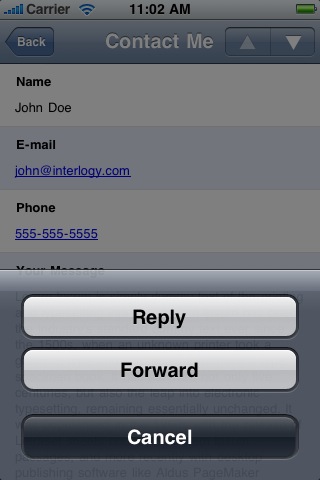
– Many people told us they are using the application for contact forms so they would like to be able to reply or forward submission messages by email, so we quickly added that as well.
– Since we are showing latest 30 submissions on Recent Submissions, My Forms and Search results, we thought that would be more than enough since the users would use the iPhone application to see recent submissions. But it turns out many users would use iPhone application instead of the reports on the web site. So, we also made it possible to load more results on those pages.
In general, users were very excited about the product. That also increased our excitement and commitment to developing an excellent product. We shipped the product to Apple for review in less than 3 months. Hopefully Apple will accept it quickly and all users can start using it. Wish us best luck. 🙂


Send Comment:
3 Comments:
More than a year ago
Bravo to all of the insightful comments. I have to visit this site more often. Thank All!
More than a year ago
Thanks Terry,
It is approved after two week. The Jotform App is now available on the Apple App Store. 300 downloads in its first three days and very nice reviews! :)
More than a year ago
Congratulations Aytekin! Hope it gets approved quickly. Keep up the great work!