Step to analyze survey data
- Identify the response rate
- Remove any incomplete or unreliable data
- Analyze four types of survey questions
- Analyze quantitative survey data
- Turn qualitative insights into quantitative data
- Cross-tabulate survey data
- Use benchmarks
- Compare survey data with previous results
- Turn survey data into meaningful insights
Survey data analysis is the process of analyzing the results of your customer surveys and turning those results into insights you can use for your business. Customer feedback gives you valuable information about how to improve your business. By analyzing your survey data, you convert that information into action items.
Steps to analyze survey data
Analyzing your survey data involves several steps. While the process of analyzing data might sound overwhelming and technical, this step-by-step approach simplifies it.
1. Identify the response rate
It’s important to gather information about how well your customers responded to the survey. How many people had the chance to participate in the survey? Of those people, how many completed the survey?
This percentage of people varies depending on how and when you offered the survey. For example, you can expect an exit survey to have a lower response rate compared to questions designed for a highly engaged visitor.
Also, your response rate might vary based on the types of questions used. Open-ended questions require more effort, which means that you can typically expect higher response rates from closed-ended questions.
2. Remove any incomplete or unreliable data
Next, it’s time to carefully review your survey responses for data that’s incomplete or unreliable.
Partial responses, responses from customers who aren’t within your intended survey audience, and responses that you can’t understand are considered incomplete or unreliable. These responses would skew the data from your survey, so it’s important to remove them before analyzing your results.
3. Analyze four types of survey questions
Now it’s time to look at the information gathered through the survey. Customize this analysis based on the type of question. Most survey questions fit into one of these four categories:
- Categorical (nominal) data. Categorical data results when a customer chooses an answer from a list of responses. Multiple-choice questions commonly generate this type of data. For example, “What is your favorite product feature?” might have responses such as ease of use, size, and affordability. Categorical data is simple to evaluate because the analysis involves simple math to identify the most popular responses.
- Ordinal data. Ordinal data consists of responses that fall into a logical order. An example is a survey question like “How often do you visit our restaurant?” with potential answers including rarely, once a year, once a quarter, once a month, and weekly. This information will help you see how often your customer is interacting with your product or service.
- Ratio data. Ratio data results from any question that asks for precise information. For example, you might ask about the customer’s budget, with an open-ended input field. Ratio data can be helpful in looking at measures of variance or calculating averages.
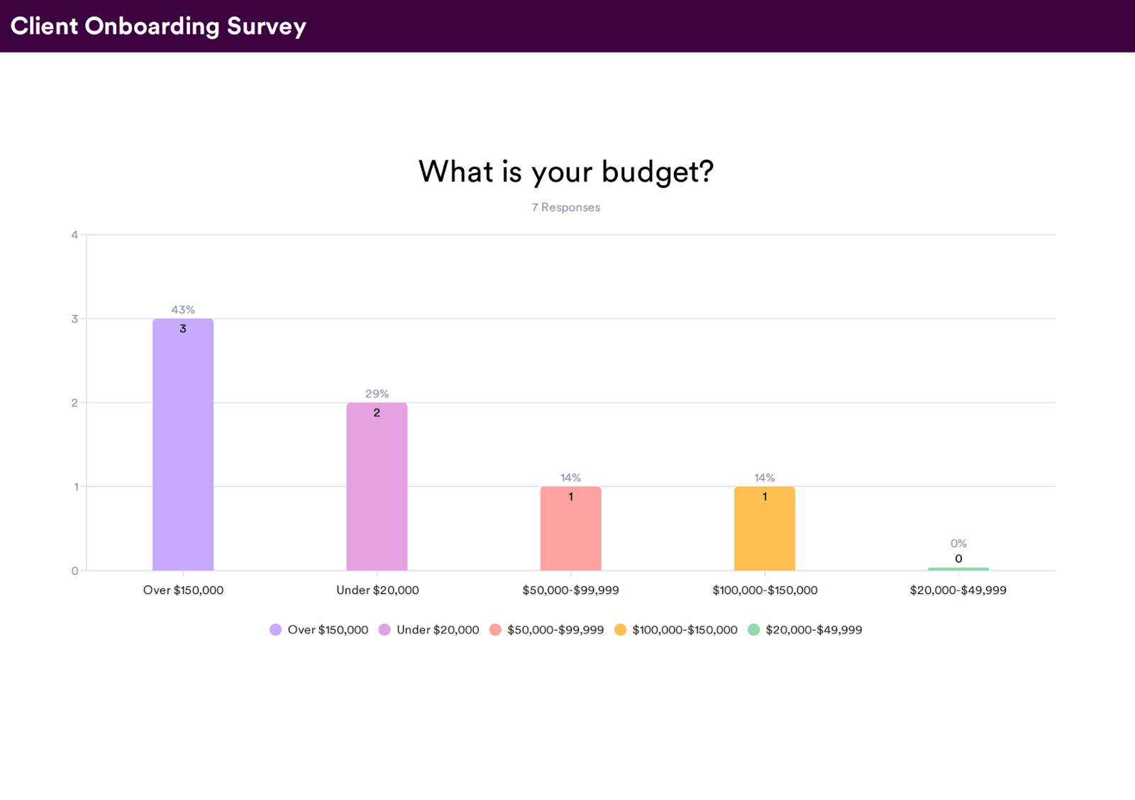
- Interval data. Interval data is produced by interval questions that segment your customers so that each group gets relevant questions. For example, you might ask a question about their preferred budget, with potential answers listing predetermined dollar amounts: <$20, $21 – $100, $101 – $200, and $201+. When the intervals are sized equally, you can calculate data averages to summarize the information.
It’s usually best to look at the numbers before you review long-form answers. Crunching the numbers first means that you have a foundation to use when reading through the open-ended responses.
4. Analyze quantitative survey data
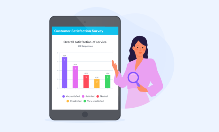
As mentioned above, you should analyze quantitative questions first, since their responses are grounded in numerical data and statistical analyses. An example of a quantitative survey question is asking your customers to rate their customer service experience on a specific scale.
Evaluating and making inferences from this information is simpler than analyzing the answers to qualitative questions, so it can be helpful to start with quantitative questions.
5. Turn qualitative insights into quantitative data
Your qualitative survey data is also important, and it can support and further inform your quantitative data.
For example, let’s say that 95 percent of your respondents reported a customer service wait time of less than two minutes, providing quantitative data on your customer service response times.
But when you asked customers about their customer service call experience, the majority of respondents said that they felt the customer service representative didn’t understand or didn’t fully solve their problems.
That qualitative insight informs your quantitative data and gives you specific areas to focus on improving.
Often, it’s important to review qualitative and quantitative data together to get the most thorough understanding of what your survey results indicate.
6. Cross-tabulate survey data
If you want to gain the most insight from these survey results, include cross-tabulation in your analysis. Cross-tabulation is a process that allows you to analyze the relationship between multiple variables. It gives the data context so you can see the factors that might affect specific outcomes. Additionally, it can be helpful to distinguish how different groups of people respond.
With cross-tabulation, you can see differing satisfaction levels between age groups or other categories. For example, if you determine that 56 percent of the participants were highly satisfied with the product, and 44 percent were dissatisfied, then consider mapping another variable to identify factors influencing their experience. You might find that the satisfaction levels change with age, budget, or any other category relevant to your target demographic.
7. Use benchmarks
As you analyze your survey data, you can use that data to set benchmarks for your company. These benchmarks serve as performance goals.
For example, if your customer service survey reveals that only 60 percent of respondents were pleased with the customer service they received, you might set a benchmark to increase that approval rate to 75 percent of customers within the next six months and then to 85 percent of customers within a year.
Setting benchmarks gives your organization concrete goals and helps you use survey results to improve your business.
8. Compare survey data with previous results
When you regularly send out surveys, the data serves as feedback on your business’s performance. Compare the results from your current survey with the results from previous surveys. Ideally, your results should improve. If you notice areas where your business didn’t improve or even declined, then you know which areas you need to focus on and examine.
9. Turn survey data into meaningful insights
Carefully analyzing your survey data transforms it into a valuable tool for your business. Take the time to really evaluate the responses you receive. Consider what those responses are saying about your company, and then use that feedback to identify concrete steps to improve your business.
Common mistakes in survey data analysis
While business owners can perform their own survey data analysis, it’s possible to make some errors that can affect how you interpret the data. Be sure to avoid these common mistakes so that you get maximum value from your data.
1. Hastily interpreting survey results
If data appears to support the results that you anticipated, it can be tempting to get swept up. It’s important to thoroughly review all of the data objectively. If you have a smaller sample size, it’s increasingly likely that your survey results could reveal an unbalanced or coincidental outcome that may not represent the feelings of your entire customer base.
2. Treating correlation as causation
If you notice two independent variables are connected, it’s common to assume that there’s a causal relationship between them and that one variable influenced the other. However, that’s not always the case, and it’s possible that the variables don’t affect each other. Be sure to avoid assuming causes behind the data you analyze.
3. Depending only on average values
When you’re analyzing a process, an average outcome that’s interpreted without context is often irrelevant when justifying an evaluation.
4. Overstating survey data
When you present your data, focus on framing the findings accurately. If you’re describing how your survey respondents felt, it’s important to qualify those results as being part of a population, and not wholly representative of an entire population. Avoid making generalizations and present the data in the most accurate way possible.
5. Misusing the word “significant”
When you’re analyzing results, it’s easy to accidentally change what those results mean. For example, the word “significant” means “important” when used in daily conversation, but that same word is defined as “an assessment of accuracy” when it’s used in the world of survey analytics.
It’s important to pay close attention to your word choice and verify that you’re conveying what the data reveals and nothing more.
Tools for survey data analysis
In addition to your survey collection tools, it can be helpful to use a survey tool to analyze the responses. Manual analysis is feasible if you have fewer than 100 responses. But it can turn into a time-intensive project when you need to evaluate hundreds or thousands of survey responses.
When you consider the time requirements for manual analysis, it’s important to note that this method could actually cost more money overall. Plus, manual methods increase the likelihood of inaccurate analysis.
Excel is sometimes used as a DIY analysis tool, but this only works if you know how to use the program’s more technical features. If you’re wondering how to analyze survey data effectively, you need to start at the beginning: How are you gathering the information?
Efficient survey analysis tools include software programs with built-in features for consolidating data and comparing results. The Jotform online survey maker provides a simple solution to share an online survey and collect responses instantly.
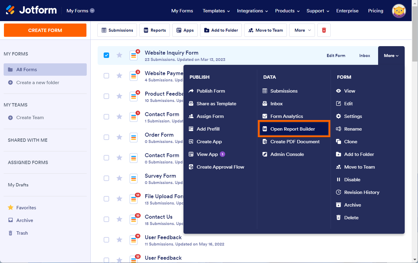
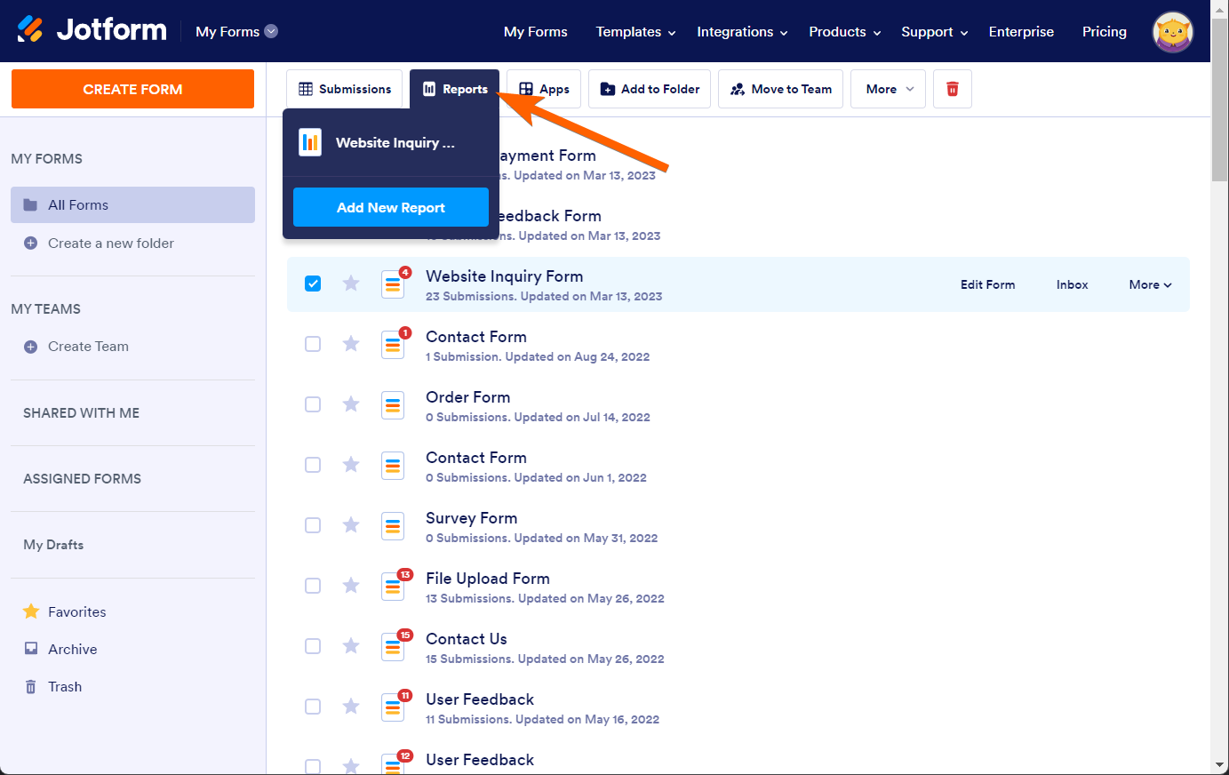
How to analyze data with Jotform Report Builder
Jotform Report Builder seamlessly transforms data into charts and graphs that make your findings easy to understand.
All you have to do is create an online form, share it, and then use Jotform Report Builder to build an elegant presentation using the data you collected through your form.
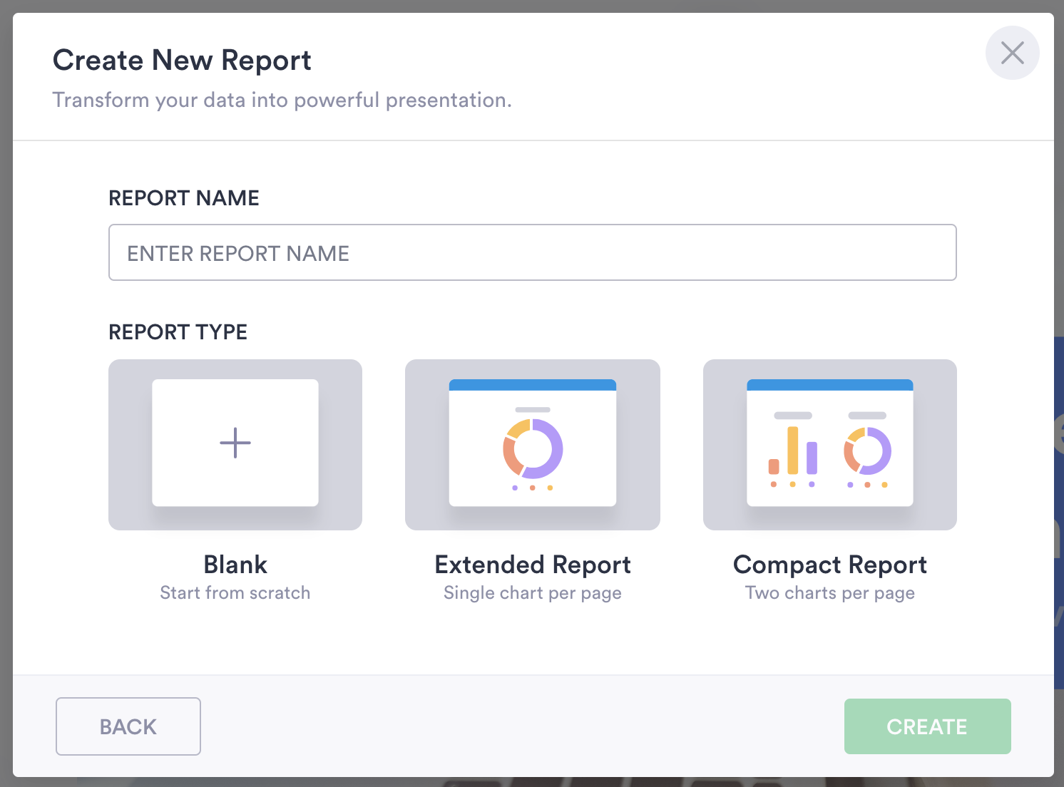
You can automatically generate a professional-looking report — with either one or two graphs per page — or start with a blank slate.
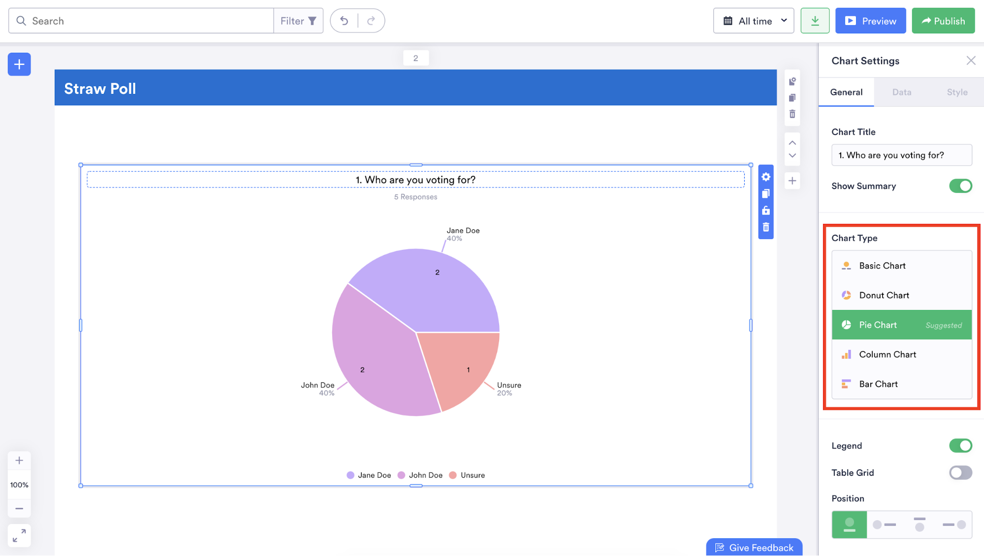
Regardless of which you choose, Jotform Report Builder has a wide variety of design options that enable you to personalize your report and display data in any number of ways. For instance, you could add a business logo, upload a background photo, change the fonts, and add fun icons to give your report some character.
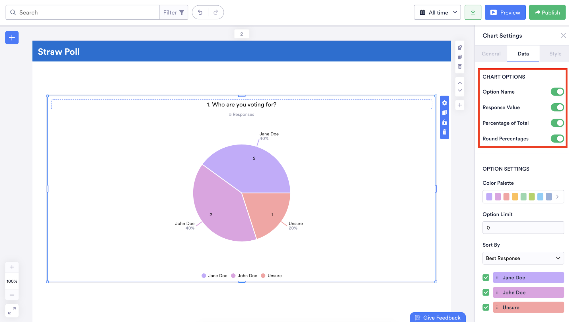
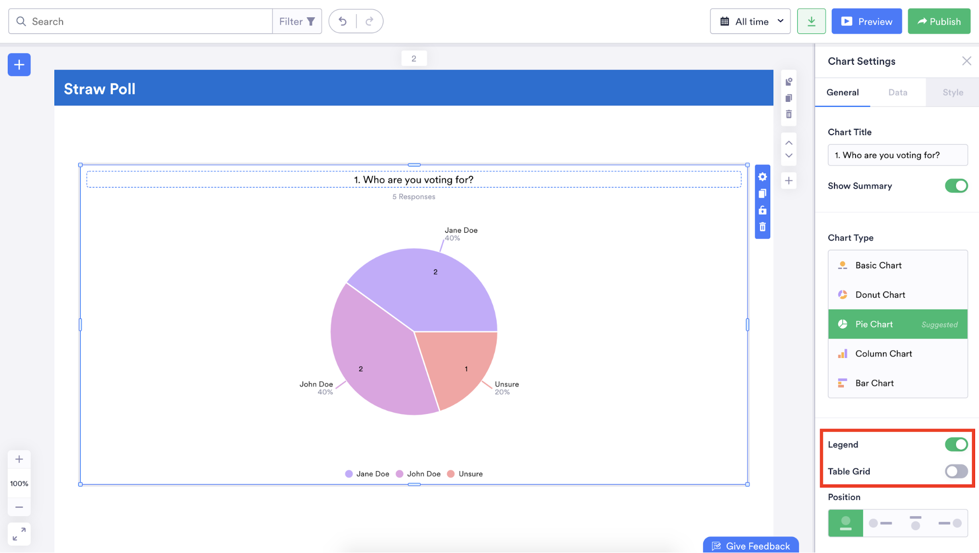
Along with changing the types of graphs or charts displayed in your report, you can also indicate how many people answered a question, show how many people selected a specific answer, and illustrate how selected answers to a question represent a certain percentage of all responses.
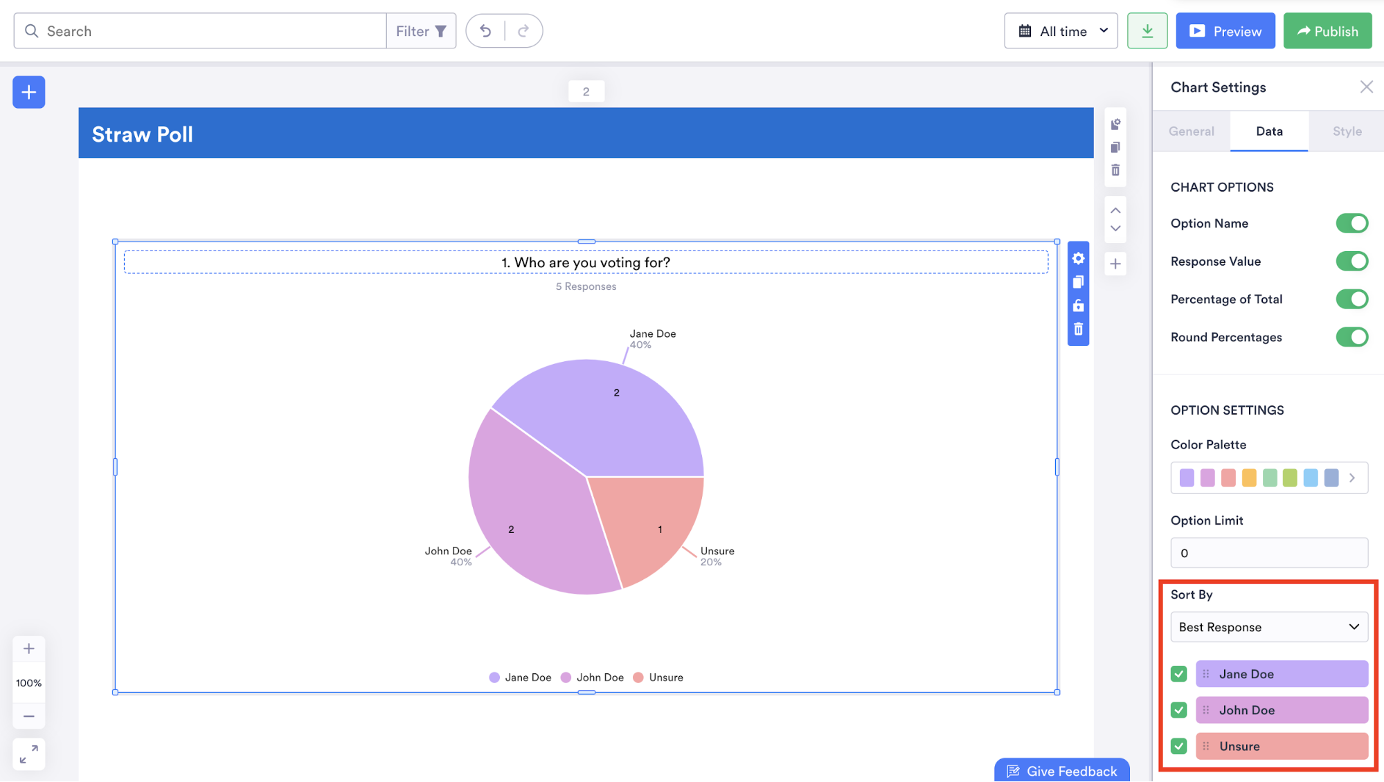
You can even make your data easier to understand by rearranging the order in which it’s displayed and adding a legend or table grid.
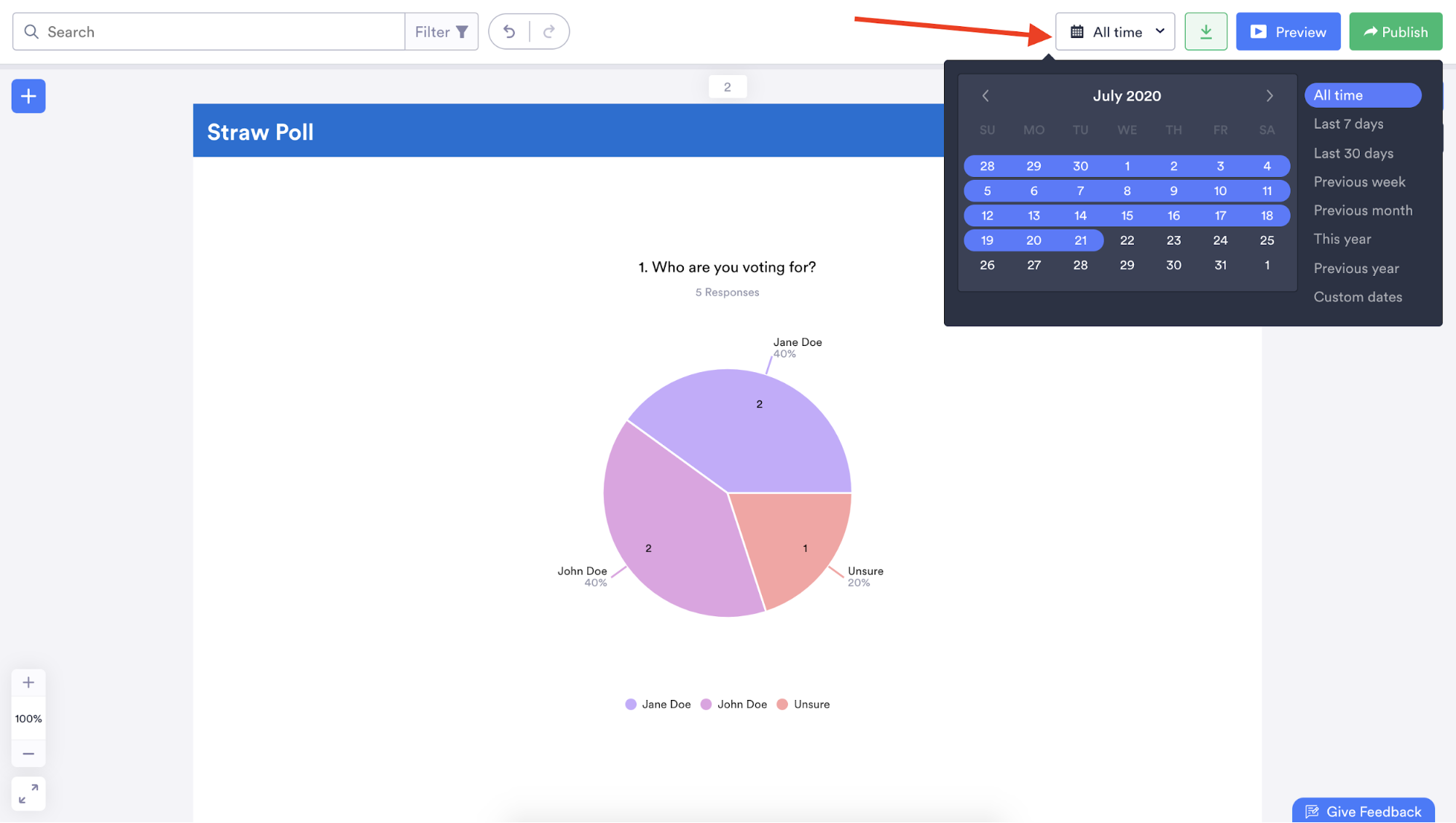
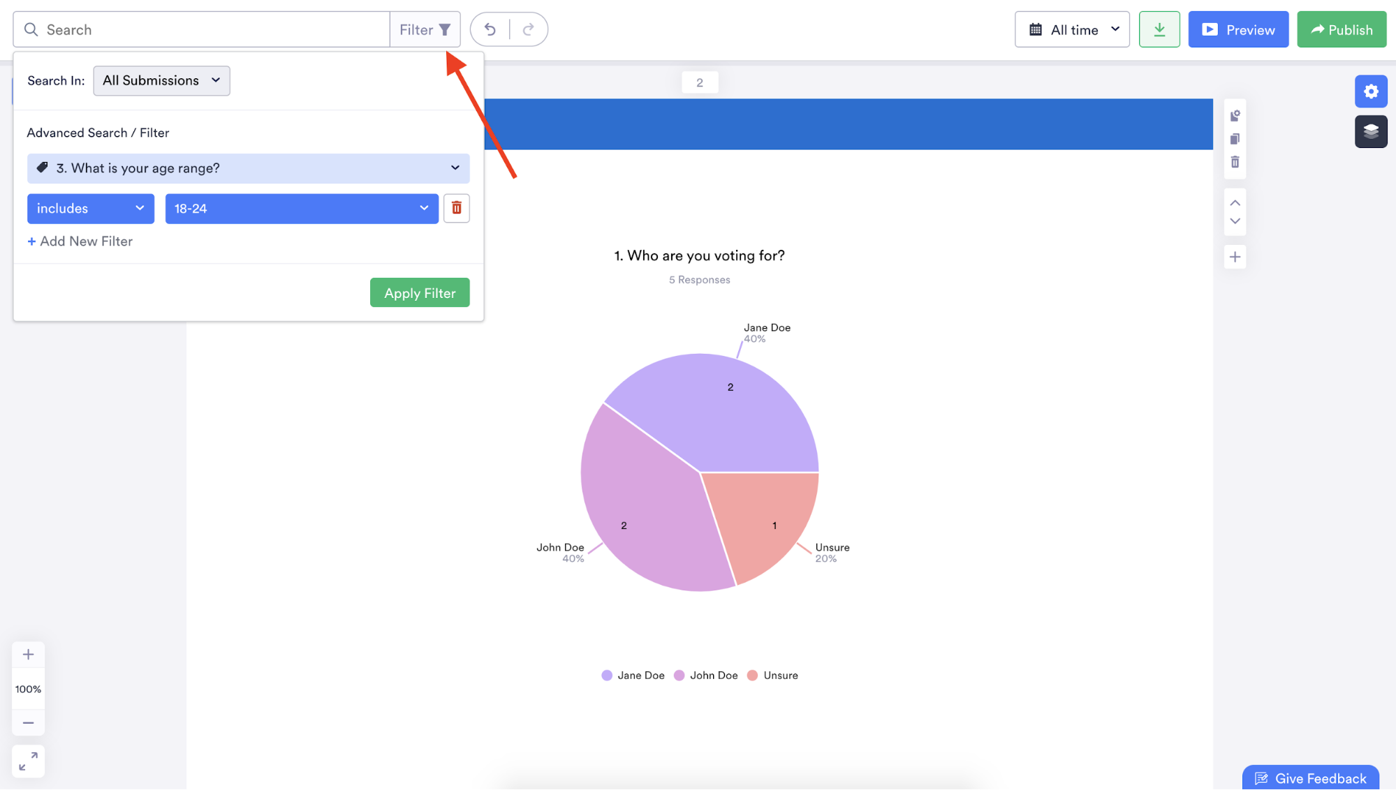
Jotform Report Builder can analyze responses submitted within a certain time frame or filter data in your report based on specific answers to certain questions so you can glean meaningful and relevant insights.
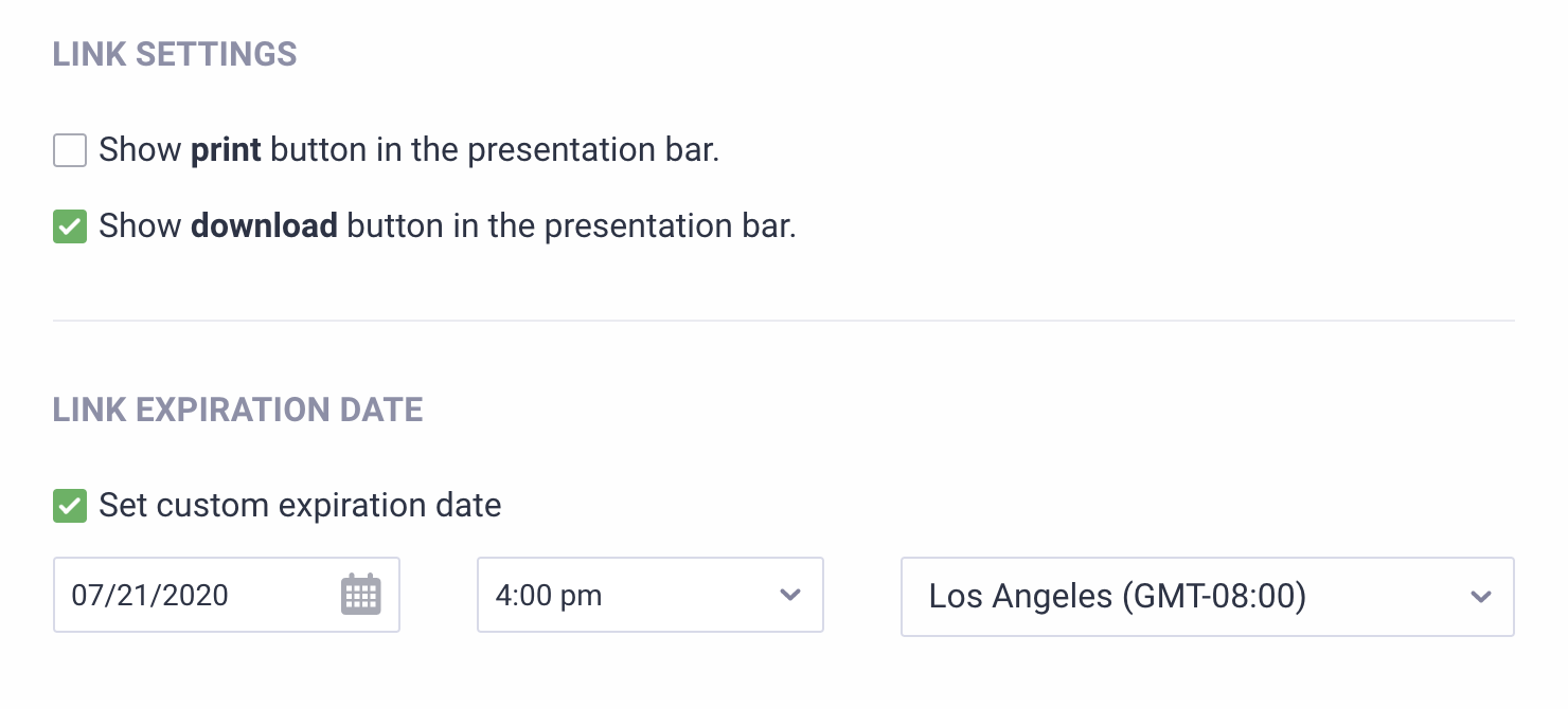
After creating a thorough and attractive report that meets your needs, you can download the report as a PDF, print it, share it in an email with a personalized message, distribute it using a dedicated link, or embed it on a website.
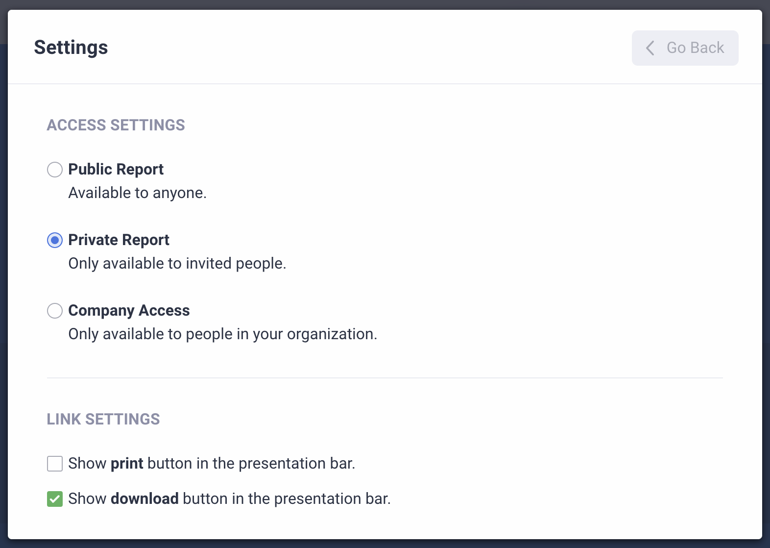
There are even safeguards that allow you to control who can view your report, what they can do with it, and how long they can access it, so you can collect secure survey data.
Jotform also ensures a smooth data collection process. Whenever someone fills out and submits a survey, that information automatically populates the associated table in Jotform Tables. Also, if your survey report is embedded on a website, the information in the report will be updated instantly. That means you no longer need to spend valuable time manually creating a report.
When all is said and done, Jotform stands out as a powerful, all-in-one solution that allows you to gather data and leverage it to seamlessly create professional-looking reports in no time. With a robust set of features that display only relevant data and make it easier to understand, Jotform Report Builder can uncover critical insights that drive informed decisions and inspire creative ideas.





Send Comment: