How to create a lightbox form with Jotform
- In Jotform’s My Forms, and select Edit Form
- Click the Publish tab
- Click Embed
- Scroll down to the Lightbox option and select it
- You should see three options: Select Preview, Copy Code, Customize
- Click the Save Changes button and then Copy Code
Thanks to heavy competition and the seemingly endless ways to advertise goods and services, it’s increasingly difficult to boost traffic to your website. You have to include relevant keywords in your blogs, send email newsletters, and write guest posts just for a fighting chance — and those are just some examples of free marketing techniques.
Once your visitors have successfully found your website, the last thing you want them to do is leave. That’s why it’s important to understand their exit intent (i.e., where visitors move their cursor on your website, how far down they scroll on each page, and how long they remain idle). Once you can figure out how your visitors are browsing your website, you’ll be better equipped to entice them to stay when they start to leave — with the help of digital marketing tools.
Benefits of exit intent popups
Exit intent popups, the little boxes that pop up on your screen when you’re leaving a website, help organizations connect with their site visitors one last time — through offers of discounts, e-books, and free gifts or shipping — before visitors navigate to another site and brand.
These popups can boost conversions, reduce cart abandonment and bounce rates, and increase sales. Plus, while they may still be slightly annoying, exit intent popups are much less distracting and bothersome for your visitors than popups that appear immediately after they’ve landed on your site.
Exit intent popups best practices
When creating an effective exit intent popup, there are a few best practices to follow. Here are some things to focus on:
- Make sure the popup grabs visitors’ attention quickly and concisely.
- Try to generate urgency with your popup. (Simply using the words “limited time” in the offer can increase your conversion rate.)
- Include an appealing offer, like an exciting consultation or irresistible discount that’s targeted to the specific page your visitor is on. For example, to reduce cart abandonment, your exit intent popup on the checkout page can be about free shipping or free returns.
- Make sure it only requires visitors to submit essential information, such as their name and email address.
Examples of exit intent popups
To illustrate these best practices in play, here are 20 real-life examples of effective, powerful exit intent popups that are clear, concise, interactive, entertaining, and visually appealing.
Clear and concise
Though simple, these first five exit intent popups waste no time getting to the message or offer, proving there’s power in minimalism. Some of them even use fun, on-brand calls-to-action (CTAs) — like “Let me in!” or “Make me a VIP!” — instead of the more commonplace “Sign me up.”
1. distorted people
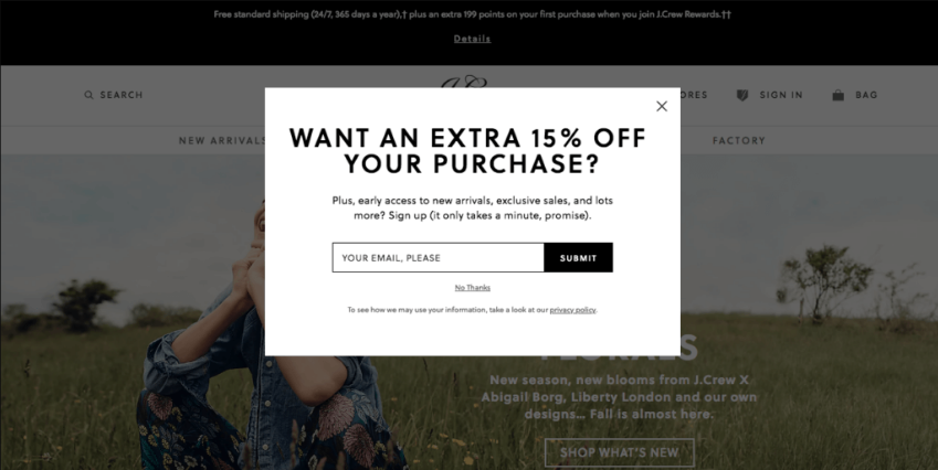
2. J. Crew
3. LionHeart Hobby
4. SkinScience
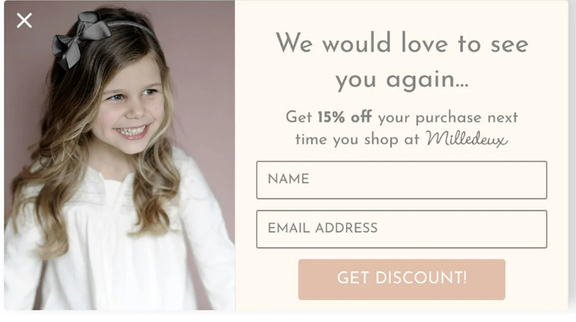
5. Milledeux
Interactive
Adding fun, interactive elements to your exit intent popups — like these next two brands have done — is another great way to engage and connect with site visitors.
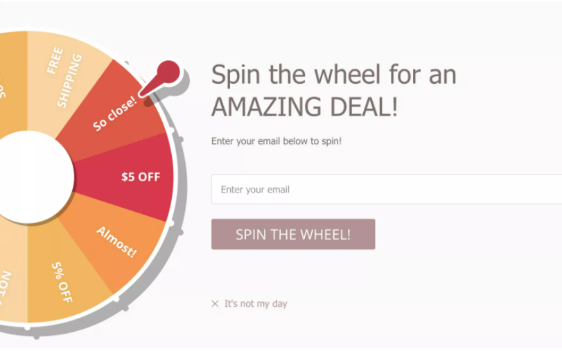
6. Modern Me Boutique
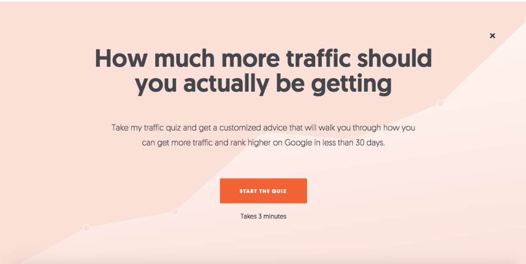
7. Neil Patel
Funny and entertaining
Sometimes, to entice a visitor to leave their name and email address, all you have to do is make them smile or laugh. Check out how these eight brands added funny, playful language or imagery to their exit intent popups.
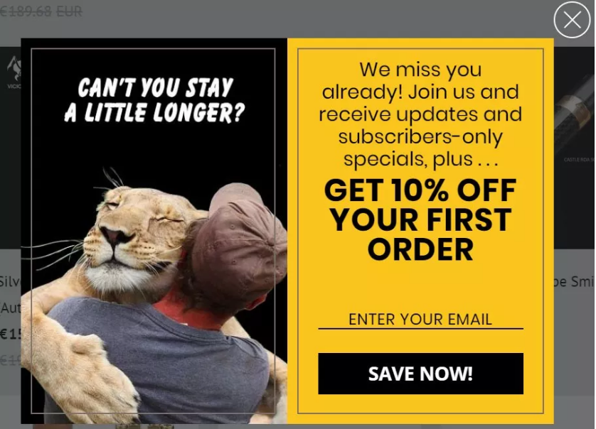
8. Roadside Vapes
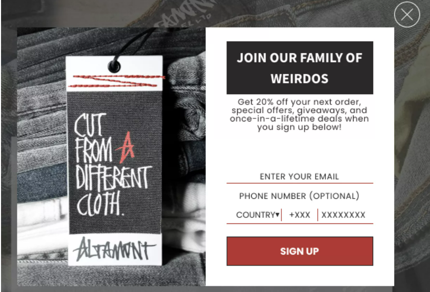
9. Altamont
10. Duke Cannon
11. GQ
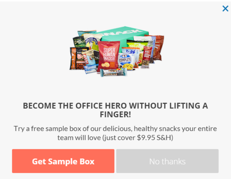
12. SnackNation
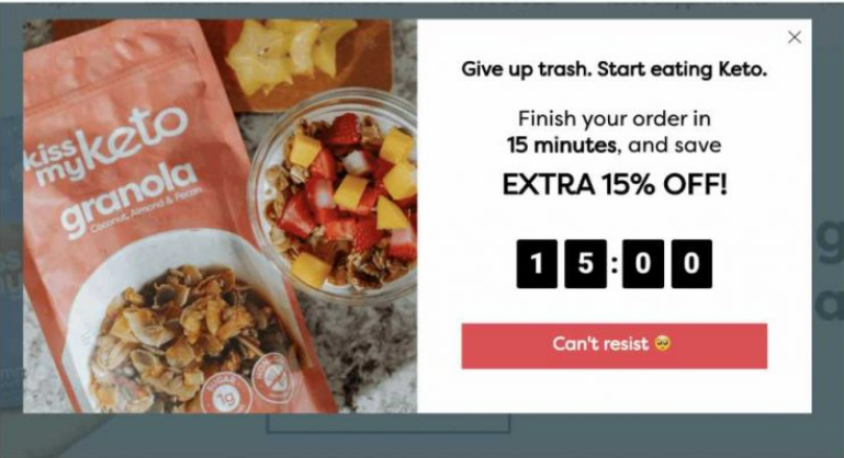
13. Kiss My Keto
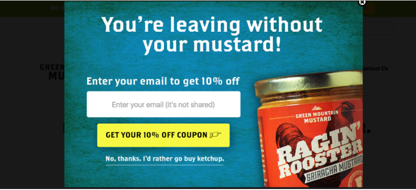
14. Green Mountain Mustard
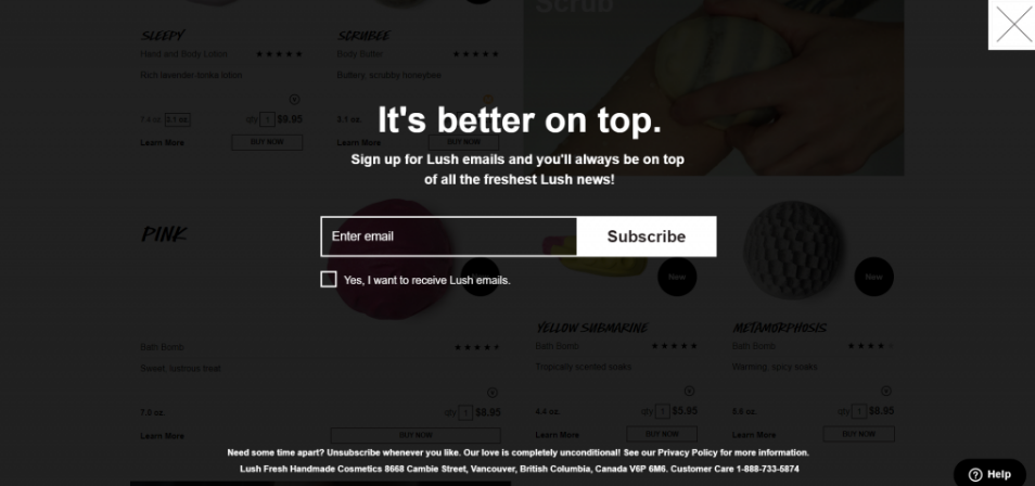
15. Lush
Visually appealing
Make your exit intent popup aesthetically pleasing to provide a bold, memorable reason for visitors to engage and connect with your brand. As in the five examples below, bright and vibrant colors, imagery, copy, or call-to-action buttons (or all of the above) should certainly do the trick.
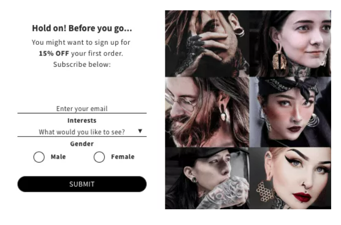
16. Ask & Embla
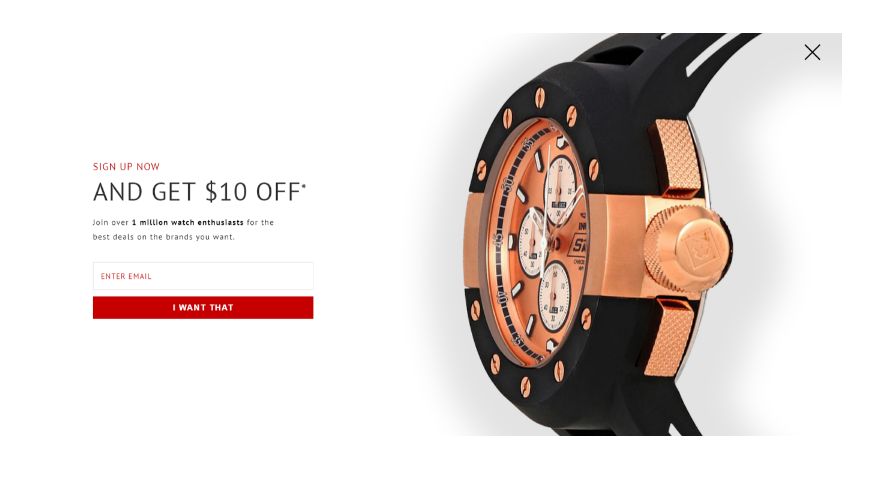
17. World of Watches
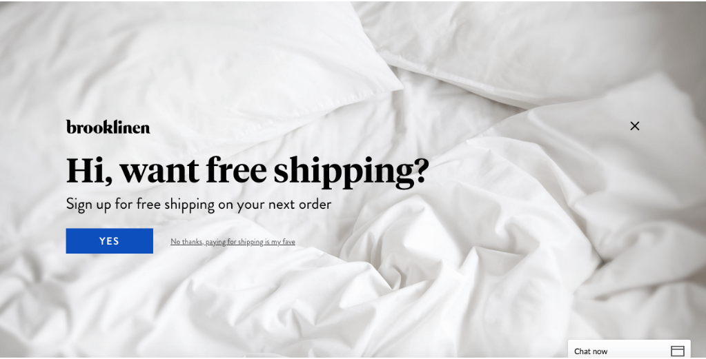
18. Brooklinen
19. Tim Ferriss
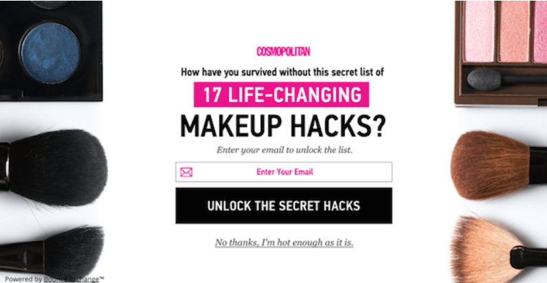
20. Cosmopolitan
How to create a lightbox form with Jotform
Now that you have a better understanding of the benefits and best practices of exit intent popups — and have seen some compelling real-life examples — it’s time to learn how to create a lightbox form using code-free online form builder Jotform to gather information from site visitors. A lightbox form is similar to a popup in that it displays your form in a popup window.
Though Jotform doesn’t offer a built-in popup modal that opens when a visitor tries to leave your site, you can embed forms within other popup software to collect additional information from your site visitors. Simply copy and paste the embed code into your popup software of choice.
Here’s how to make a lightbox form in Jotform.
- In Jotform’s My Forms, hover over the form you’d like to appear in a lightbox and select Edit Form. (If you need to make a form first, click the orange Create Form button and either start from scratch or use one of Jotform’s 10,000-plus premade templates.)
- Once you’ve customized your form to your liking, click the Publish tab.
- In the navigation bar on the left, click Embed.
- Scroll down to the Lightbox option and select it.
- You should now see three options:
- Select Preview to test your lightbox.
- Select Copy Code to copy your embeddable lightbox code to your clipboard.
- Select Customize to update the lightbox form’s title, dimensions, style, and colors.
- After you’re done customizing, don’t forget to click the Save Changes button and then Copy Code.
Pro Tip
If you’re more technologically savvy or have experience with code, you can even set your newly created lightbox form to appear at certain times.
Though simple, exit intent popups tout a ton of benefits to engage and connect with your site visitors one final time before they head elsewhere — especially if you make your popups fun, appealing, and succinct. So, next time you’re shopping online or surfing the web, take note of the effective exit intent popups you come across and recreate one for your business — perhaps with Jotform — based on the ones you like the most.









Send Comment: