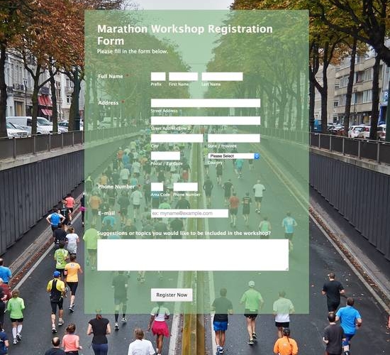
We can all agree on one thing: we don’t like when companies are confusing. Knowing exactly what you’re signing up for or getting into alleviates concerns and drives trust for the company. Instead of using the one-size-fits-all default “submit” text on the call-to-action button, describe to the visitor what action they will take by submitting the form. Examples include “Shop Now,” “Learn More,” Sign Up,” “Book Now,” and “Complete Survey.”
Customizing your call-to-action is simple, but powerful. Here’s how you do it!
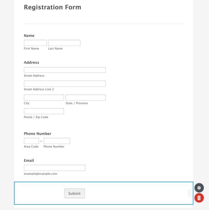
1. Once your form fields are complete, click on the button’s section to highlight it.
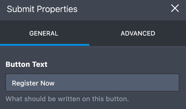
2. Click “Properties” button next to the field. You will see the “Button Text” section.
3. Click “Button Text” and type whatever call-to-action you’d like in the box, then press “OK.”
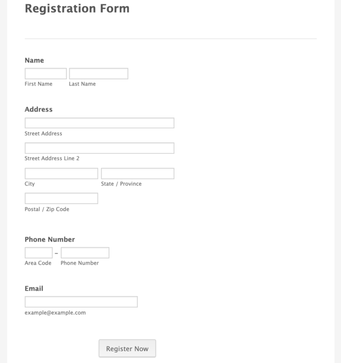
4. Your form now features your custom call-to-action!
As always, you can always use the Form Designer to customize the look and feel of your form for optimal impact.


Send Comment:
3 Comments:
More than a year ago
the blog is very interesting and will be much useful for us. thank you for sharing the blog with us. please keep on updating.
More than a year ago
Thank you very much for this article . I think that i can consider this article as a reference for me because it contains many important information at once...
More than a year ago
hi......how i fill a form.......??