The importance of form organization cannot be overstated: better designed forms get better completion rates. So how do you design a better form? Here are a few tips — group form fields together if they’re in a similar category, break up longer forms so that it still feels bite-sized, and generally make your form more aesthetically pleasing and easier to get through. Read on for 3 widgets that can help increase your form’s completion rate.
Form Tabs
Including tabs to your multi-page form adds not only style, but function! Tabs make it easy to navigate multiple pages, and make a long form seem more manageable as there are well laid out breaks that make sense.
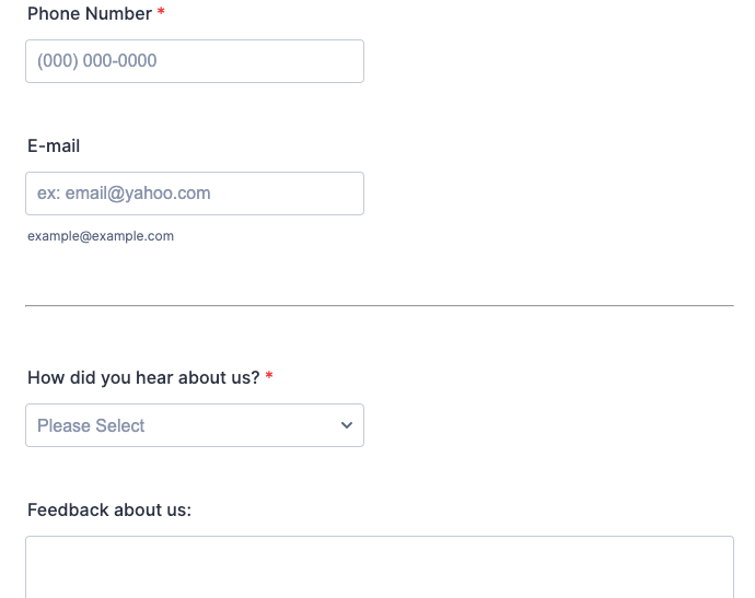
Form Separators
Form separators organize your form. These are a smart addition if you have sections on your form that cover topically different questions and question types. For example, perhaps you want to begin gathering information about a different subject, or you’re transitioning to asking questions in a star scale format rather than multiple choice. This would be a logical point at which you can add a form separator.
Progress Bar
Moving through a long form can be a slog and make you feel like you’re trying to run a marathon through a path of molasses. Put some pep in your respondent’s step by adding a progress bar on your form to cheer them on! As they move through the form, they’re rewarded by more of the progress bar being filled, and more motivation to get to the finish line: the “submit” button.
So, how do you measure completion rates? Jotform has Form Analytics, where you can track your completion rates/conversion rates, and other useful information about your online forms. You can access Form Analytics for any of your online forms right from your Jotform dashboard.


Send Comment:
12 Comments:
More than a year ago
Quality. Love the simple interface. Keep it up Jotform!
More than a year ago
thanks
More than a year ago
Love Jotform! This article was timely!!! I literally used all 3 of these suggestions. Thanks!
More than a year ago
I just sent a job application.
More than a year ago
Loan Application
More than a year ago
What would you advise for a form that has many or most of the questions required? We find that if we don't make them required, they sometimes don't get answered. This is an issue for separating b/c someone can't move forward unless they answer the question.
It's also difficult because they can't see what else they will need to answer (applications for example). Since they can't save the form they have to reenter information. Thus I've had to make one long form so people can see all the information they will need to enter.Would much rather separate into several pages or tabs.
Thanks for the help!
More than a year ago
Just wanted to say how much I value Jotform and how it helps me with my small volunteer programme. I see the ad " Are you still using Jotform" Yes, I reply .....because I find Jotform so much better by Cognito. Yes I am because I find Jotform so much better all round. Simples!!
More than a year ago
Lets see if it helps
More than a year ago
OOO I SEE...:)
More than a year ago
ReaLLY ReaLLY amazing ,.. lets go on !
More than a year ago
The spam comment from @Ralphsnics has been deleted.
More than a year ago
@Ralphsnics
I can't believe people are still doing this spammy crap. It's 2017 for God's sake. ;)