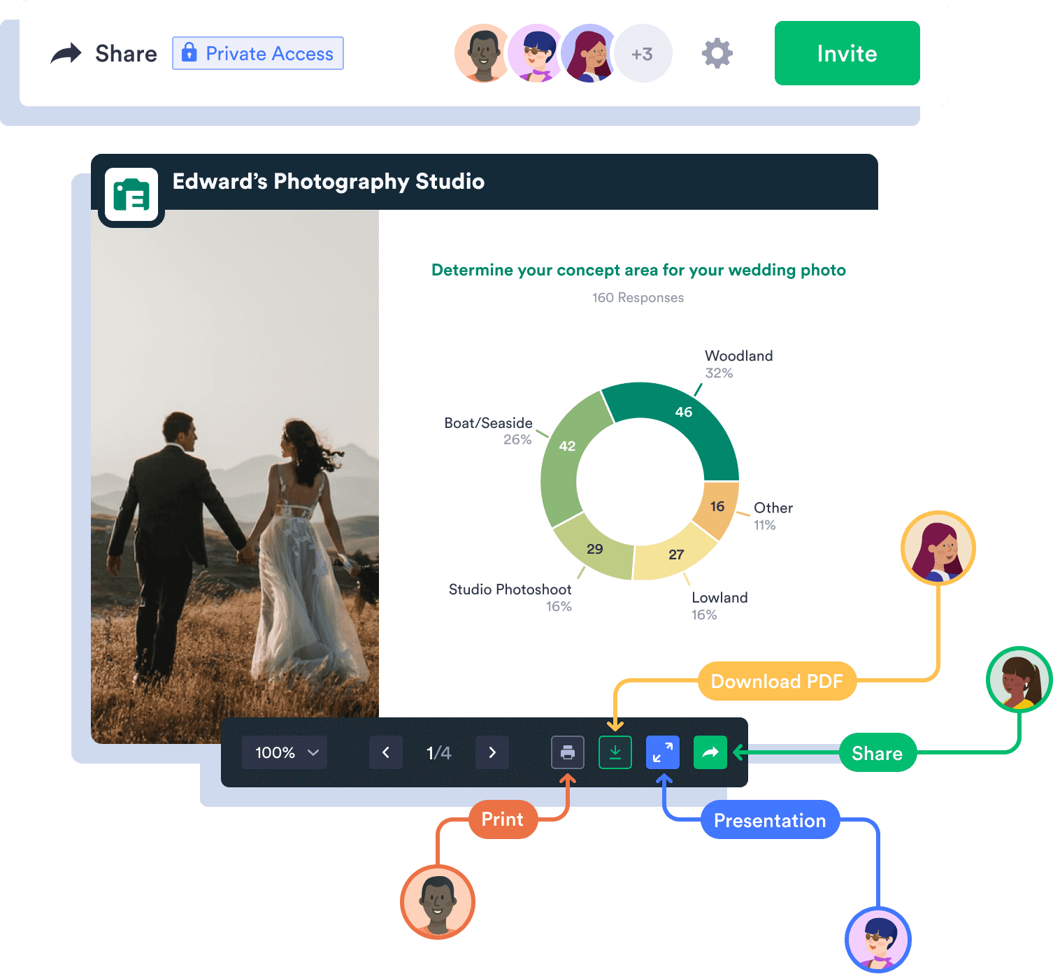
Transform raw submission data into a professional donut chart with Jotform Report Builder. Whether you’re a business owner, a data analyst, a teacher, or just a data lover, our Donut Chart Maker will be your go-to tool for turning complex numbers into clear, user-friendly charts.
القوالب
To get started, choose one of our ready-made survey templates. Drag and drop to customize it by adding images or branding assets, changing fonts and colors, integrating with useful tools, and much more. Then gather the data you need for your donut chart.
الفوائد
With Jotform’s Donut Chart Maker, you can effortlessly transform your raw data into polished, visually engaging charts — no manual data entry required. You can also create tailored reports and presentations with Report Builder to seamlessly share with your colleagues and stakeholders.
Personalize your charts to match your unique requirements and preferences using Jotform’s intuitive drag-and-drop Report Builder. You have the flexibility to adjust colors, labels, and other design elements, ensuring that your charts align with your company’s brand.
Embed reports in your website or social media platforms — no coding required — so your audience can access your donut charts instantly. Plus, your embedded reports will automatically update with each new submission, so you won’t need to worry about manually adjusting your charts.
To speed up your workflows, you can share your donut charts with coworkers, clients, and stakeholders in just a couple of clicks. Forward reports via email or direct link, as a PDF, or in a QR code for your convenience. Visualizing your data has never been easier!
توصيات
Turn your form data into appealing, presentation-ready reports in a matter of minutes. Discover how to use Jotform Report Builder in this quick tutorial.
جميع أسئلتك عن Jotform - تمت الإجابة عنها. تحقق من الأسئلة الشائعة للحصول على إجابات للأسئلة الشائعة، أو اتصل بفريق الدعم للحصول على مزيد من المعلومات.
That’s right! The Donut Chart Maker from Jotform is free to use and always will be. You can turn your submission data into appealing, professional reports in a matter of minutes, and present them to colleagues, stakeholders, customers, and more. Keep in mind that you can increase your submission limits with paid Gold, Silver, or Bronze plans to maximize your data collection and visualization.
You can create a donut chart using Report Builder in a few simple steps. First, go to My Forms and choose the form you want to use to build your chart. Open Reports, add a new report, then select Visual Report Builder. You can then select your report type and start customizing it by clicking on images to choose from a variety of chart formats.
Yes — Jotform’s donut chart templates are completely free to use. When you set up your data chart, you have the option to choose from a variety of templates, which include donut charts, bar charts, tables, and more. You can mix and match, or change charts at a later point if you think a different format would work better for your needs. The best part? It’s totally free!
Yes, you can customize the appearance of donut charts by adjusting fonts, colors, labels, and more. You can also edit the names and text in your charts to make sure they fit your needs perfectly.
You can share your donut charts with others in several ways. Export your charts as PDFs, send them via email or direct link, or forward them in a handy QR code. You can also embed your charts in your website or social media to share them with your audience instantly.
Donut charts are similar to pie charts in that they are used to display different data sections that total up to 100 percent. They are best for comparing a handful of categories at a glance, and they give a good picture of how each category relates to the data as a whole. Donut charts accommodate fewer categories than pie charts because viewers need to be able to see different arc lengths clearly. As such, donut charts are best for visualizing data that’s split into two to five sections.